
















Branding
B2B Branding Strategy: Positioning, Proof and Buying-Committee Trust
Sep 6, 2026
/ By Hamoun Ani
Brand Vision is a UX research agency handling the work end to end, from recruitment through findings a team can design against.
Design decisions are only as good as the evidence behind them. Brand Vision runs research before design begins, observing how real users behave and where they struggle, then translating those findings into direction a design team can act on immediately. As a UX research agency working across industries, we replace assumptions with evidence before a single screen is designed.

Building real partnerships with top global brands. Delivering results that last well beyond the launch.















UX research agency work covering what users say, what they do, and where they struggle.

Brand Vision runs user interviews as structured studies with a defined outcome. We write the discussion guide from the decisions the research has to inform, recruit participants who match the real customer profile, and moderate without leading. Analysis then reduces hours of conversation to the handful of findings that matter. Our UX research agency records where each insight came from, so when a stakeholder asks how we know, the answer is on file.
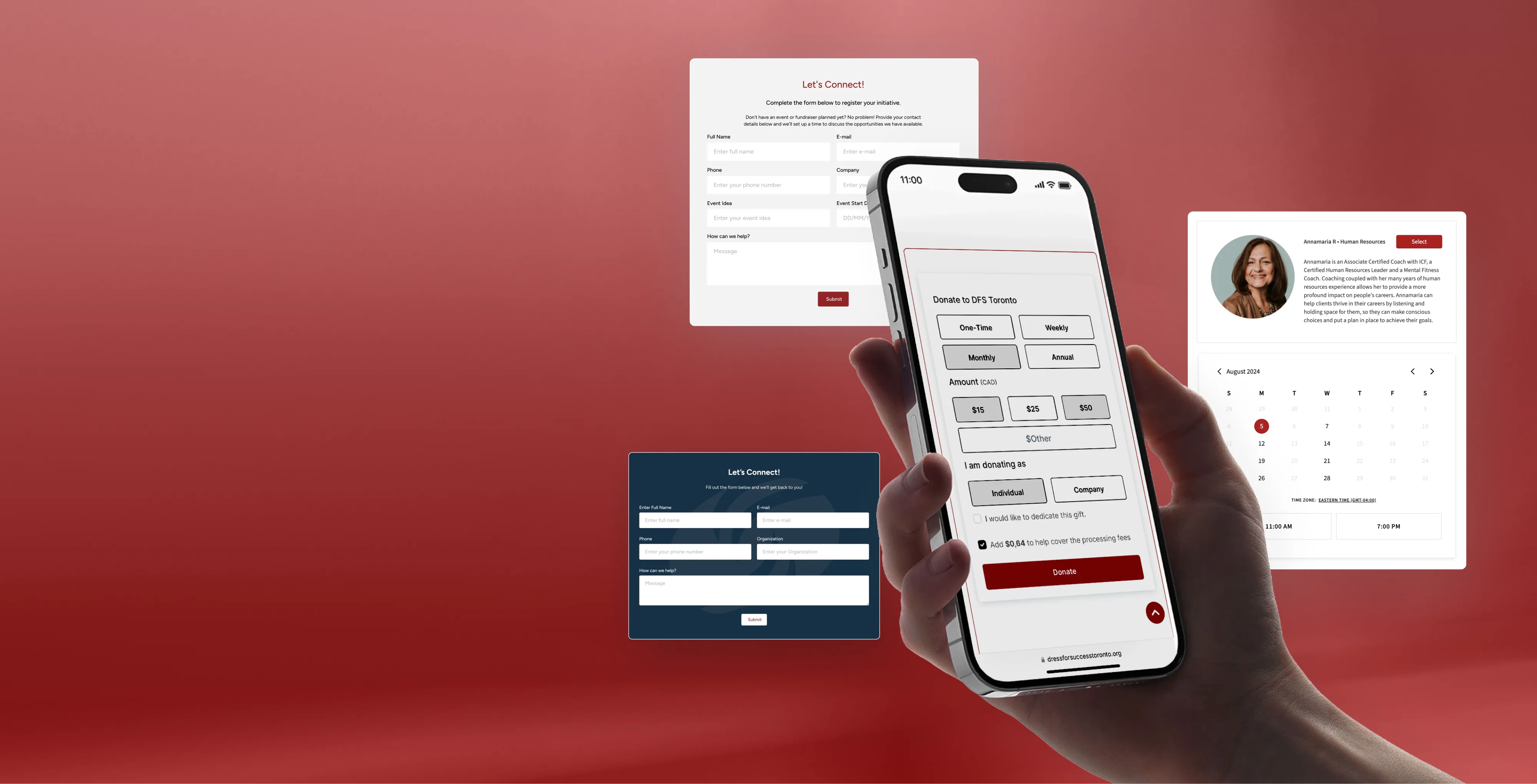
Usability testing services show where a product loses people. Brand Vision recruits real users, gives them real tasks, and watches where they hesitate or fail. Each round tests a stated question, whether on a live product or a prototype that has never shipped. Findings arrive ranked by severity with the session recordings attached, so nobody has to take our word for anything. Our UX research agency retests once changes ship, so improvement is measured and not assumed.

Brand Vision handles persona development as a research deliverable with evidence behind every trait. Each persona is built from interview and analytics data, describing what the person is trying to accomplish and what stands in the way. Marketing claims stay out of it. Our UX research agency delivers a small set the whole company can agree on, so product debates end with which persona wins instead of whichever opinion is loudest.
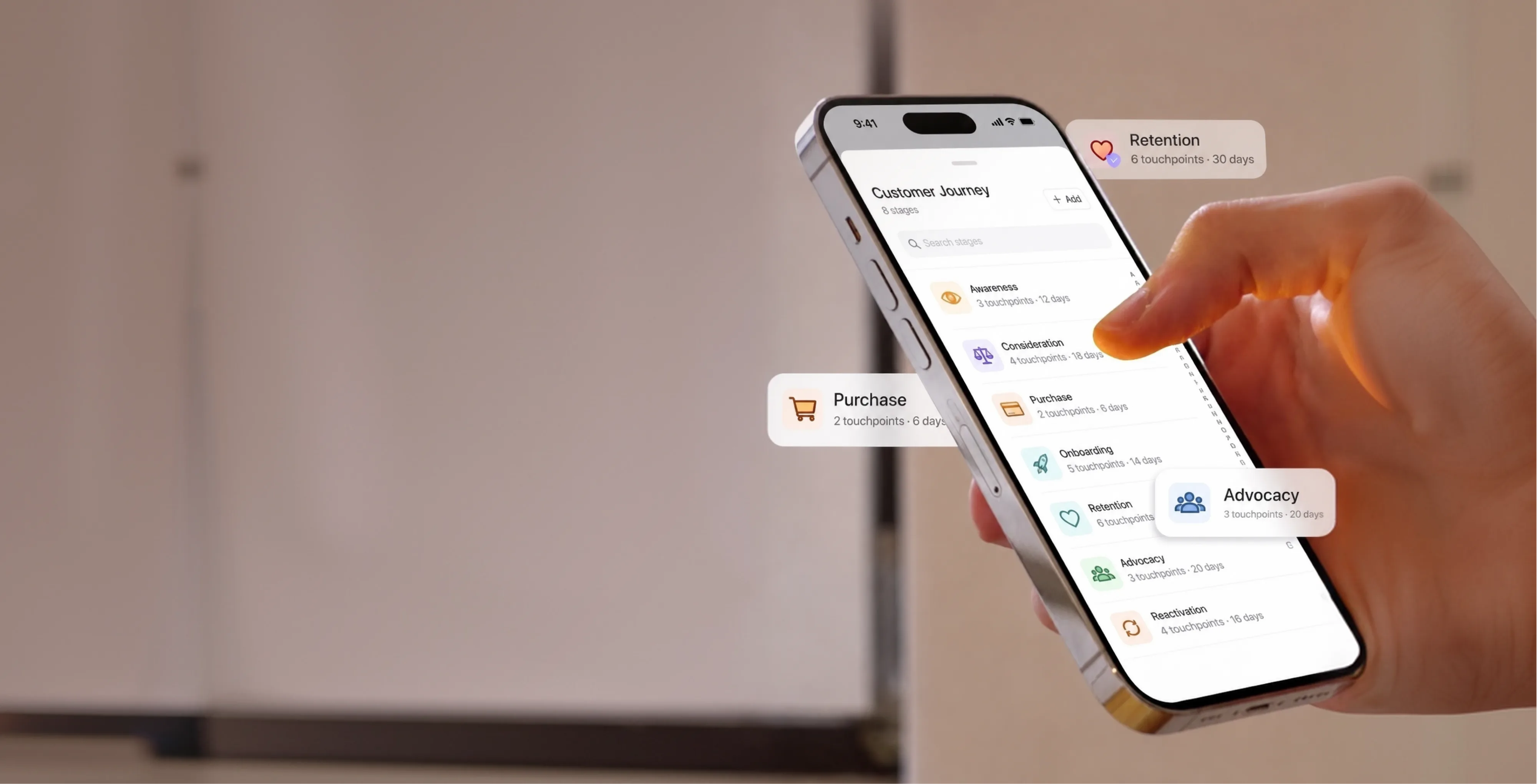
Brand Vision runs customer journey mapping to find the moments that decide whether a customer continues. We chart the full path across channels, marking what the customer is doing and feeling at each stage and where the experience breaks down. Every entry traces to a research source. Our UX research agency delivers the map with the failures ranked by what they cost, so the document drives the roadmap after the meeting ends.
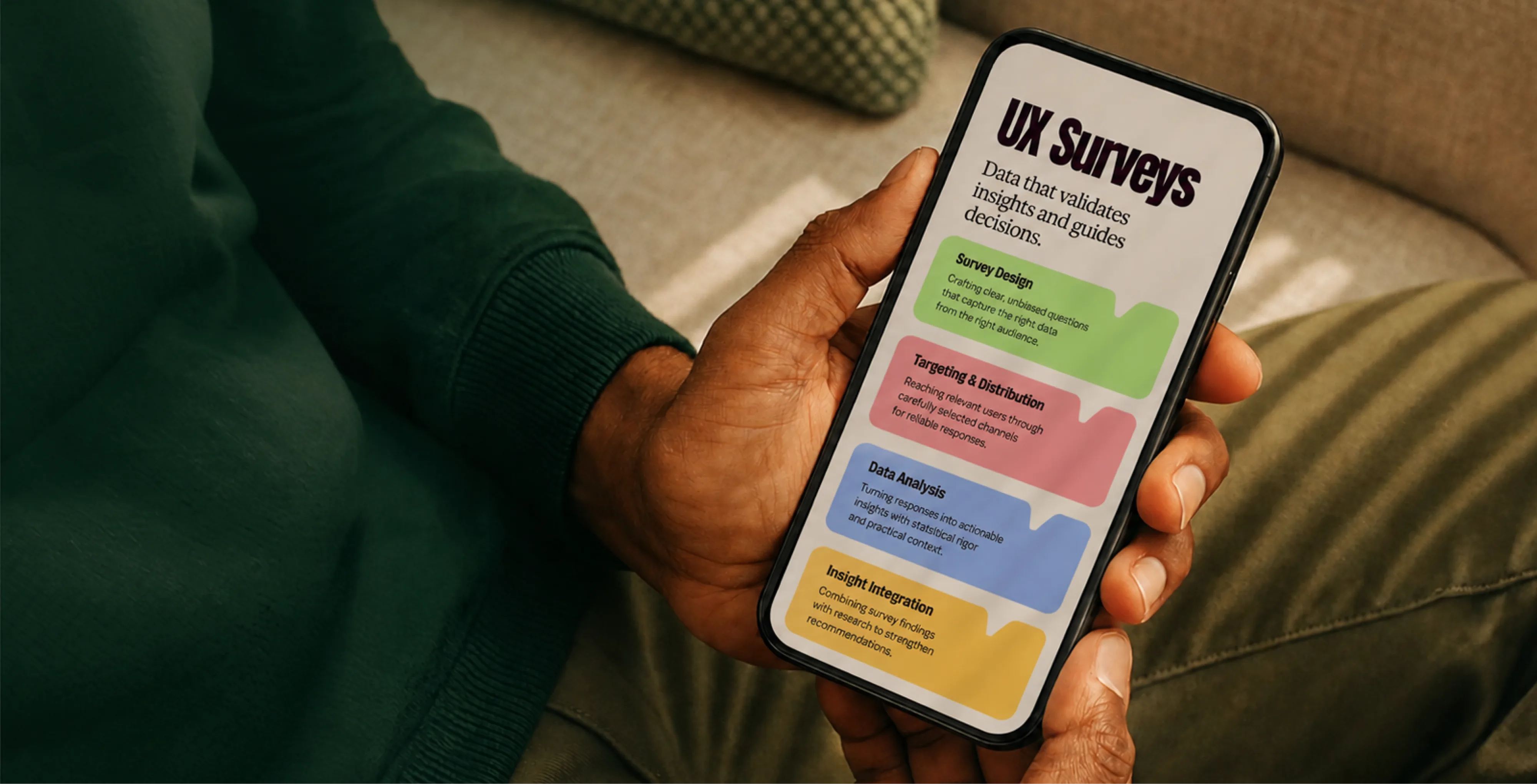
Surveys put numbers behind what interviews suggest. Brand Vision designs each questionnaire around a decision, writing neutral questions and testing them on a small group before anything is sent. We handle sampling and distribution, then analyze the results with the discipline to say when a difference is noise. Our UX research agency pairs the survey data with the qualitative work, so every finding carries both the story and the scale.
From the question to findings a team can design against.
We align on goals, study the audience and competitors, and audit what's already there. Research and analytics shape the sitemap, the content priorities, and the standards the finished site has to meet.
We turn strategy into page models, components, and responsive layouts. Interactive prototypes put the design in context, so the decisions that matter get made early, before anything is built in code.
We build on a clean, well-structured CMS and implement the design system, with accessibility, performance, and analytics handled from the first line rather than bolted on at the end.
We run full QA, set up redirects, and prepare a clear handover, then map the first round of improvements so the site continues to earn its place well after go-live.
Research work delivered by our UX research agency for corporations and growing businesses across North America.
What research has to uncover changes with the category. An ecommerce study watches how customers compare and abandon, while a healthcare study works with patients reluctant to say what they mean. Our UX research agency designs each study around how that industry's users behave.
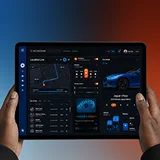











Product depth shouldn’t slow the story down. We partner with SaaS, platform, and enterprise software teams to translate technical capability into focused narratives. Clear paths to demo, trial, or contact serve both buyers and technical evaluators. Systems are built for product-led growth with composable components, editor guardrails, and instrumented analytics that tie directly to pipeline.
Complex services sell on clarity, not volume. We help consulting, financial, and advisory firms structure their digital presence around buyer tasks: understanding capabilities, comparing options, and starting a brief. Every touchpoint earns trust through specificity and proof. Content is organized by audience need, so the people making the hiring decision find answers quickly and move to contact without friction.
Patients and practitioners make high-stakes decisions under pressure. We design trust-first experiences for healthcare and wellness brands, keeping clinical accuracy intact while making it simple for people to find the right provider, service, or next step. Accessibility, privacy-compliant forms, and plain-language content are standard. Local visibility for practices and clinics is built into the foundation, not bolted on later.
Prospective clients searching for legal help are often under pressure and comparing firms quickly. We help law firms present practice areas with credibility, surface the right contact paths, and build a digital presence that earns trust before the first conversation. Clear structure, plain language, attorney profiles, and consultation flows make it easy for people to take the next step with confidence. Ethical advertising compliance is built in from the start.
Buyers, investors, and project owners move on trust and timing. We work with brokerages, developers, general contractors, and property management firms to present listings, projects, and capabilities with clarity. Content is organized around what prospects actually need: proof of work, service scope, location context, and a direct path to inquire. Pre-construction launches and trade portfolios get the same strategic rigor as resale platforms.
Conversion lives in the details. We work with consumer and ecommerce brands to build fast, clear shopping experiences where product pages explain value quickly, checkout flows reduce friction, and the entire system scales with the catalog. Promotional templates, collection architecture, and performance monitoring keep the storefront sharp as demand and inventory shift with seasons. The result is a store your team can run day to day without developer dependency.
Early-stage companies need focus over flash. We help startups define positioning, build a credible identity, and launch a conversion-ready presence that clearly communicates what the product does, who it’s for, and how to get started. Everything is built to scale: component systems, content structures, and analytics foundations grow with the roadmap instead of needing a rebuild at Series A. The pitch and the website tell the same story.
Students, parents, and administrators all need different answers from the same site. We help schools, universities, and training organizations structure digital experiences by task: apply, visit, inquire, enroll. Accessible design and plain-language content serve diverse audiences without alienating any of them. A manageable CMS means internal teams keep program pages, event listings, and admissions information current without outside help or bottlenecks.
Nonprofits compete for attention, funding, and volunteers simultaneously. We build accessible digital experiences that make programs clear, donation paths intuitive, and calls to action specific enough to drive real participation and support. Content governance is designed for lean teams, so pages, campaigns, and impact reports stay current without bottlenecks. The organizations doing the most important work deserve a digital presence that matches their mission.
From restaurants to packaged goods, this industry sells on quality and convenience. We help food and beverage brands connect story with logistics: clear menus, product lines, ordering options, and wholesale paths that make it obvious how to buy and reorder. Identity and digital experience work in tandem so visitors see quality and know exactly what to do next, whether they’re a consumer walking in or a distributor placing a first order.
Audiences decide in seconds. We work with labels, venues, talent agencies, and event companies to build media-rich, performance-optimized experiences where the work is front and center. Booking, inquiry, and ticket paths stay visible and fast across devices. Campaign templates and component systems let teams launch content for new shows, releases, and events without starting from scratch each time. The creative comes first; the infrastructure stays invisible.
Guests research and book across multiple touchpoints. We help hotels, resorts, tourism brands, and event venues present their experience with clarity, connecting visual storytelling with practical booking flows, local discovery, and seasonal content that stays current. The systems we build make it straightforward for teams to update rates, packages, and promotions without depending on a developer for every change. The experience starts online, and it should feel as considered as the stay itself.














Original research and expert perspective on design, branding, and the strategy behind both.
Still have questions? Contact us to discuss.
A UX research agency establishes how people actually behave in a product before a team spends three months building for how they were assumed to behave. Stated opinion and observed behaviour differ more than most companies expect, and the gap between them is where budget disappears.
The plain version. Somebody has to watch real users attempt real tasks, ask the questions that surface the reasoning behind what they do, put numbers on how widespread each problem is, and reduce all of it to a handful of findings a design team can act on this week. The watching is the visible part. The reducing is where research earns its fee.
Why clients bring the research to us.
Findings come with their evidence attached. Every insight is traceable to the session it came from, so when somebody in the room asks how we know, the answer is a recording and a timestamp instead of a claim.
Research and design sit in the same team. The people who ran the study are in the room while the interface work gets built, which is the difference between a report that changes a product and one that gets filed.
We retest. Changes get measured against the original benchmark after they ship, so improvement is demonstrated instead of assumed. Very few agencies come back to check.
We say when research is the wrong purchase. If the problem is already visible in your analytics, or the decision is cheap to reverse, we will tell you to skip the study.
Findings land while the decision is still open. A study that reports after the sprint has already been committed is archaeology, so rounds get scheduled against your release dates and the first read arrives within days of the last session instead of weeks.
Fifteen years of design experience behind that, plus 250+ verified five-star reviews. Our engagements have averaged a 35% lift in conversion where we were able to retest, which is an average across projects and not a forecast for yours. You can see the work and the team before committing to anything.
Five methods, and the useful question is never which one is best but which one answers the question in front of you. Most engagements combine two or three, because what people say and what they do need different instruments.
Interview research. Structured studies with a defined outcome. A discussion guide written from the decisions the research has to inform, participants recruited against the real customer profile, moderation that does not lead, and analysis that reduces hours of conversation to the findings that matter.
Usability testing. Real users, real tasks, and observation of where they hesitate or fail. Each round tests a stated question, on a live product or on a prototype that has never shipped, and findings arrive ranked by severity with the recordings attached. Rounds run moderated, where somebody is on the call and can ask why a participant did that, or unmoderated, where participants record themselves at a fraction of the cost and nobody gets to follow up.
Persona development. A research deliverable with evidence behind every trait, built from interview and analytics data, describing what somebody is trying to accomplish and what stands in the way. Marketing language stays out of it.
Customer journey mapping. The full path across channels, with what the customer is doing and feeling at each stage, where the experience breaks, and every entry traced to a source.
Surveys. Numbers behind what the qualitative work suggests. Neutral questions, piloted before launch, with sampling and distribution handled and the discipline to say when a difference is noise. Fielding takes one to two weeks once the questionnaire is settled, and panel cost gets quoted as a separate line because it moves with how narrow the audience is.
Around those sit two things worth naming. Analysis of the behavioural data you already have, which is usually the cheapest place to start. And the design work the findings feed, meaning interaction design, the site design itself, and the build. Where the question is whether an existing product has problems at all, a UX audit is faster and cheaper than a study, and we will point you there when it fits.
UX research studies behaviour inside a product. Market research studies demand for it. Brand research studies what people believe about the company selling it. All three are legitimate, they use overlapping methods, and buying the wrong one is a common and expensive mistake.
The split in practice. Market research answers whether people want this, who they are, and what they will pay. Brand research answers what the market believes, who it credits, and how you are described when you are not in the room. UX research answers whether somebody can accomplish what they came to do, where they fail, and why they fail there.
An example makes it concrete. Market research can tell you that a segment values speed. Brand research can tell you that segment does not currently think of you as fast. UX research can tell you that the reason they experience you as slow is a three-step form nobody can complete on a phone. Only the third one gives a design team something to do on Monday.
Where the confusion causes damage. A company with a positioning problem commissions usability testing and gets a smoother experience of a proposition nobody wanted. A company with a usability problem commissions a brand refresh and relaunches the same broken funnel in new colours. We check which one you are before scoping anything, and where the answer is that the problem sits above the interface, that is positioning work and we will say so.
Sequencing settles most of it. Market and brand questions are worth answering before a build gets committed, while UX research earns most once there is something for somebody to attempt, even a rough clickable mockup. Run it before anything exists and you collect opinions about a product, which is a weaker and more expensive thing to own.
Two things UX research is also not. It is not an accessibility audit, although testing with assistive technology users belongs in it and conformance to a standard does not prove a product is usable. And it is not the same as analytics, which is the next question and the one we get most often.
Analytics tells you what happened and how often. Research tells you why, which is the part you cannot act on without. They answer different halves of the same question and neither substitutes for the other.
What your existing data is genuinely good at. Scale, meaning how many people hit a problem instead of how loudly one person complained. Locating where in a funnel people leave. Device and browser splits. Comparing before and after a change. And flagging the pages where something is clearly wrong.
What it cannot tell you. Why the drop happens at that step. What people expected instead. Which of four plausible explanations is the real one. What they went and did afterward, including buying from somebody else. And anything at all about the customers who never arrived.
Here is the pattern we see most. A funnel shows 60 percent abandonment at one step. The team generates five theories, argues for two weeks, ships the most popular one, and the number does not move. Six users attempting that step out loud would have identified the cause in an afternoon, because the reason is usually specific and unguessable, like a required field asking for information people do not have in front of them.
So the honest sequence is analytics first, research second. We start in the data you already own, which is cheap, then design the study around the questions the data raised. That also keeps the research short, because a study aimed at three specific unknowns is a fraction of the cost of a general discovery exercise.
Two cautions on the data itself. Consent banners and tracking restrictions mean your analytics is a partial picture, so treating it as complete overstates certainty. And session recordings and heat maps show behaviour without motive, which makes them a good place to find questions and a poor place to find answers. Where the immediate need is a diagnostic on an existing product instead of a study, auditing what is already built is the faster route, and in ecommerce in particular that combination of funnel data and a short test round is usually where the fastest wins are.
A focused usability study runs two to three weeks. A discovery program with interviews, a survey, and a journey map runs six to ten. Recruitment sets the clock more than anything else.
Define. Two to four days. We write down the decisions the research has to serve and the questions those decisions depend on, then agree what evidence would count as an answer. A study without this becomes interesting and unusable.
Recruit. Three days to three weeks, and this is the variable that moves everything. Consumers in a broad category are quick. Specialists, enterprise buyers, and clinicians are slow, and no amount of planning makes a busy professional available on Tuesday.
Field. One to two weeks. Sessions run, usually five to eight per audience per round, scheduled tightly so analysis starts while the material is fresh.
Analyze. Three to five days. Sessions coded, patterns identified, findings ranked by severity and by how many participants hit each one.
Report and work through. Two to four days. A written set of findings with clips attached and a working session where the team argues with them instead of receiving them.
What moves the cost. Number of audiences, since each one needs its own sample. Whether participants are hard to reach, because recruitment difficulty and incentive levels scale together. Moderated against unmoderated, as moderated sessions cost more and produce the reasoning behind the behaviour. Whether a survey runs alongside, which adds panel or distribution cost. Number of markets and languages. And whether you need findings or findings plus the design work that follows.
Two honest notes on budget. Incentives and panel fees are a real line and usually passed through, and senior or clinical participants cost several times what a consumer panel does. And a small study aimed at a specific decision beats a large one aimed at general understanding almost every time, which is why we would rather scope three tight rounds than one sprawling engagement. Sizing that is what a short consultation is for, and if the honest answer is that you do not need us yet, say so on the call and we will tell you.
Five per audience per round for usability testing, which surprises people until they see how quickly the same problems repeat. The instinct to test with fifty comes from statistics, and usability testing is not a statistical exercise.
Why five works. Problems in an interface are not evenly distributed. The serious ones affect most people who attempt the task, so they appear in the first two or three sessions and get confirmed by the fourth and fifth. Adding participants after that mostly reproduces what you already know. The established finding in the field is that a round of five uncovers the large majority of the usability problems that group will encounter, and that three rounds of five find considerably more than one round of fifteen, because you fix things between rounds and the next round finds what was hiding behind the first set of problems.
The number changes in three situations.
Distinct audiences need their own five. A product used by both administrators and end users is two studies, not one.
Interviews aimed at understanding rather than task success need more, generally ten to twelve per segment, at which point new conversations stop producing new themes.
Anything you want to state as a number needs a real sample. Benchmarking task success or comparing two designs statistically is a quantitative exercise with quantitative sample requirements, and a survey intended to hold up needs enough responses per segment for the margin of error to be tolerable. Around four hundred brings it near five points. One hundred does not, and we will say that before you spend.
What actually ruins a study is not the count. It is the wrong five people. Five participants who match your real customer profile are worth more than fifty convenient ones, which is why screening matters more than volume and why we would rather delay a week than test with whoever was available. Sector matters here too, since a healthcare study and a software study reach very different people in very different ways.
Real users attempt real tasks while we watch and stay quiet, and the deliverable is a severity-ranked list of what broke with the video to prove it. The discipline is in the not-helping.
How a session runs. Each round starts from a question the team needs answered, not from a general look at the product. Participants get tasks phrased as goals instead of instructions, so find the return policy and not click the footer link. They talk through what they are doing as they go, which surfaces the expectation behind each action. We do not explain, hint, or rescue, because a moderator who helps has destroyed the finding. Where a task fails, we let it fail and then ask what they expected to happen.
What gets measured alongside the observation. Whether the task was completed. How long it took. Where errors happened and whether people recovered. How difficult it felt immediately afterward, asked the same way every time so scores are comparable across rounds. Those numbers turn a set of anecdotes into a benchmark you can retest against.
What arrives. Findings ranked by severity, meaning what stops people completely, what costs them time, and what is merely untidy, with the number of participants who hit each one. A clip for each finding, since a thirty-second video of somebody failing ends an internal debate faster than any document. A specific recommendation per issue. And a benchmark record so the next round is a comparison instead of a fresh opinion.
Prototypes or live product, and both have a place. Testing a prototype catches structural problems before they are expensive, which is the cheapest research money you will ever spend. Testing live catches the things only real data, real speed, and real accounts expose.
Then the part most agencies skip. We retest after the fixes ship, against the original benchmark. Improvement gets demonstrated rather than assumed, and where a fix made something worse, which happens, we find out from data instead of hearing about it in six months. Where the changes are substantial enough to become a build, that continues into interface and interaction work or into a site rebuild on the same evidence, and recent case studies show what those rounds changed.
With a screener, a realistic incentive, and enough time, and hard-to-reach audiences are a scheduling problem instead of an impossible one. Recruitment is where studies quietly go wrong, since the wrong participants produce confident findings about the wrong people.
How it works. We define the profile from the decision, meaning the behaviours and circumstances that matter and not a demographic sketch. That becomes a screener, which is a short set of qualifying questions written so people cannot guess what answer gets them in. Quotas keep the sample from filling up with the easiest respondents. Then sourcing, which is usually a mix of your own customer list, a specialist panel, and direct outreach for narrow professional audiences.
The trade-off with your own list. Your customers are the easiest people to reach and they are also people who already chose you, so they cannot tell you why anybody else did not. A study meant to explain lost business needs people who left, people who evaluated you and went elsewhere, and people who have never heard of you. We will ask for those specifically.
What we watch for. Professional respondents who take studies as a side income and will claim any profile to qualify. Attention and consistency checks catch most of them. Colleagues, friends, and anybody inside your industry, because they know too much. And schedule bias, since testing only during business hours quietly excludes shift workers and anybody with a job like your customers have.
Hard-to-reach audiences and what actually works. Clinicians, executives, and specialists respond to shorter sessions, real honoraria, and flexible scheduling, and they do not respond to a generic panel invitation. Enterprise and B2B research often needs an internal sponsor to open the door, and it is worth planning for the fact that the buyer, the administrator, and the daily user are three different people with three different problems.
Consent and privacy sit here too. Participants are told what is recorded and how it is used, recordings are stored with access controls, and in regulated settings sessions are structured so no patient or client information enters the material at all. Where the study touches a category with its own rules, that gets designed in from the start and not fixed afterward, which is one reason we scope research against the standards of each industry.
Useful when they are built from research and used to make decisions, and worthless when they are a slide with a stock photo and a name like Marketing Mary. The method has a bad reputation because most personas deserve it.
What makes one real. Every trait traces to evidence, meaning interviews and behavioural data rather than a workshop. The content is about what the person is trying to get done, what gets in the way, what they compare, what they already know, and what would make them abandon the attempt. Demographics appear only where they change a design decision, which is less often than most templates imply. And there are three or four of them, not nine, because a set nobody can hold in their head is a set nobody uses.
What we leave out on purpose. Invented biographical detail. Aspirational language borrowed from marketing. Anything that reads as a customer profile for a pitch deck instead of a working document for a product team.
How they actually get used, which is the test of whether they were worth making. Deciding which flows get designed for first. Settling arguments, since a product debate that ends with which persona this is for is a shorter debate than one about whose opinion is stronger. Writing test tasks and recruitment screeners, because a persona set doubles as a sampling frame. And qualifying feature requests, where the honest answer is often that a request serves nobody in the set.
The honest critique, since you will hear it. Personas can encourage designing for an average person who does not exist, and they age quietly as the customer base changes. Two habits fix both. Anchor them in the job somebody is trying to complete instead of in who they are, which is more stable and more actionable. And revisit them when the business or the audience moves instead of treating them as permanent.
They are also not the same thing as brand audiences. A persona describes how somebody uses a product. An audience segment describes who to reach and what to say, which sits with messaging and content work, gets built from market and buyer research, and is what campaign targeting runs on. Confusing the two produces personas that are useless to designers and segments that are useless to marketers.
Journey mapping charts the whole path a customer takes across every channel and marks where it breaks, and it earns its keep only if each break has a cost attached. A beautiful map with no numbers on it gets admired once and never opened again.
What goes on it. The stages, from first awareness through to renewal or repeat purchase. What the customer is doing at each stage and what they are trying to achieve. Every channel involved, meaning site, email, phone, app, physical location, third-party marketplace, and the handoffs between them, since handoffs are where most experiences fail. What the customer is thinking and feeling, drawn from interviews and not imagined. And what is happening on your side of the counter, meaning the teams, tools, and processes behind each moment, because most customer-facing failures are internal process failures wearing a customer costume.
What makes it usable. Every entry traces to a source, so nothing on the map is an assumption. Failures get quantified, meaning how many customers hit each one and what it costs in abandoned carts, support contacts, delayed renewals, or lost deals. Then they get ranked, so the roadmap has an order instead of a wish list. And the moments that actually decide continuation get identified, since not all stages carry equal weight and a map that treats them equally hides the important ones.
The failure mode to avoid. A workshop map built from internal opinion in one afternoon, printed large, hung on a wall, and contradicted by the first real research anybody runs. Internal workshops are a reasonable starting hypothesis and a poor deliverable.
How ours gets used afterward. The ranked failures become the input to a design and development backlog. The worst ones usually become test rounds, since a suspected failure is a question and usability testing answers it. Where the breaks concentrate in acquisition instead of in the product, the fix sits with paid and organic performance rather than with the interface. And where they concentrate at the point of purchase, that is checkout and ecommerce territory. What we do not do is deliver a poster and leave.
By deciding what the numbers have to settle before writing a single question, then piloting the questionnaire on a small group who will tell us what is confusing. Most surveys fail at the writing stage and no amount of responses rescues them.
Five rules govern how we write them.
Questions cannot lead. Asking how much somebody values a feature invites agreement. Asking which of these they used last month, or what they did the last time this happened, produces something closer to true.
One idea per question. A question containing an and cannot be answered cleanly and cannot be analyzed at all.
Behaviour beats intention. What people say they will do is a weak predictor of what they do, so past behaviour gets asked about wherever it is available.
Scales stay consistent. Mixing five-point and seven-point scales across one questionnaire makes the results incomparable with each other and with the next wave.
Length gets defended. Every additional question increases abandonment, and a survey with a hundred items produces a hundred items of unreliable data from the small group patient enough to finish.
Then the mechanics. A pilot on ten to twenty people before launch, which reliably catches two or three questions nobody understood the way we intended. Sampling planned instead of accepted, because surveying only your newsletter list gives you the opinions of your most engaged customers and nothing else. Sample sizes set per segment, since a total of a thousand responses split across eight segments cannot say anything about any of them. And analysis that reports the margin of error and says out loud when a difference between two groups is noise, which is the discipline most survey reporting lacks.
Two specifics worth knowing. Non-response matters, since the people who ignore a survey are frequently the ones with the strongest negative view. And a single satisfaction or recommendation score is a weak instrument on its own, useful as a trend line and useless as a diagnosis, which is why we pair every number with the qualitative work that explains it. Surveys are also where the honest limits of a small market show up. In narrow B2B categories with only a few hundred buyers, no survey will produce significance, so we design the study as qualitative and say so instead of dressing eleven answers up as a percentage. Sizing that properly is part of the scoping conversation before anything is fielded.
Findings get delivered in a form a designer can act on and a benchmark that can be retested, because research that ends in a document ends. The single most common failure in this discipline is a good study nobody used.
What makes findings actionable. Each one names the problem, the evidence, how many participants hit it, its severity, and a specific recommendation. Not consider improving the navigation, but this label is read as a category and not an action, here are three people misreading it, and here is what to call it instead. Ranked by severity, so the argument about what to do first is already settled. With clips attached, since watching somebody fail is more persuasive than any summary of them failing.
Then it has to be used. The findings go into the backlog as items with owners. Research and design sit together, which means the person who ran the study reviews the fix instead of handing over a report and leaving. Anything ambiguous becomes the question for the next round instead of a guess. And the evidence stays accessible, so in eight months when somebody proposes the same idea that already failed twice, the sessions are still there.
How we measure it. The benchmark from the first round, retested after the changes ship, meaning task success, time, error recovery, and perceived difficulty. Then the business numbers, meaning conversion by step, funnel completion, support contacts about the thing you fixed, and revenue or enquiry volume where the change is close enough to attribute honestly.
On that last point, a caveat we will not drop. Our engagements have averaged a 35 percent lift in conversion where retesting was possible, and that is an average of past projects rather than a forecast for yours. A redesign changes many variables at once, so attributing everything to one fix would be dishonest. What we can do is instrument each change, retest against the benchmark, and report both what moved and what else was happening at the time.
Where the findings point past the interface, we say that too. Sometimes the answer is interface design and build work. Sometimes it is a search and content problem, since a product cannot be usable to people who never arrive. And sometimes the right next step is a wider look at how the whole thing fits together before anybody designs anything.

Our goal is to nurture your vision and provide innovative, custom solutions for all your marketing needs.


%2520(1).png)
.png)
