









Branding
B2B Branding Strategy: Positioning, Proof and Buying-Committee Trust
Sep 6, 2026
/ By Hamoun Ani
A logo design agency drawing original marks by hand, testing them at every size, and handing over every file.
A logo does not need to explain the business. It needs to become the thing people recognize, which is a different job and a harder one. Brand Vision designs marks for recognition, distinctive within the category, disciplined enough to stay consistent, and simple enough to be remembered after one encounter. It is the standard we hold as a logo design agency, on every mark we draw.

Building real partnerships with top global brands. Delivering results that last well beyond the launch.







Everything a logo needs across its life, drawn, refined, protected, and delivered in every format it will ever appear in.
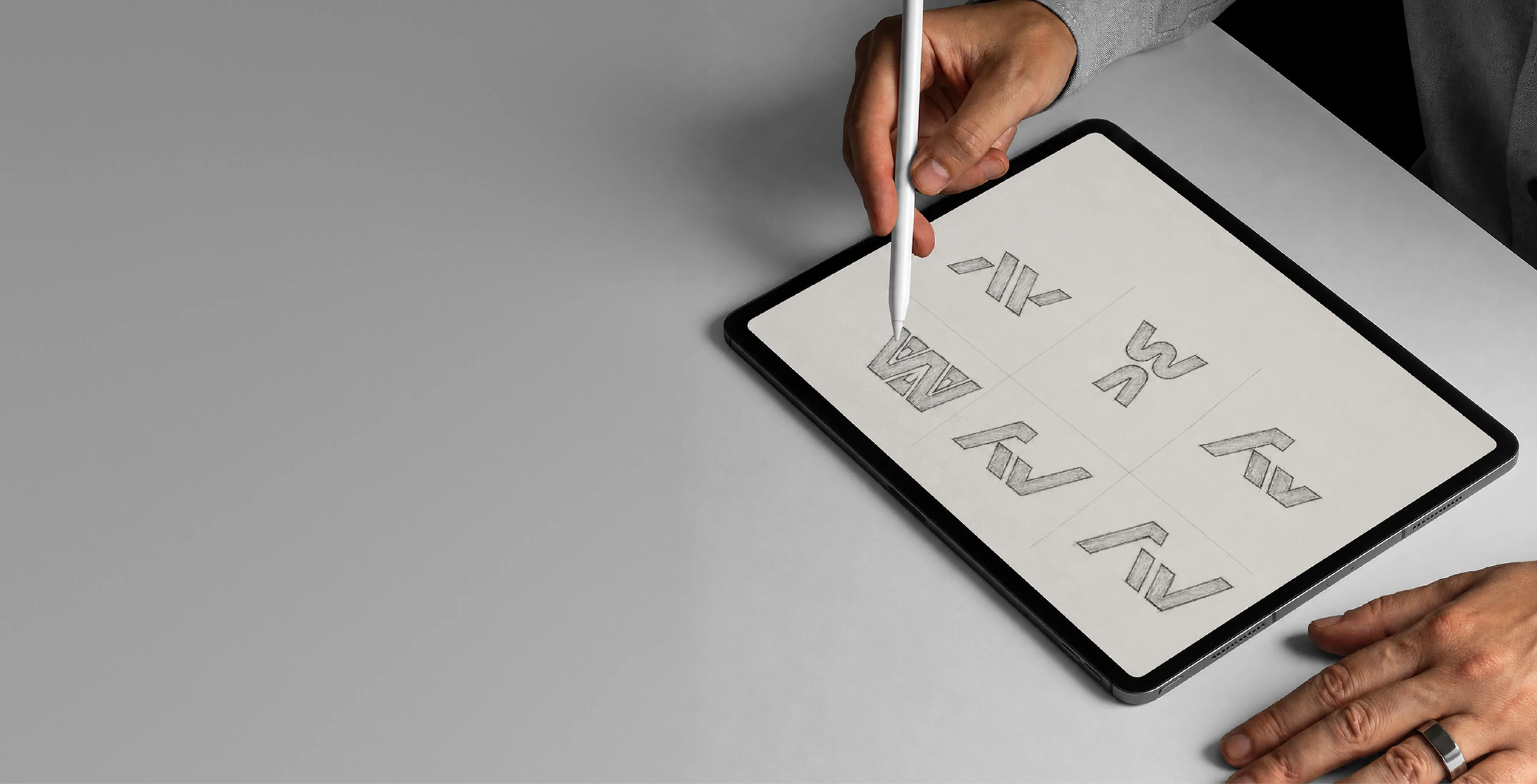
Every mark Brand Vision designs is drawn from scratch for the business it will represent. No templates, no stock symbols, no generated assembly. Work begins with research into the category and the marks already occupying it, moves through broad sketch exploration, and arrives as a small number of strong directions presented with their reasoning. Each concept is tested at favicon size before it is shown. Custom logo design ends with every file, in every format, owned outright by the client.
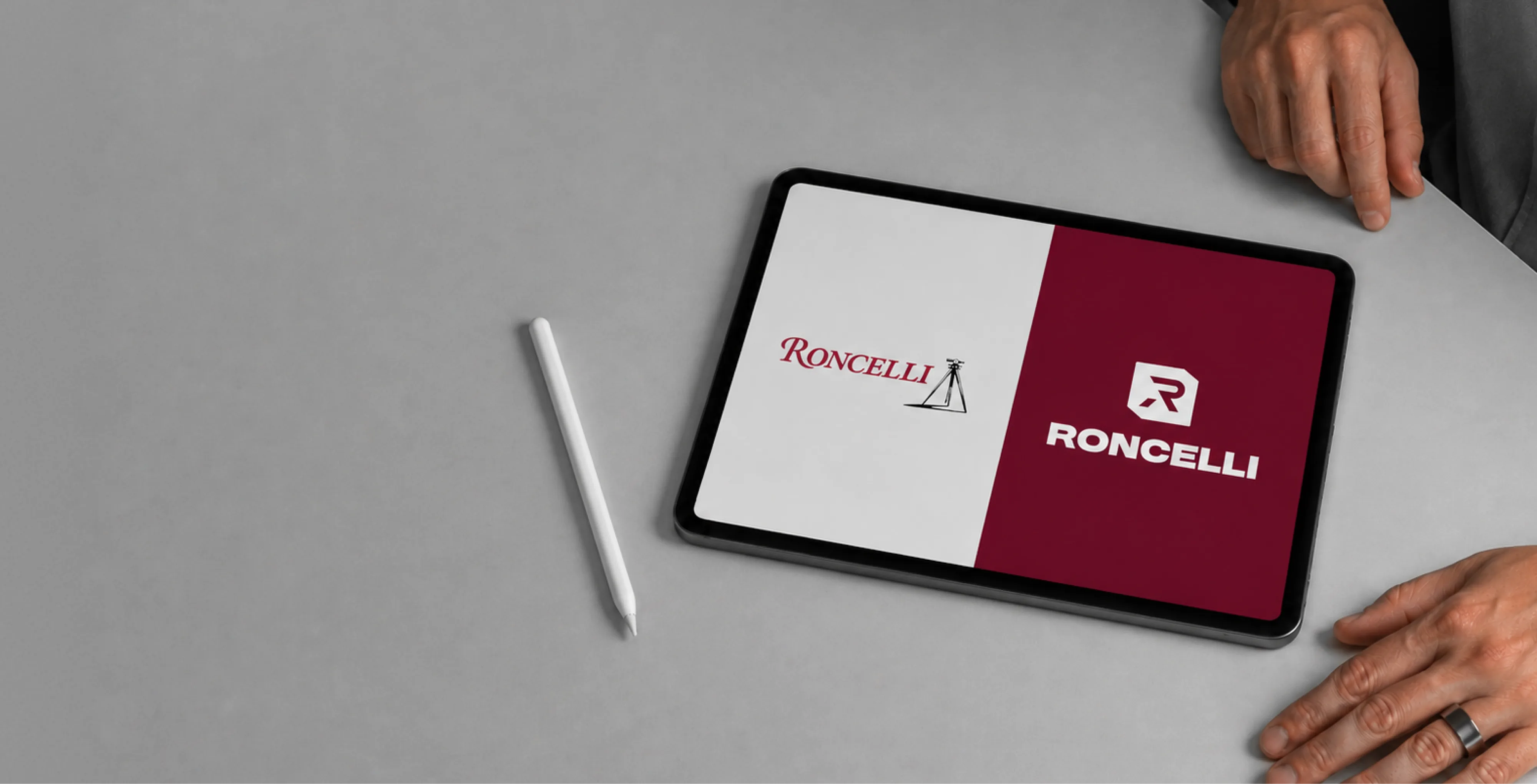
Most redesigns begin with the same discovery, a mark designed for print struggling everywhere the business now appears. Brand Vision modernizes logos without discarding the recognition behind them, simplifying detail, correcting proportions, and rebuilding the files properly so the mark holds from a favicon to a storefront. Every logo redesign is tested beside the old mark at real sizes before anything ships. What customers already know stays. What was holding the mark back does not.
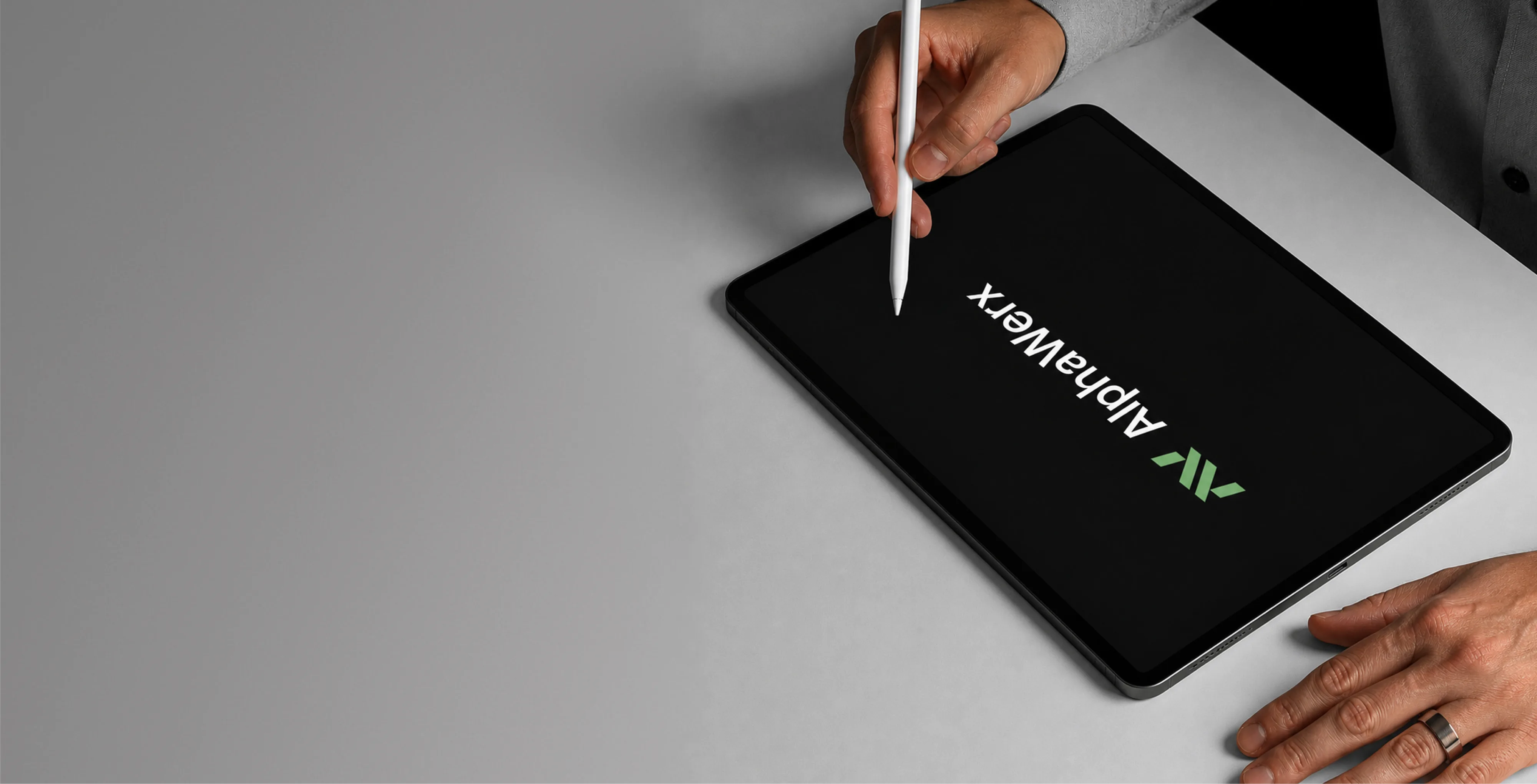
Custom letterform work for businesses whose name should be the mark. Brand Vision designs wordmarks from the letters up rather than from a typeface down, building distinction into the forms themselves so the name cannot be reproduced by simply typing it. Spacing, weight, and detail are resolved at the smallest size the mark will face. The result carries the presence of a symbol with the clarity of simply reading the name.

Some businesses need a logo that works without the name beside it. Brand Vision designs symbols for exactly that, app icons, avatars, favicons, and the places a full logo will not fit. A symbol starts with no meaning and earns it through repetition, so the work concentrates on being distinctive, simple, and impossible to confuse with the category's usual shapes. Each one is delivered as part of a complete lockup system alongside the wordmark it pairs with.
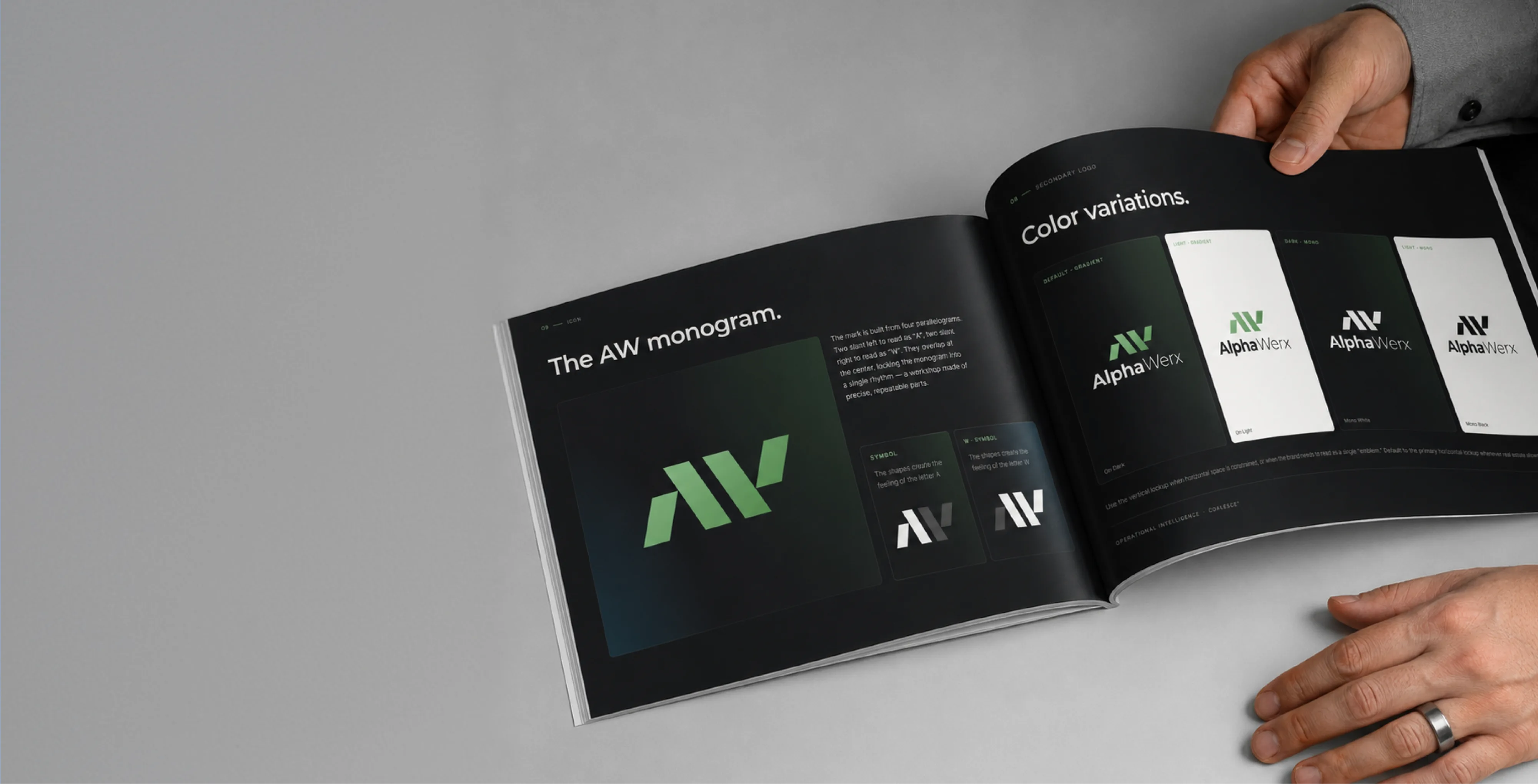
A logo is eventually used by people who were never in the room, printers, partners, sponsors, and whoever builds the next presentation. Brand Vision writes logo guidelines for exactly those hands, covering clear space, minimum sizes, palette values for print and screen, approved lockups, and the misuses that damage a logo fastest. Short enough to be read, specific enough to settle arguments. It is how the work stays sharp for years instead of drifting within one.
From a blank page to a mark you own outright.
Study the category and existing marks, so yours stands apart rather than blends in.
Broad sketching narrows to a few strong directions, each with its reasoning.
The chosen mark refined and tested at every size, down to a favicon.
Every file in every format, owned outright, plus guidelines that keep it consistent.
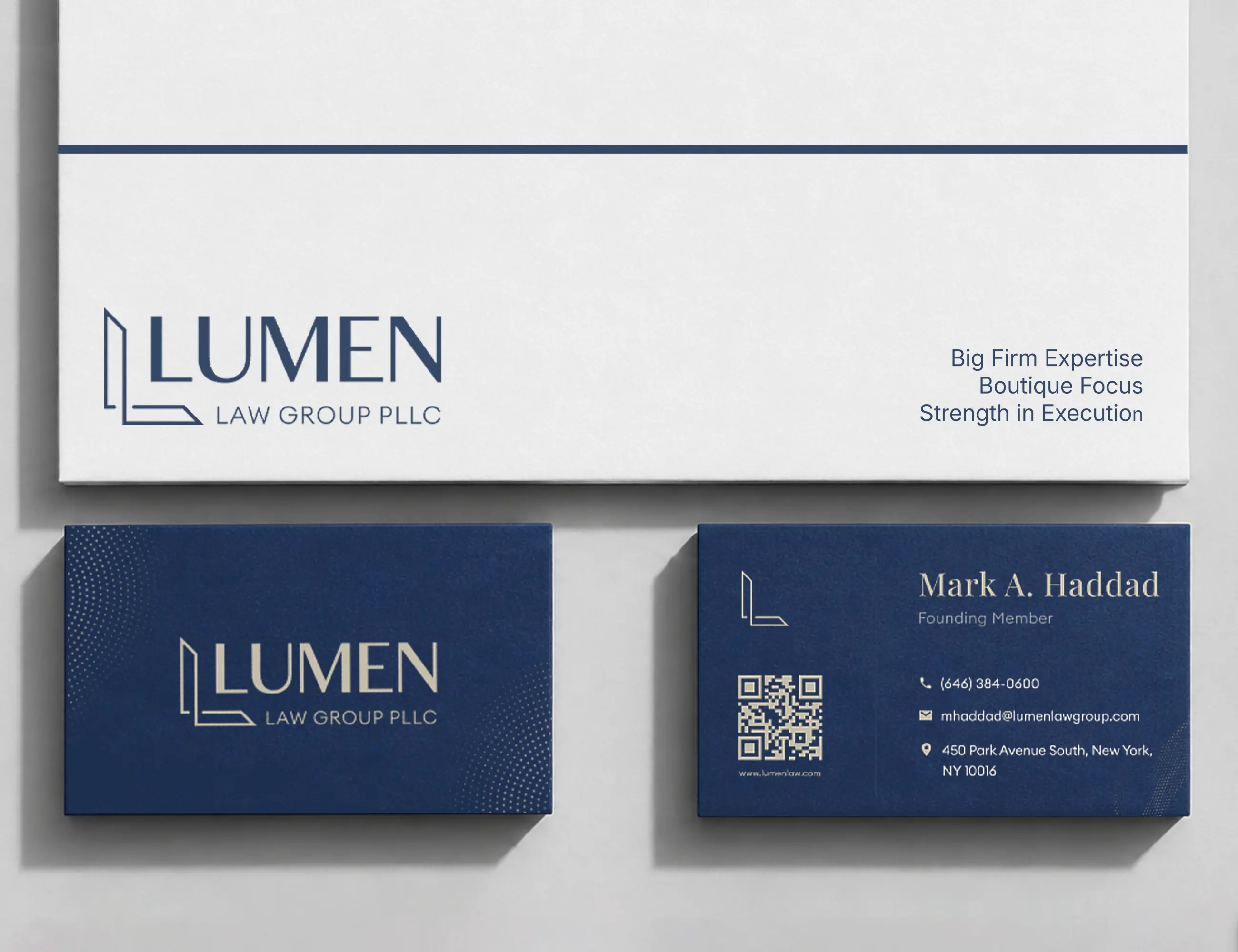
Recent visual identity and logo design work done by Brand Vision for clients in the US and Canada.
What reads as premium in one industry reads as wrong in another. Brand Vision designs logos with the category understood, then deliberately and selectively broken, so a logo belongs to its industry without disappearing into it.
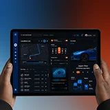









Product depth shouldn’t slow the story down. We partner with SaaS, platform, and enterprise software teams to translate technical capability into focused narratives. Clear paths to demo, trial, or contact serve both buyers and technical evaluators. Systems are built for product-led growth with composable components, editor guardrails, and instrumented analytics that tie directly to pipeline.
Complex services sell on clarity, not volume. We help consulting, financial, and advisory firms structure their digital presence around buyer tasks: understanding capabilities, comparing options, and starting a brief. Every touchpoint earns trust through specificity and proof. Content is organized by audience need, so the people making the hiring decision find answers quickly and move to contact without friction.
Patients and practitioners make high-stakes decisions under pressure. We design trust-first experiences for healthcare and wellness brands, keeping clinical accuracy intact while making it simple for people to find the right provider, service, or next step. Accessibility, privacy-compliant forms, and plain-language content are standard. Local visibility for practices and clinics is built into the foundation, not bolted on later.
Prospective clients searching for legal help are often under pressure and comparing firms quickly. We help law firms present practice areas with credibility, surface the right contact paths, and build a digital presence that earns trust before the first conversation. Clear structure, plain language, attorney profiles, and consultation flows make it easy for people to take the next step with confidence. Ethical advertising compliance is built in from the start.
Buyers, investors, and project owners move on trust and timing. We work with brokerages, developers, general contractors, and property management firms to present listings, projects, and capabilities with clarity. Content is organized around what prospects actually need: proof of work, service scope, location context, and a direct path to inquire. Pre-construction launches and trade portfolios get the same strategic rigor as resale platforms.
Conversion lives in the details. We work with consumer and ecommerce brands to build fast, clear shopping experiences where product pages explain value quickly, checkout flows reduce friction, and the entire system scales with the catalog. Promotional templates, collection architecture, and performance monitoring keep the storefront sharp as demand and inventory shift with seasons. The result is a store your team can run day to day without developer dependency.
Early-stage companies need focus over flash. We help startups define positioning, build a credible identity, and launch a conversion-ready presence that clearly communicates what the product does, who it’s for, and how to get started. Everything is built to scale: component systems, content structures, and analytics foundations grow with the roadmap instead of needing a rebuild at Series A. The pitch and the website tell the same story.
Students, parents, and administrators all need different answers from the same site. We help schools, universities, and training organizations structure digital experiences by task: apply, visit, inquire, enroll. Accessible design and plain-language content serve diverse audiences without alienating any of them. A manageable CMS means internal teams keep program pages, event listings, and admissions information current without outside help or bottlenecks.
Nonprofits compete for attention, funding, and volunteers simultaneously. We build accessible digital experiences that make programs clear, donation paths intuitive, and calls to action specific enough to drive real participation and support. Content governance is designed for lean teams, so pages, campaigns, and impact reports stay current without bottlenecks. The organizations doing the most important work deserve a digital presence that matches their mission.
From restaurants to packaged goods, this industry sells on quality and convenience. We help food and beverage brands connect story with logistics: clear menus, product lines, ordering options, and wholesale paths that make it obvious how to buy and reorder. Identity and digital experience work in tandem so visitors see quality and know exactly what to do next, whether they’re a consumer walking in or a distributor placing a first order.
Audiences decide in seconds. We work with labels, venues, talent agencies, and event companies to build media-rich, performance-optimized experiences where the work is front and center. Booking, inquiry, and ticket paths stay visible and fast across devices. Campaign templates and component systems let teams launch content for new shows, releases, and events without starting from scratch each time. The creative comes first; the infrastructure stays invisible.
Guests research and book across multiple touchpoints. We help hotels, resorts, tourism brands, and event venues present their experience with clarity, connecting visual storytelling with practical booking flows, local discovery, and seasonal content that stays current. The systems we build make it straightforward for teams to update rates, packages, and promotions without depending on a developer for every change. The experience starts online, and it should feel as considered as the stay itself.










Original research and expert perspective on design, branding, and the strategy behind both.
Still have questions? Contact us to discuss.
A logo design agency draws an original mark, proves it works everywhere it will actually appear, and hands over every file you will ever need. Those three things are what separate professional logo design from a picture somebody sent you, and a large share of the marks we are asked to fix fail at the second or the third.
What the work actually involves. Research into the category and the marks already occupying it, so yours stands apart instead of blending in. Broad sketch exploration before anything gets refined. A small number of strong directions presented with the reasoning attached. Then testing at every size the mark will face, down to a favicon, before it is shown to anybody. Then the full file set and the guidelines that keep it consistent.
Why clients choose us for it.
Every mark is drawn from scratch. No templates, no stock symbols, no generated assembly. That takes longer and it is the only way to end up with something you can actually own.
Concepts are tested small before they are presented. A mark that only works at presentation scale is a mark that will fail on a phone, an app icon, and an embroidered shirt. We check that before you see it, not after you approve it.
You own all of it outright. Every file, every format, with the rights transferred. Covered properly further down because it is the question buyers most often forget to ask.
Senior people do the drawing. More than 100 original logos delivered across a decade of design work, and the person sketching is the person presenting. You can see the marks themselves and the people behind them before deciding anything.
The one thing worth saying up front. A logo does not need to explain what the business does. It needs to become the thing people recognize, which is a harder job and a different one, and confusing the two is the most common reason a logo project goes in circles.
Five logo design services, covering a mark's whole life from the first sketch to the guidelines that protect it. Most engagements use three or four of them.
Custom logo design. An original mark drawn for the business it represents. Category research, broad exploration, a small number of resolved directions with their reasoning, testing at favicon size, and delivery of every file owned outright. The exploration is deliberately wide before it narrows, because the first credible direction is rarely the best one available.
Logo redesign. Modernizing a mark without discarding the recognition already built into it. Detail simplified, proportions corrected, and the files rebuilt properly so it holds from a favicon to a storefront. Where the change needed goes past the mark itself, it becomes a rebranding conversation and we will say so.
Wordmark logo design. Custom letterform work for businesses whose name should be the mark. Drawn from the letters up instead of from a typeface down, so the name cannot be reproduced by typing it. Where the name itself is still unsettled, naming comes first.
Brand marks and symbols. For the places a full logo will not fit, meaning app icons, avatars, favicons, and small physical applications. Delivered as part of a complete lockup system alongside the wordmark it pairs with. A symbol drawn for sixteen pixels is a different drawing from the same symbol at two hundred, and both get made.
Logo guidelines. Clear space, minimum sizes, palette values for print and screen, approved lockups, and the misuses that damage a mark fastest. Short enough to be read and specific enough to settle arguments. Written so a printer or a new hire can follow them without a designer sitting beside them.
Most projects use a combination instead of one item. A young business with a settled name usually takes custom design plus guidelines. An established business with recognition to protect usually takes the redesign and nothing else. A business whose name is the whole story takes the letterform work and a symbol for the small spaces. The mix gets decided after we look at where the mark actually has to appear, and not from a menu.
Where a logo is one part of something larger, meaning a full identity system with typography, palette, imagery direction, and layout rules, or the collateral and templates a business runs on daily, that is scoped as brand work instead. A logo on its own solves less than most people expect, and we would rather tell you that before you buy one.
Distinctive, simple, scalable, appropriate, and ownable, in that order of difficulty. Everything else people argue about in a logo review is preference dressed as principle.
What each of those actually means.
Distinctive. Different enough from the marks already in your category that somebody could pick it out of a lineup. Most logo briefs ask for the opposite without realizing it, since the reference images clients bring are almost always competitors. A mark that looks like the category is a mark nobody remembers.
Simple. Reducible to its essential shape and still recognizable. The test is whether you could describe it over the phone, or draw it badly from memory and still have it read. Detail is what fails first at small sizes, and a mark carrying more than a handful of distinct shapes is usually carrying decoration somebody was reluctant to remove.
Scalable. Works at sixteen pixels and on a building. Sixteen pixels is roughly the height of a lowercase letter in a line of body copy, which is the honest scale a favicon has to survive. That means no hairline strokes, no gradients that muddy in one colour, no tight counters that fill in, and no drop shadows.
Appropriate. Belonging to its industry without disappearing into it. What reads as premium in one category reads as wrong in another, so we establish the conventions across the industry and then break them deliberately and selectively.
Ownable. Original enough to defend, which is a legal question as much as a creative one and gets its own answer further down.
What a good logo does not have to do. Explain the business, illustrate the product, contain the industry's obvious symbol, or mean something on day one. Symbols start with no meaning and earn it through repetition. The most recognizable marks in the world are arbitrary shapes that became meaningful because people saw them ten thousand times.
Which is why we do not judge a mark on whether it communicates the strategy. We judge it on whether it is distinctive, holds up small, and can carry meaning once it has been used for a year. The strategy belongs in the positioning and messaging, and the category research is what tells us where the space actually is.
Six shapes, and the right one depends on your name, your category, and where the mark will be seen most. Most businesses end up with a combination, and the decision is more practical than aesthetic.
Wordmark. The name itself, drawn as the logo. Right when the name is distinctive, reasonably short, and worth building recognition around directly. It is the most efficient choice for a young business, because every use builds name recognition and mark recognition at once. Custom letterform work matters here, since a name set in a stock typeface can be reproduced by anybody with the same font, and where the name itself is still in play that decision comes first.
Lettermark or monogram. Initials, used when the full name is long or awkward. Works well in small applications and needs care, because two or three letters in a box is the most crowded space in logo design.
Pictorial mark. A recognizable object, simplified. Immediate to understand and risky, because a literal symbol can date quickly or lock a business into what it did at the start.
Abstract mark. A geometric or organic form with no literal reference. Maximum flexibility and maximum patience required, since it means nothing until repetition gives it meaning. The right choice for businesses that will outgrow a literal description.
Emblem. Type contained inside a shape, like a crest or a badge. Strong presence and traditional authority, and the weakest at small sizes, which makes it a harder choice than it used to be.
Combination mark. A symbol and a wordmark designed to work together and apart. This is what most businesses actually need, delivered as a lockup system with horizontal and stacked arrangements, plus a standalone symbol for the places a full lockup will not fit. It is also the shape that extends most easily into everything that comes after it, which is why it appears in most of our brand engagements.
How we decide. Where the mark will appear most, whether it needs to work without the name beside it, how long the name is, what the category already looks like, and whether you have the patience and the exposure for an abstract mark to earn its meaning. Then it gets built as a system instead of a single file, since a lockup that works in one arrangement and fails in another is half a job.
A focused logo project runs three to five weeks. A logo as part of a full identity system runs six to ten. Logo design cost scales with the same variables as the timeline, so the two are worth answering together. Cost scales with how much exploration and how many applications are in scope, and a logo on its own is the smallest branding engagement we take.
What drives the timeline and the number.
What we will tell you plainly. A logo on its own frequently is not what a business needs, and buying one when the actual problem is positioning means paying twice. Where that is the situation, a scoped consultation is a cheaper way to find out than a design project. And if you are working to a launch date, say so on the first call and you will get a straight read on whether that date and that scope can coexist.
The other honest note is about the bottom of the market. There are marketplaces and generators producing a mark for very little, and they are covered properly further down, because the comparison is not really about price.
Ideas come in batches, we discuss them together, and we keep going until the mark is right. There is no revision limit.
Why there is no cap. The moment a contract says three rounds, the conversation changes. A client starts rationing feedback, saving a round in case something worse comes up later, and quietly not mentioning the thing that actually bothers them. That is how a mark gets approved that nobody in the room really likes. Removing the ceiling removes the arithmetic from the discussion, so you can explore an idea properly, say plainly what is not working, and change your mind about a direction you liked last week.
How the batches actually work. We present a set of directions with the thinking behind each one. That is a conversation and not a verdict, and it usually reveals something neither side knew at the brief stage. What we learn shapes the next batch, which is either new territory or a deeper pass on the direction that resonated.
What keeps an uncapped project from drifting. A settled position before design starts, because a project looping on taste is almost always a project with an unresolved strategy underneath it. One person with the authority to decide, since a mark relayed through an intermediary comes back as a list of individually reasonable requests that collectively ruin it. And feedback that names the problem instead of prescribing the fix. Those three do the job a revision limit pretends to do, without making you count.
You will not be shown thirty options, because volume is a symptom of a designer who has not decided anything, and it moves the work of judgment onto you. Behind each batch there are usually sixty or eighty sketches. You see the ones that survived, with an explanation of why.
How the four stages run.
Research. The category, the competitors, and the marks already occupying the space, so we know what to avoid as much as what to aim at.
Explore. Broad sketching, deliberately wide, then narrowed to the directions with genuine potential. This is the stage that decides the outcome and the one clients see least of.
Refine. The chosen direction resolved properly. Optical adjustments, spacing, weight, the lockup system, and testing at every size down to a favicon.
Deliver and protect. Every file, plus the guidelines that keep it consistent once people who were never in the room start using it.
Where a disagreement turns out to be about what the business stands for, that is a positioning conversation. We will pause and have it instead of designing through it, which is frequently the moment a wider consultation earns its place.
You own it outright, transferred on completion, and you receive every format you will ever be asked for. The second part matters more than people expect, because the file you do not have is always the one a supplier needs on a Friday afternoon.
What the delivery actually contains.
Vector master files. The original artwork in an editable vector format, which is the source everything else comes from. Without this you do not really have a logo, you have pictures of one.
Print-ready vectors. EPS and PDF, with type converted to outlines so nothing depends on a font being installed.
Screen files. SVG for the web, plus PNG at multiple sizes with transparent backgrounds.
Every lockup. Horizontal, stacked, symbol on its own, and any secondary arrangement, each as its own file instead of one file you are expected to crop.
Colour variants. Full colour, one colour black, one colour white, and reversed versions for dark backgrounds. Plus values specified in CMYK, RGB, HEX, and Pantone, so what a printer produces matches what the screen shows.
Favicon and app icon files at the required sizes, drawn as their own thing instead of a shrunken logo, since a mark that works at 200 pixels usually needs simplifying at 32.
A single-line or engraving version where the mark will be etched, embossed, embroidered, or cut in vinyl. Almost nobody asks for this until a supplier does, and then it becomes urgent.
On ownership. Rights transfer to you on completion, in writing, including for the final mark and the lockup system. Two exceptions apply, and both are stated in the agreement where you can see them. Unselected concepts remain ours, and any licensed typeface used alongside the mark carries its own terms, which we itemize so you know exactly what you hold and what you are licensing. That distinction matters and it is covered again in the trademark answer.
The files should also arrive organized, named sensibly, and with a short guide to which one to send where. That is part of the guidelines and collateral work, and it is what makes a logo usable by whoever builds your website or your next presentation.
Keep the recognition and fix what is holding it back, which is a different project from replacing it. Most businesses that ask us for a new logo need a careful redesign, and telling them so costs us the larger fee.
When a redesign is the right call. The mark was drawn for print and struggles everywhere the business now appears. It has too much detail to survive a favicon. The files are a mess, or nobody can find the vector. Proportions or spacing were never properly resolved. Or the business has outgrown a literal symbol that describes what it did at the start.
When to leave it alone. People recognize it and associate it with you. It works small. The problem you are actually trying to solve is that your website is dated or your messaging is unclear, both of which the logo will not fix. We audit that honestly, and a fair share of the time the answer is that the mark is fine.
When it needs to go further than the mark. If the position has changed, the audience has changed, or the name no longer fits, a new logo alone will not carry that. That is a rebrand and it should be scoped as one.
How we handle the equity question. First we separate what carries genuine recognition from what is merely familiar. A colour the market associates with you, a shape people can draw, a proportion they would notice changing. Those get protected. Then detail gets simplified, proportions corrected, and the files rebuilt so the mark holds from a favicon to a storefront. Every redesign gets tested beside the old mark at real sizes, on real applications, before anything ships, because a comparison at presentation scale tells you nothing about what a customer will see.
Then the rollout gets sequenced instead of announced. Internal first, then the highest-visibility touchpoints, then the long tail. And if a site rebuild is happening in the same year, the two should be planned together, because launching a new mark on an old site undercuts both.
Nothing stops you, and the reason not to is ownership instead of quality, which is the opposite of what most people assume. The output from a good generator often looks fine. What you may not have is anything you can protect or build on.
On AI generators. Three problems, in order of how much they cost you. First, ownership is genuinely uncertain. Copyright protection generally requires human authorship, and material produced entirely by a generator sits outside that in several jurisdictions, which means you may not hold the rights you assume you hold. Second, these tools produce recombinations of what already exists, so the risk of arriving at something close to an existing mark is real and the tool will not tell you. Third, you get an image and not a system. No lockups, no small-size version, no one-colour variant, no engraving file, and frequently no proper vector master.
On design marketplaces and contests. Cheap, fast, and carrying a specific risk, which is that you are relying on somebody you have never met to have drawn the work themselves. Submissions taken from stock libraries or lifted from other marks do happen, and the liability lands on the business using the logo. Assignment of rights is also frequently informal or absent, which becomes a problem at exactly the wrong moment, meaning a funding round or a sale.
On cheap freelance work generally. Some of it is excellent. What it usually lacks is the category research, the small-size testing, and the file discipline, which is why so many of the marks we are asked to fix came from there and looked fine in the presentation.
Where the cheap route is genuinely reasonable. A side project, a pre-launch placeholder, something testing an idea you may abandon. Spending real money on a mark for a business that might not exist in six months is not prudence, it is procrastination, and we will say so.
Where it stops being reasonable. The moment you intend to register a trademark, raise money, sell through retail, or build recognition you want to keep. At that point ownership and originality stop being abstractions. This is a conversation we have with early-stage founders regularly, and the honest framing is that the cost of redoing it later is several times the cost of doing it once. You can see what the difference looks like in the work.
Usually yes, and the checking should happen before the design is final instead of after, because a mark you cannot register is a mark you cannot fully own. We build screening into the process for that reason.
What actually matters.
Distinctiveness. Descriptive and generic elements are weak. A logo built around a literal picture of what you sell, or a common industry symbol from your category, is harder to protect and easier for a competitor to work around. Distinctive marks are both better design and better assets, which is a rare case of those two things pointing the same way.
The difference between a word mark and a design mark. Registering the name as text protects it in any typeface. Registering the logo protects that specific visual treatment. They are separate registrations covering different things, and most businesses eventually want both. Which one you file first is a real strategic decision.
Classes and jurisdictions. Registration is granted for specific classes of goods and services and in specific countries. Clearance needs to cover the classes you operate in and the markets you sell into, which is wider than the home market on almost every project.
Existing use, and not registrations alone. Unregistered marks in active use can still create a conflict. A search that only checks registers is an incomplete search.
Font licensing, which catches people out. Many commercial typeface licences restrict or prohibit use in a logo or trademark, or require an extended licence for it. This is a genuine and widely ignored problem, and it is one of the reasons custom letterform work is worth it for a wordmark. We convert type to outlines in the final artwork and we itemize any licence that applies, so you know what you own and what you are renting.
Timing. Screening early costs a fraction of discovering a conflict eighteen months in, when changing a mark means new signage, new packaging, new everything, and explaining it to customers.
How we work it. We check exact and close matches, common-law use, and adjacent categories during exploration, so a direction with an obvious problem gets dropped before you see it. We prepare the artwork and documentation your trademark counsel needs, which means their time goes on the legal question instead of on catching up. To be clear about scope, we are not lawyers. Clearance opinions and filing belong with a trademark professional, and we will tell you when it is time to involve one. If you want to talk through where you stand before starting, get in touch.
That is what the refinement stage is for, and it is the part of logo design that separates a mark from a picture. A logo lives in more places than any other piece of design a business owns, and most of those places are hostile.
What gets tested and what each constraint demands.
The outcome of all that is not one logo. It is a small system, with variants drawn for the conditions they will actually meet, plus rules about which to use where. That is what makes the mark survive contact with the build, your product interface, and whoever your printer is.
A logo on its own drifts, and guidelines are what stop it. Within a year of delivery the mark is being used by printers, partners, sponsors, a new hire, and whoever builds the next presentation, and none of them were in the room when it was designed.
What logo guidelines cover. Clear space and minimum sizes. Which lockup to use in which situation. Colour values for print and screen, including the one-colour and reversed rules. What to do on photography and busy backgrounds. And the misuses that damage a mark fastest, which is stretching it, recolouring it, adding effects, boxing it, or rebuilding the lockup by hand.
The specification we hold ourselves to is short enough to be read and specific enough to settle an argument. A fifty-page document nobody opens protects nothing.
Where a logo genuinely is not enough, and this is the honest part. A mark answers what you look like at the top of a page. It does not answer what your typography is, how photography should feel, what the layout system is, what the voice sounds like, or how any of it behaves across a website, a deck, a sign, and a social post. Businesses that buy a logo and stop usually come back within eighteen months, because the first time three people produce material independently the brand stops looking like one thing.
So the honest sequence looks like this. If you need a mark now and can only fund that, take the logo and the guidelines, and make sure the files and rights are complete so nothing has to be redone. When you are ready, the full identity system extends it into typography, palette, imagery, and layout, and the wider practice settles the position and messaging underneath all of it.
The one thing we will push back on is buying a logo to solve a problem it cannot solve. If the real issue is that nobody understands what you do, a new mark will make that confusion better looking. Say what the actual problem is on the first call and you will get a straight recommendation, including one that is smaller than what you asked for.

Our goal is to nurture your vision and provide innovative, custom solutions for all your marketing needs.


%2520(1).png)
.png)
