


.webp)










Branding
B2B Branding Strategy: Positioning, Proof and Buying-Committee Trust
Sep 6, 2026
/ By Hamoun Ani
Brand Vision is an award-winning UI/UX design agency that turns complex interfaces into experiences people move through without thinking.
Most digital products do not fall short because they lack features. They fall short because the experience asks too much of the user. As a UI UX design agency, Brand Vision uses research, testing, information architecture, interaction design, and interface design to make complex journeys easier to understand and complete. The result is a digital experience that feels clear, useful, and considered across every screen, state, and step.

Building real partnerships with top global brands. Delivering results that last well beyond the launch.










Our UI UX design agency applies strategy, design and testing to websites, platforms, and applications that need to be easier to use and more effective.

Strong UX design begins with evidence. Brand Vision uses interviews, usability testing, surveys, analytics, and usage analysis to understand what users are trying to accomplish, where they hesitate, and what information they need to move forward. Our UX research services turn those findings into practical design priorities, giving the structure, content, and interface decisions that follow a clear reason to exist.
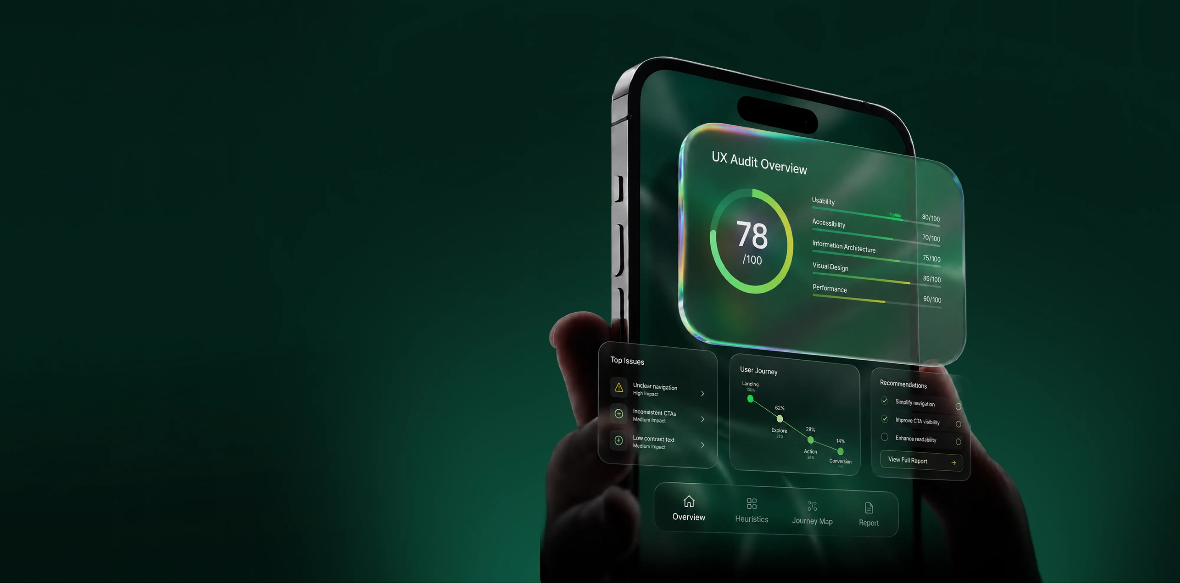
A UX audit identifies where an existing experience creates unnecessary effort, confusion, or abandonment. Brand Vision reviews user journeys, navigation, content hierarchy, interface patterns, accessibility, and available performance data to uncover what is getting in the way. Our UX audit services provide a prioritized set of findings and recommendations, helping teams focus on the changes most likely to improve usability, conversion, and customer satisfaction.
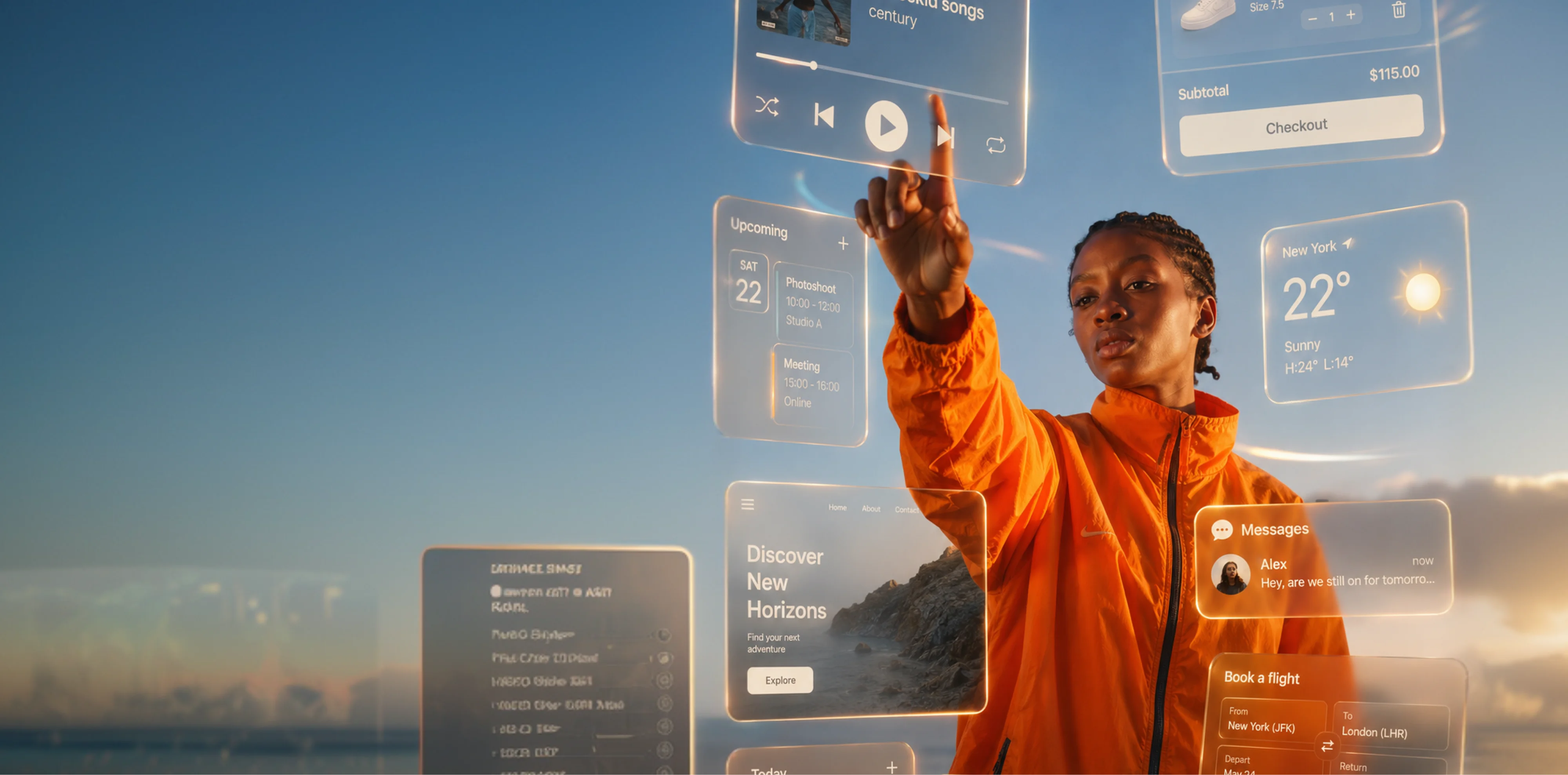
Interaction design defines how an interface responds as a person moves through it. We design states, transitions, feedback, controls, and micro-interactions that make actions easier to understand and outcomes easier to predict. As part of our UI UX design services, each interaction is considered within the wider user journey so the product feels responsive, consistent, and clear from intent to completion.
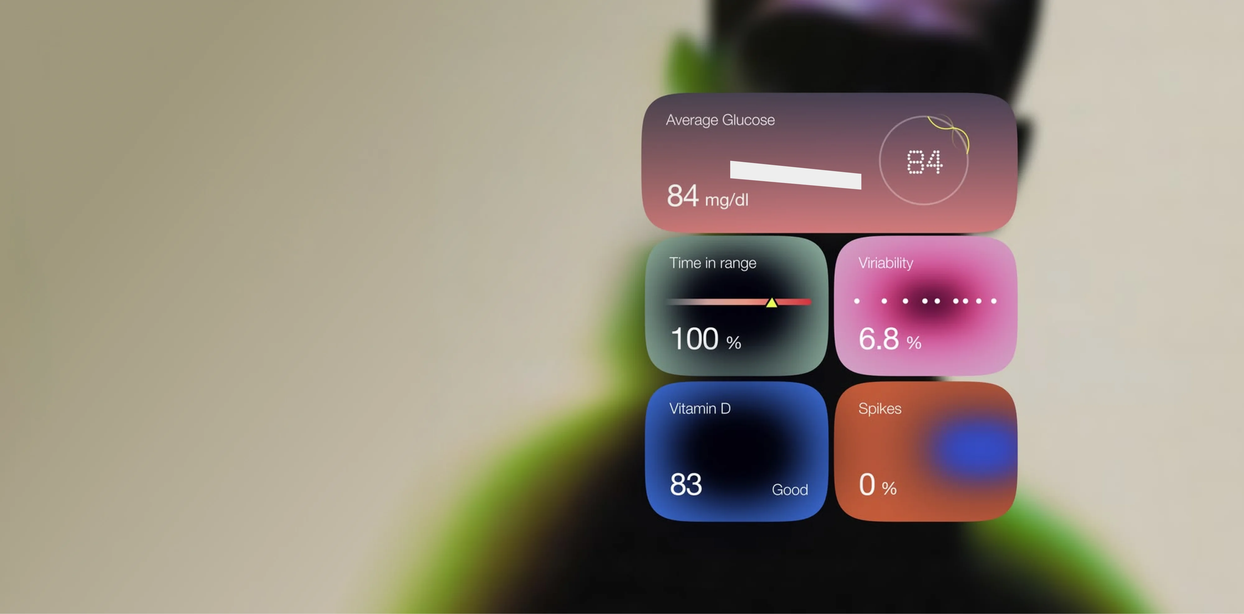
UI design gives structure and visual form to the experience. Brand Vision uses layout, typography, palette, spacing, components, and interface states to establish hierarchy and make each action easier to recognize. As a UI UX design agency, we ensure the visual system supports the underlying user experience, creating interfaces that are distinctive enough to represent the brand and disciplined enough to remain easy to use.
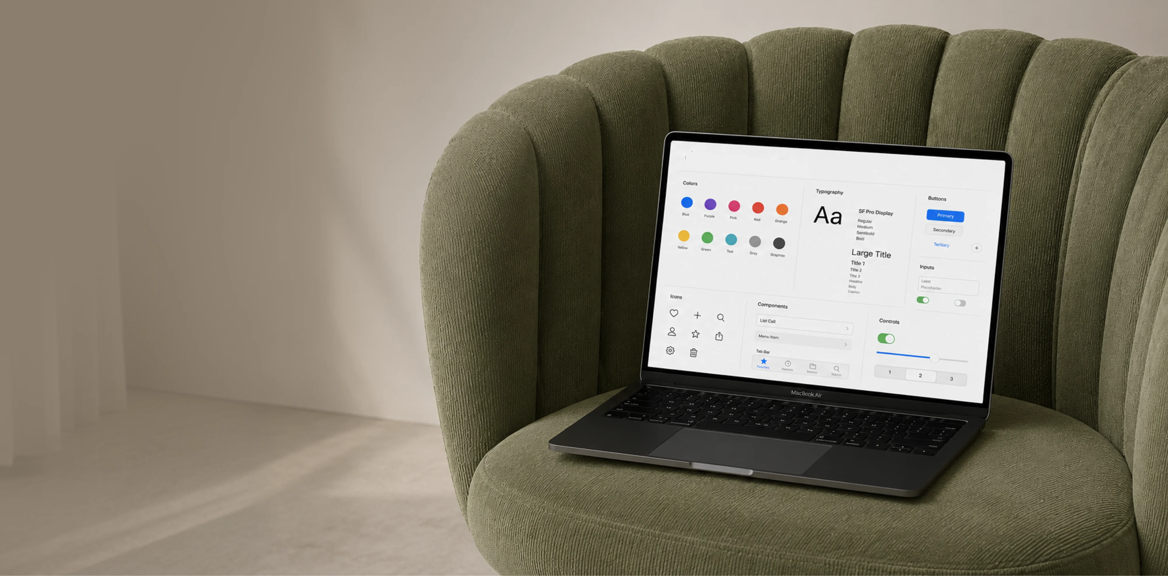
A design system gives growing digital products a consistent foundation. Brand Vision creates reusable components, patterns, design tokens, documentation, and governance standards that help design and development teams make faster decisions without fragmenting the experience. Our design system work improves consistency across screens, products, and teams while giving the interface enough flexibility to evolve as new features and requirements are introduced.
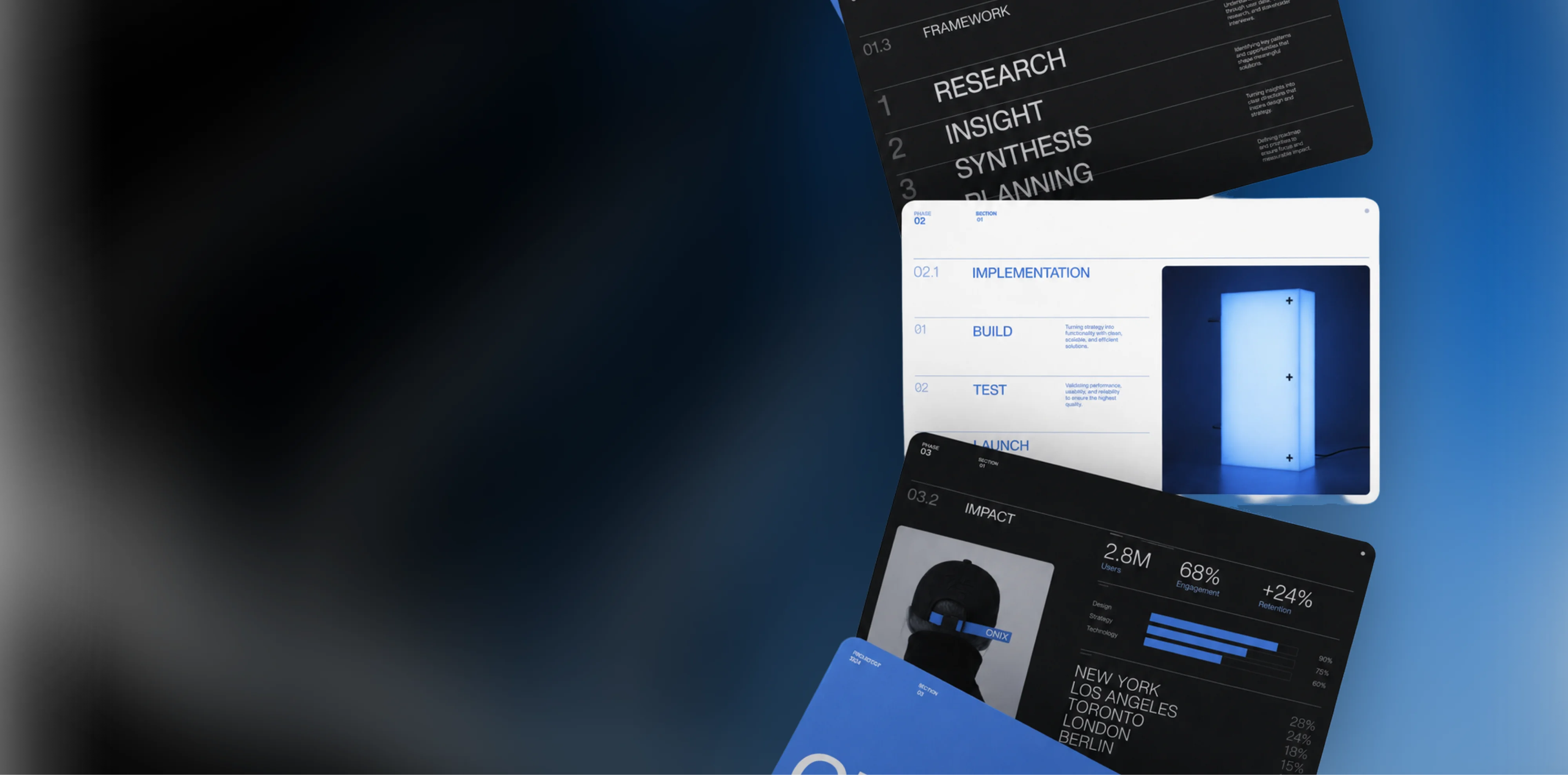
Wireframes and prototypes make ideas testable before development begins. Brand Vision uses them to explore structure, content priority, user flows, interactions, and responsive layouts, then places realistic experiences in front of users and stakeholders early. As a UI UX design company grounded in testing, we resolve important questions before they become expensive code changes and give development teams a clearer reference for implementation.

Mobile app design has to reflect how people actually use their phones: quickly, one-handed, and often with limited attention. Brand Vision designs mobile experiences around focused tasks, clear navigation, accessible controls, and familiar interaction patterns, keeping important actions within reach. Our mobile app design services create products that feel fast and intuitive while giving the brand a distinctive presence on the most personal screen a user owns.
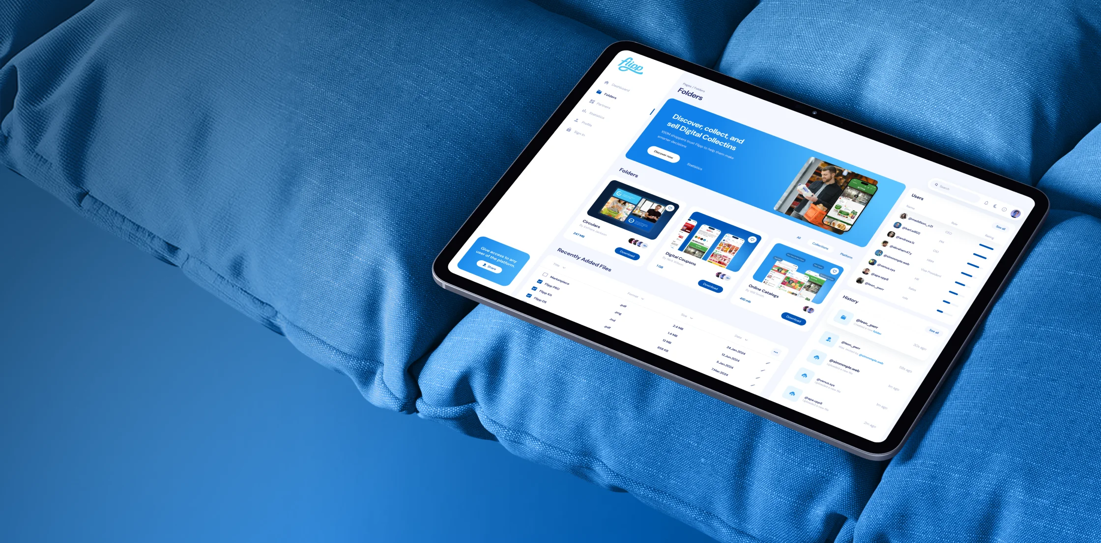
SaaS product design has to make complex functionality feel manageable without hiding the power experienced users depend on. Brand Vision maps roles, workflows, onboarding, dashboards, and recurring tasks, then designs the interface around how people learn and use the product over time. As a UX design agency with product design expertise, we focus on the moments that drive activation, adoption, retention, and long-term value.
A structured process grounded in research and testing, so every design decision is backed by evidence rather than opinion.
We align on goals, dig into the research and analytics, and talk to the real users or front-line teams who live with the product. That becomes a short, sharp brief everyone can design against.
We build the flows, wireframes, and interface patterns, then test them in context before they harden into decisions. A documented system keeps everything consistent as the product scales past the core team.
We put the design in front of real users and watch where they hesitate, then refine around what actually happens instead of what we assumed. The hard calls get proven on screen before they reach development and get expensive to change.
We hand off organized Figma files, specs, and assets ready for development, then stay close through QA, analytics, and handoff so nothing is lost between design and build.
A selection of research, interface, and product design work, each shaped around a real usability challenge.
How people expect to use a healthcare tool is different from a fintech dashboard or a retail app. We shape research, structure, and interface around the expectations already built into each industry.
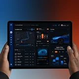











Product depth shouldn’t slow the story down. We partner with SaaS, platform, and enterprise software teams to translate technical capability into focused narratives. Clear paths to demo, trial, or contact serve both buyers and technical evaluators. Systems are built for product-led growth with composable components, editor guardrails, and instrumented analytics that tie directly to pipeline.
Complex services sell on clarity, not volume. We help consulting, financial, and advisory firms structure their digital presence around buyer tasks: understanding capabilities, comparing options, and starting a brief. Every touchpoint earns trust through specificity and proof. Content is organized by audience need, so the people making the hiring decision find answers quickly and move to contact without friction.
Patients and practitioners make high-stakes decisions under pressure. We design trust-first experiences for healthcare and wellness brands, keeping clinical accuracy intact while making it simple for people to find the right provider, service, or next step. Accessibility, privacy-compliant forms, and plain-language content are standard. Local visibility for practices and clinics is built into the foundation, not bolted on later.
Prospective clients searching for legal help are often under pressure and comparing firms quickly. We help law firms present practice areas with credibility, surface the right contact paths, and build a digital presence that earns trust before the first conversation. Clear structure, plain language, attorney profiles, and consultation flows make it easy for people to take the next step with confidence. Ethical advertising compliance is built in from the start.
Buyers, investors, and project owners move on trust and timing. We work with brokerages, developers, general contractors, and property management firms to present listings, projects, and capabilities with clarity. Content is organized around what prospects actually need: proof of work, service scope, location context, and a direct path to inquire. Pre-construction launches and trade portfolios get the same strategic rigor as resale platforms.
Conversion lives in the details. We work with consumer and ecommerce brands to build fast, clear shopping experiences where product pages explain value quickly, checkout flows reduce friction, and the entire system scales with the catalog. Promotional templates, collection architecture, and performance monitoring keep the storefront sharp as demand and inventory shift with seasons. The result is a store your team can run day to day without developer dependency.
Early-stage companies need focus over flash. We help startups define positioning, build a credible identity, and launch a conversion-ready presence that clearly communicates what the product does, who it’s for, and how to get started. Everything is built to scale: component systems, content structures, and analytics foundations grow with the roadmap instead of needing a rebuild at Series A. The pitch and the website tell the same story.
Students, parents, and administrators all need different answers from the same site. We help schools, universities, and training organizations structure digital experiences by task: apply, visit, inquire, enroll. Accessible design and plain-language content serve diverse audiences without alienating any of them. A manageable CMS means internal teams keep program pages, event listings, and admissions information current without outside help or bottlenecks.
Nonprofits compete for attention, funding, and volunteers simultaneously. We build accessible digital experiences that make programs clear, donation paths intuitive, and calls to action specific enough to drive real participation and support. Content governance is designed for lean teams, so pages, campaigns, and impact reports stay current without bottlenecks. The organizations doing the most important work deserve a digital presence that matches their mission.
From restaurants to packaged goods, this industry sells on quality and convenience. We help food and beverage brands connect story with logistics: clear menus, product lines, ordering options, and wholesale paths that make it obvious how to buy and reorder. Identity and digital experience work in tandem so visitors see quality and know exactly what to do next, whether they’re a consumer walking in or a distributor placing a first order.
Audiences decide in seconds. We work with labels, venues, talent agencies, and event companies to build media-rich, performance-optimized experiences where the work is front and center. Booking, inquiry, and ticket paths stay visible and fast across devices. Campaign templates and component systems let teams launch content for new shows, releases, and events without starting from scratch each time. The creative comes first; the infrastructure stays invisible.
Guests research and book across multiple touchpoints. We help hotels, resorts, tourism brands, and event venues present their experience with clarity, connecting visual storytelling with practical booking flows, local discovery, and seasonal content that stays current. The systems we build make it straightforward for teams to update rates, packages, and promotions without depending on a developer for every change. The experience starts online, and it should feel as considered as the stay itself.














Original research and expert perspective on design, branding, and the strategy behind both.
Still have questions? Contact us to discuss.
A UI and UX agency is hired to make a piece of software easier to use and better at producing the result the business needs from it. Evidence comes first and drawing comes second, which is the part that separates the practice from styling.
Five activities make up the work, and most engagements use four of them.
What separates this from web design is the object being designed. Most of a website is material somebody reads once and leaves. A product is a tool the same person opens on a Monday and again on a Thursday for the next two years, so a two-second hesitation multiplies by frequency and by headcount until it surfaces as a support queue and a renewal conversation. That inverts what good means. An unfamiliar layout can win attention on a campaign page and it taxes a tool somebody uses every day, which is why software companies get judged on how fast a stranger recognizes the pattern.
The honest case against buying any of it. A five-page marketing site does not need a research program. Where the real problem is that nobody has heard of you, or that the homepage never says plainly what you sell, a usability engagement spends money in the wrong lane and the rest of the studio has a cheaper answer. This work earns its fee when people already reach your product and fail inside it, when money moves through a flow, or when a team is producing screens faster than anybody is deciding what those screens should do.
Brand Vision is an award-winning design agency headquartered in Toronto since 2018, with three more staffed offices, one in Chicago, one in San Francisco and one in Miami, four Awwwards and a Webby to its name, and RGD and CGD certification behind its practitioners. None of that is a reason to hire anybody for interface work, so here is what should actually decide this purchase.
One team holds the brand and the interface. The type scale, the palette, the spacing rhythm and the motion language get set once and then used inside the application by the people who set them. The usual alternative is an identity from one studio, a website from a second and a product from two in-house designers, which produces three defensible visual languages and a customer who cannot tell they belong to one company. Your product should not read as the output of some other business that happens to share your logo.
Recommendations arrive with what they came from. A session recording, a step in a funnel, an interview, or a named usability principle. Where there is no evidence behind a call, it gets labelled a judgment call in the document instead of dressed as a finding.
Success is defined on a named flow before work starts. Task completion, drop-off at a specific step, or leads and revenue where the journey is commercial. Never impressions, and never a satisfaction score with nothing attached to it.
We scope down more often than up. Plenty of products need one journey rebuilt and a pass over the conditions their existing components can occupy, and nothing more this year. That answer costs us revenue in the quarter and it is the reason clients come back.
The honest ceiling. If your product ships weekly and design questions arrive hourly, you do not want an agency. You want a full-time embedded product designer who sits in your standups, argues in your channels and owns a backlog, and you should hire that person instead of retaining us. An agency is good at concentrated work with a shape to it, meaning a research program, one journey rebuilt, a design system, a launch. It is structurally worse than a salaried designer at being reachable for a decision that cannot wait. Where you sit between those two states, say so early and you will get a straight read instead of a retainer proposal.
Most of this is checkable without talking to us. The people who would be on your file are named, the Toronto practice is where the senior seats sit, and the people we hire are recruited against the same standard the client work is held to.
UX is the structure. UI is the surface. UX decides what happens and in what order, UI decides what it looks like and how it responds when you touch it. They get written as one phrase because they fail separately.
UX, user experience, is the logic of how someone gets something done. What steps exist, in what sequence, what information appears when, what happens when a person makes a mistake, and what they see when there's nothing there yet. It's mostly invisible when it's right. Nobody compliments a checkout that worked.
UI, user interface, is the layer people actually touch. Layout, typography, colour, spacing, iconography, the states a button moves through, and the feedback that confirms something happened. It's what makes an experience feel considered instead of assembled.
Here's why the split matters commercially. A beautiful interface cannot rescue a confusing flow, and people blame themselves before they blame the design, so they leave without telling you. A logical flow rendered carelessly never earns enough trust for anyone to get far enough to use it. Both failures look like "the product isn't working" in a dashboard, and they need opposite fixes.
There's also a commercial reason the two get bought as one thing and then quietly bought as one of them. UX work produces flows, findings and a rationale, which a client expecting pictures reads as thin. UI work produces screens, and screens look like value even when nothing underneath them was ever questioned. So the common purchase is UI wearing a UX label, and the product comes back handsome and unchanged.
Which is why we treat them as one discipline. Evidence about real use shapes the structure, the structure shapes the interface, and the interface gets tested against real behaviour instead of approved on a slide. The surface never fights the structure underneath it.
One boundary worth drawing, because both get confused with it. Neither of them is graphic design, which resolves a composition once and leaves it resolved. An interface has to keep working while data arrives late, while the same label runs longer in French than in English on a bilingual product, and while somebody presses a control twice because nothing told them the first press landed.
One useful distinction if you're diagnosing your own product. If people can't find the thing, that's UX. If they find it and don't trust it, that's UI. If they find it, trust it, and still get stuck, that's interaction design, which sits between the two.
Structured investigation into how people really behave with a product, which is reliably different from how the team that built it assumes they behave. It exists so design decisions have a reason attached instead of a preference.
The methods, and what each one is genuinely good for.
What you get is not a report nobody reads. Findings come with severity ratings so you know what's costing money versus what's merely imperfect, in the same shape a severity-ranked audit report delivers, video clips of the actual moment someone struggled, screen-level recommendations your team can act on, and a prioritized order.
The pairing that matters is analytics plus testing. Analytics tells you where people leave. Testing tells you why. Either one alone produces confident guessing.
Two limits are worth stating plainly, because this discipline gets oversold. Research will not tell you what to build. It tells you what stands in the way of the thing you already decided to build, and those are separate questions. And a fault four of five participants hit is strong evidence about an interface and weak evidence about market demand, which needs a bigger sample and a different method entirely. Anybody presenting five sessions as a market finding is overreaching, and we will say that about our own study before somebody else does.
The blunt case for it. What feels intuitive to the people who built a product almost never is, because they know where everything is. A structured study is how you find that out before your customers find it out for you, silently.
A systematic assessment of where an existing product loses people and why, delivered as a prioritized list of what to fix in what order. It's the right starting point when you know something is underperforming and opinions internally disagree about what.
What a UX audit examines.
The deliverable is a findings report with each issue rated by severity and effort, annotated screens, and a recommended sequence. Crucially it includes an estimate of what each fix is worth, because a list of forty problems with no priority is how audits end up in a drawer.
Accessibility is read in the same pass, and for some buyers it is the whole reason to commission one. WCAG, short for the Web Content Accessibility Guidelines, is what the regulations point at, and Level AA of version 2.1 is the bar a United States Department of Justice rule sets for state and local public bodies under the Americans with Disabilities Act at Title II. Larger public entities went past that date in April 2026 and smaller ones have until April 2027. Private companies are not named by the rule and meet it anyway, because a school board or a public health system buying your software asks for a conformance report before it asks the price. We screen and build against the guidelines, we are not lawyers, and real exposure belongs with counsel.
When it's the right move. Traffic is fine and conversion isn't. Support keeps answering the same question. A redesign is being discussed and nobody can agree what's actually broken. Or a new feature underperformed and the reason isn't obvious.
When it isn't. If you already know precisely what's wrong and have the evidence, skip it and fix the thing, whether that's a design change or a build one. We'll say so rather than sell a diagnostic you don't need.
You can execute the findings with us or entirely in house. The report is written to be actionable by someone else, which is deliberate.
The design of what happens in the moments between a person's intent and the outcome they wanted. Every tap, transition, loading state, confirmation, and error lives in that gap, and it's where a product either feels responsive or feels broken, and the work we've shipped turns on it more than on any single screen.
Concretely, here is what the behaviour layer of a product decides.
Two things make this a budget line instead of a footnote. None of it can be judged from a picture, and nobody gets assigned to it by default. A visual designer signs off the screen. An engineer implements the behaviour under sprint pressure. What happens on a declined payment gets settled at four in the afternoon by whoever picked up the ticket. That is how a company ends up with a support queue asking whether an order went through, which is a design cost recorded as a staffing cost, and on stores and checkouts it arrives as the same order placed twice.
The reason this is its own discipline is that these decisions are invisible in a static mockup. A screen looks resolved. The experience of moving through it is a separate question, and it only becomes answerable once something is clickable.
Which is why interaction work happens in prototypes instead of in flat comps, and gets tested before it reaches code.
A wireframe is structure without decoration. A prototype is something clickable that behaves like the real thing. One answers what goes where, the other answers whether it actually works.
Wireframes strip out colour, imagery, and typography deliberately, so conversation stays on hierarchy, content priority, and flow. That constraint is the value. Show a client a finished-looking screen and the feedback becomes about the shade of blue instead of the structure underneath. Show them a wireframe and it becomes about whether the pricing table belongs above the testimonials.
Prototypes connect screens so a person can attempt a task. Depending on the question, that ranges from a clickable flow through the primary journey to a high-fidelity build with real interactions, states, and transitions.
Three levels of fidelity get used, and the wrong choice wastes the round.
Both exist in sequence because they answer different questions at different costs. Wireframes are cheap to change and resolve structural decisions. Prototypes are more expensive and resolve behavioural ones, the questions you genuinely cannot answer by looking.
The economics are the whole argument. A structural problem caught in a wireframe costs an hour. The same problem caught in a prototype costs a day. In code it costs a sprint, plus the meeting about why it wasn't caught earlier. Inside a full replatform it costs a template, which is the most expensive place to find one because everything else was built on top of it. In production it costs whatever the lost conversions were worth, and it may never be attributed correctly.
The failure mode is a prototype mistaken for a build. A happy path with no error states, no empty screens and no slow connection gets approved in a boardroom, then an engineer discovers six decisions nobody made and makes them alone at speed. The prototypes we test with include the paths where things go wrong.
So the hard questions get resolved on screen before anything is committed to code. That's also what makes usability testing possible early, since you can put a prototype in front of real people weeks before a developer would have anything to show them.
A design system is the documented set of components, patterns, and rules a product gets assembled from, so new screens are composed instead of invented. Whether you need one depends almost entirely on how many people are producing work.
What it contains.
When you need one. More than two or three people producing interface work. A product shipping features continuously. Multiple surfaces that should feel like one product. Or a team spending real time recreating things that already exist somewhere.
When you don't. A single marketing site, or an early product where the interface is still changing weekly. Building a system around decisions you haven't made yet is a way to lock in the wrong ones. A component library in the build is usually enough at that stage.
How they fail, because an unmaintained system costs more than none at all.
The payoff is compounding. The first few features take slightly longer. Everything after that gets faster, and consistency stops being something someone has to police. The cost of not having one shows up as an interface where four buttons do the same job and none of them match.
Designing software products is a substantial share of what this team does, and the central challenge is making dense functionality approachable without hiding what makes it powerful. Complex software doesn't have to feel complex to use.
Where product design differs from designing a website.
We also design for the moments that matter commercially in product-led growth. Time to first meaningful action, the point where someone understands what the product is for, and what turns a first session into a returning one. Those are design problems before they're marketing problems.
Of those, time to first meaningful action is the one worth instrumenting, because it moves, it is measurable, and it predicts whether an account survives its first week. What usually blocks it is a setup sequence written around the company's data model instead of the customer's job, so a person is asked to name a workspace, invite colleagues and connect an integration before the product has done one useful thing for them.
Most of this work runs alongside in-house teams. Where a technology company has engineers but no dedicated design function, that's the most common shape an engagement takes, and for companies at the earliest stage the honest recommendation is frequently to repair onboarding and leave everything else until there are more customers to learn from.
Mobile app design is a full discipline here, and it's a genuinely different problem from a smaller version of desktop. A phone is the most personal screen someone owns, used in short sessions, often one-handed, usually while something else is competing for attention.
What that changes.
One constraint changes how carefully all of that has to be settled. A web fix ships in an hour. An app change has to clear store review and then be downloaded, so a version of your interface you already regret stays in people's hands for months, and the users who never update keep it for years. That makes an unresolved state expensive in a way it isn't on the web, which is why every condition gets specified before a build starts instead of during it.
The work covers information architecture, flows, interaction and motion, full interface design with every state specified, and a documented handoff engineers can build from without guessing, and shipped work you can look at.
We design apps and we work alongside your development team or partner to ship them. Where the app is one surface of a broader product, the design system is built on the same identity foundation as the web experience, so they read as the same product rather than two projects that happened to the same company.
Conversion work sits inside most of what this practice does, and our engagements average a 35% lift. Read that as a record across past programs starting from very different positions and never as a projection for yours. The work starts with diagnosis, because redesigning before you know what's broken is how a project changes everything and improves nothing.
The sequence we work through.
Speed belongs on that list and rarely gets there. Three published thresholds are worth holding a checkout to. Largest contentful paint, meaning how long until the largest thing on screen has actually rendered, wants to be done in 2.5 seconds or less. Interaction to next paint, meaning the delay between a tap and a visible response, wants to stay under 200 milliseconds. Cumulative layout shift, which scores how far the page moves while it loads, wants to stay below 0.1. The last of those costs conversions outright, since a person who taps the wrong control because the layout jumped blames you and leaves.
The wins are usually unglamorous. Shortening a form. Clarifying what happens after the button. Moving the answer to the question someone has at the exact moment they hesitate. Removing a required field that was only there because someone asked for it in 2021.
There are two honest notes to add. Conversion work has a ceiling set by traffic quality. If the people arriving aren't buyers, the highest-converting page in your category won't fix it, and that's a traffic or targeting problem, not a design one. We'd rather tell you that than run an optimization program against the wrong audience.
The same repair also pays twice, because every click you bought lands on the same page, and paid media budgets carry the cost of a slow or confusing one first. And the lasting value isn't a single lift. It's the accumulated knowledge about how your specific users behave, which keeps paying after any individual change.
Frequently, and the deliverables are built for production, not for a presentation. The gap between a design that looks resolved and one an engineer can actually build is where most handoffs fall apart.
What that means concretely.
The failure mode we design against is two sources of truth. The design file says one thing, the codebase says another, and after two releases nobody trusts either. So the library gets reconciled against code at the end of every phase, and where the two disagree the code wins and the file gets corrected.
What we need from you sets the pace more than anything on our side. Access to a build we can click, and to the repository where that is possible. One named person who can settle a design question inside the week it gets asked. Your component vocabulary, so tokens land in your names instead of ours. And a straight account of what your front end can actually do, since a specification written against real constraints is worth more than one written against an ideal.
We join standups, sprint planning, and design reviews where that's useful, and stay through implementation QA, and you can start with a call, because what ships should match what was approved and the only way to guarantee that is for someone who made the decisions to look at the build.
This usually takes one of three shapes. Your team owns the product and we handle a specific initiative or the design system. We add capacity to a team that knows what it needs and can't produce it fast enough. Or we do research and definition and your team executes, which is how a marketing audit engagement often ends too, which is a legitimate finish, not a failed sale.
The measure is whether your team ships better work faster afterward. If you come out of it dependent on us to keep shipping, we built the wrong thing. Where you'd rather we build it too, development sits in the same team.
A UX audit starts at $4,000, a focused flow redesign in the five figures, and full product design engagements run monthly. The shape of the problem decides which of those applies.
What drives the number isn't screen count. Five things do.
One role with one workflow costs a fraction of what four roles carrying different permissions across three surfaces will cost.
Because the deliverable is measured improvement instead of mockups, proposals define success criteria upfront, like task completion or completed checkouts on a named flow, so the investment connects to something you can verify. Where the budget genuinely won't stretch, the honest first step is a paid working session or a single-journey review, and the number moves sector by sector more than buyers expect, since a regulated flow carries review cycles a consumer one never sees. Get in touch and we'll tell you which shape fits before anything is signed.
A UX audit takes two to three weeks, a focused flow redesign four to six, and a full product design engagement two to four months. Ongoing product work runs continuously against your release cycle.
The four stages.
Discover, 1 to 2 weeks. Goals, analytics and a read of whatever research already exists, plus conversations with real users or the front-line team who live with the product. Ends in a short brief everyone can design against.
Design, 2 to 6 weeks. Flows, wireframes, and interface patterns, built and tested in context before they harden into decisions.
Test and validate, 1 to 2 weeks, frequently overlapping with design. Real people attempting real tasks, then refinement based on what happened instead of what we expected.
Deliver, 1 week. Organized files, specs, and assets ready for development, plus QA support through the build.
What you receive at handoff. Organized Figma files with a documented component library, design tokens, every state specified, interaction specs, exported assets, and where research was in scope, the findings and recordings that justified each decision. Plus a walkthrough with whoever is building it.
What we need from you at each stage, since three of those four durations are set on your side.
Two facts about timing deserve saying up front. None of the durations above include your legal, security or brand review where those exist, and they routinely add a fortnight nobody scoped. And a fixed launch date is workable as long as scope is the variable. Where the date genuinely cannot move, put it in the first conversation and you will hear immediately which of the date, the scope or the amount of testing has to give.

Tell us about your goals and project, and receive a proposal shaped to your brand, your timeline, and your budget.


%2520(1).png)
.png)
