














Branding
B2B Branding Strategy: Positioning, Proof and Buying-Committee Trust
Sep 6, 2026
/ By Hamoun Ani
An evidence-first approach to UX audit services, delivered as findings a team can act on immediately.
Good interaction design makes complex products feel understandable. Brand Vision defines how interfaces respond to clicks, taps, gestures, inputs, errors, loading states, and changes in context, creating a consistent interaction language across the product. From micro-interactions and motion to interactive prototypes and design handoff, every decision is made to improve clarity, feedback, and usability.

Building real partnerships with top global brands. Delivering results that last well beyond the launch.















Our interaction design agency defines how interfaces respond, transition, communicate, and guide users, then turns those decisions into prototypes and specifications teams can build from.
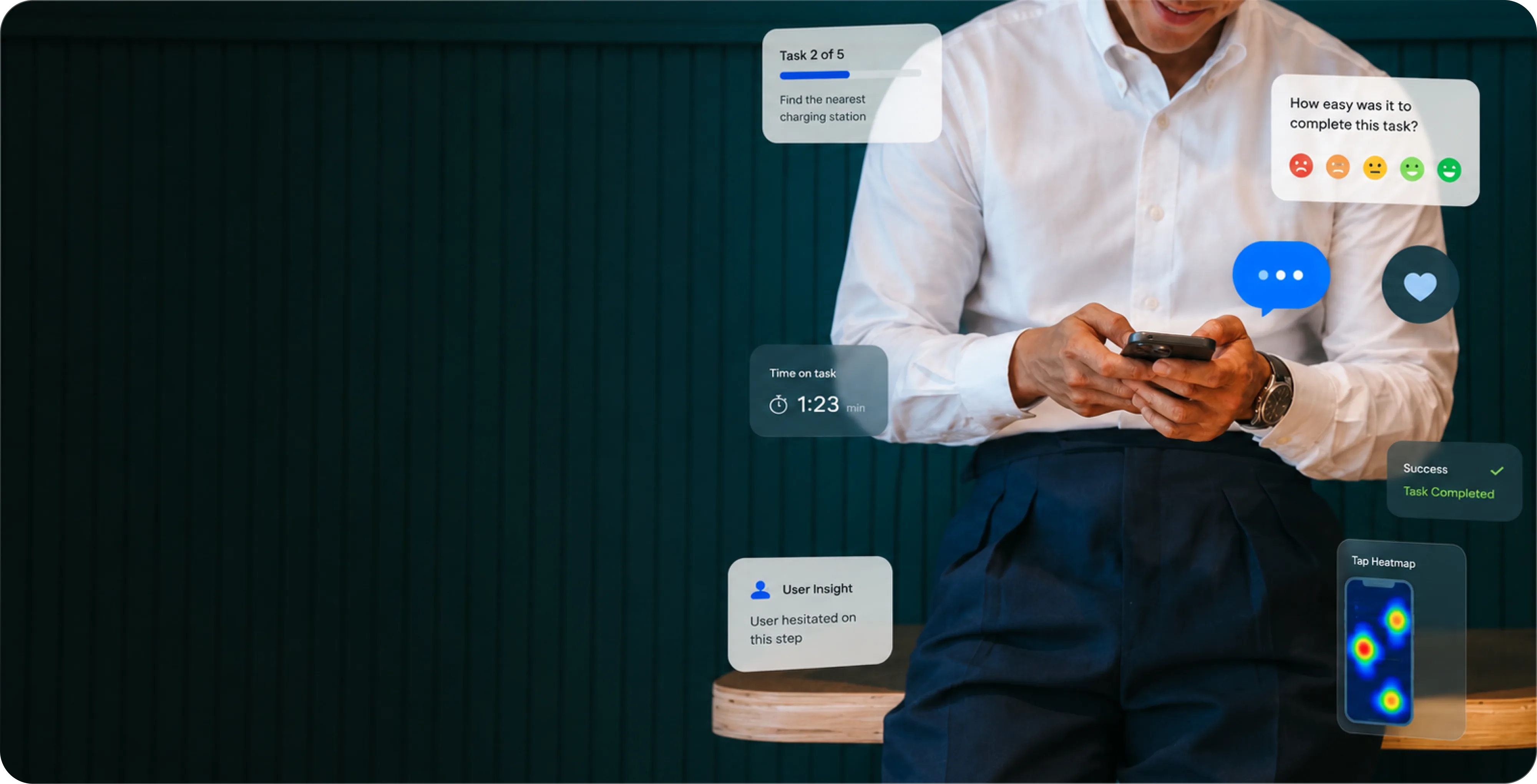
Micro-interactions are where product feedback becomes visible. Brand Vision designs responses around actions such as selecting, saving, dragging, submitting, loading, confirming, and failing, including hover, focus, pressed, disabled, progress, success, and error states. The goal is to give users clear feedback, reinforce cause and effect, and make interactions feel predictable. We carry those patterns consistently across the product so familiar actions work in familiar ways.

Motion should clarify what changed, not compete for attention. Brand Vision uses movement to establish continuity between states, direct attention, communicate hierarchy, show progress, and help users understand where elements came from or where they're going. We define transitions, timing, easing, entrances, exits, and loading sequences as part of a consistent motion system, while also knowing when the interface should remain still.
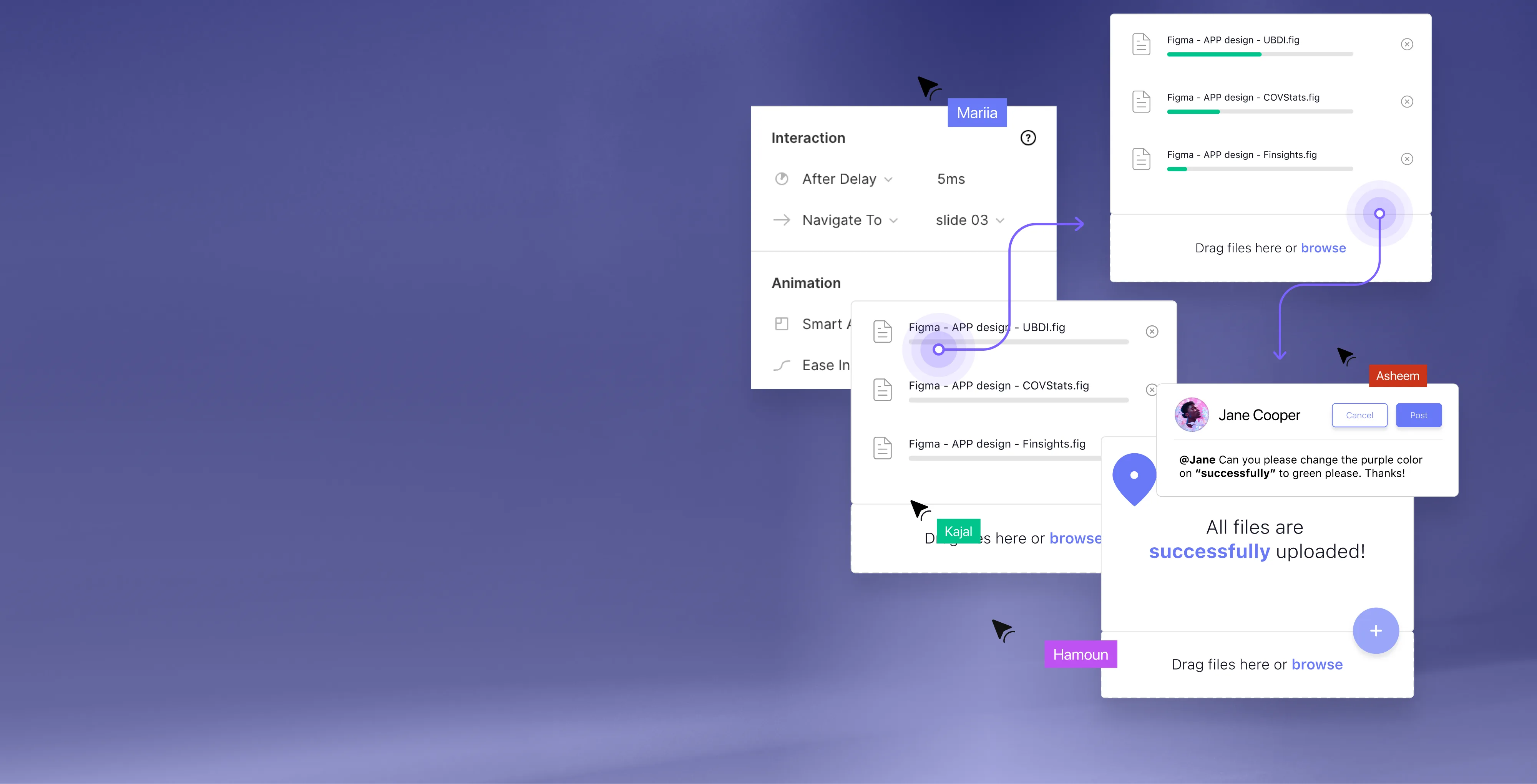
Static screens can show what a product looks like, but not how it feels to use. Brand Vision creates interactive prototypes that connect screens, states, overlays, transitions, gestures, and key decision points into experiences teams can navigate before development begins. Prototypes help expose gaps between screens, clarify important flows, and give stakeholders and developers a stronger reference for how the final product should work.

Design handoff should remove ambiguity between design and engineering. Brand Vision documents component states, triggers, transitions, timing, responsive rules, edge cases, and interaction details that aren't obvious from static screens alone. Interactive references and implementation notes give developers a clearer source of truth, helping preserve design intent while reducing guesswork during development.
From the way a product behaves to a prototype and spec teams can build from.
We align on goals, study the audience and competitors, and audit what's already there. Research and analytics shape the sitemap, the content priorities, and the standards the finished site has to meet.
We turn strategy into page models, components, and responsive layouts. Interactive prototypes put the design in context, so the decisions that matter get made early, before anything is built in code.
We build on a clean, well-structured CMS and implement the design system, with accessibility, performance, and analytics handled from the first line rather than bolted on at the end.
We run full QA, set up redirects, and prepare a clear handover, then map the first round of improvements so the site continues to earn its place well after go-live.
See how thoughtful interaction design turns complex workflows into clearer, more intuitive product experiences.












Product depth shouldn’t slow the story down. We partner with SaaS, platform, and enterprise software teams to translate technical capability into focused narratives. Clear paths to demo, trial, or contact serve both buyers and technical evaluators. Systems are built for product-led growth with composable components, editor guardrails, and instrumented analytics that tie directly to pipeline.
Complex services sell on clarity, not volume. We help consulting, financial, and advisory firms structure their digital presence around buyer tasks: understanding capabilities, comparing options, and starting a brief. Every touchpoint earns trust through specificity and proof. Content is organized by audience need, so the people making the hiring decision find answers quickly and move to contact without friction.
Patients and practitioners make high-stakes decisions under pressure. We design trust-first experiences for healthcare and wellness brands, keeping clinical accuracy intact while making it simple for people to find the right provider, service, or next step. Accessibility, privacy-compliant forms, and plain-language content are standard. Local visibility for practices and clinics is built into the foundation, not bolted on later.
Prospective clients searching for legal help are often under pressure and comparing firms quickly. We help law firms present practice areas with credibility, surface the right contact paths, and build a digital presence that earns trust before the first conversation. Clear structure, plain language, attorney profiles, and consultation flows make it easy for people to take the next step with confidence. Ethical advertising compliance is built in from the start.
Buyers, investors, and project owners move on trust and timing. We work with brokerages, developers, general contractors, and property management firms to present listings, projects, and capabilities with clarity. Content is organized around what prospects actually need: proof of work, service scope, location context, and a direct path to inquire. Pre-construction launches and trade portfolios get the same strategic rigor as resale platforms.
Conversion lives in the details. We work with consumer and ecommerce brands to build fast, clear shopping experiences where product pages explain value quickly, checkout flows reduce friction, and the entire system scales with the catalog. Promotional templates, collection architecture, and performance monitoring keep the storefront sharp as demand and inventory shift with seasons. The result is a store your team can run day to day without developer dependency.
Early-stage companies need focus over flash. We help startups define positioning, build a credible identity, and launch a conversion-ready presence that clearly communicates what the product does, who it’s for, and how to get started. Everything is built to scale: component systems, content structures, and analytics foundations grow with the roadmap instead of needing a rebuild at Series A. The pitch and the website tell the same story.
Students, parents, and administrators all need different answers from the same site. We help schools, universities, and training organizations structure digital experiences by task: apply, visit, inquire, enroll. Accessible design and plain-language content serve diverse audiences without alienating any of them. A manageable CMS means internal teams keep program pages, event listings, and admissions information current without outside help or bottlenecks.
Nonprofits compete for attention, funding, and volunteers simultaneously. We build accessible digital experiences that make programs clear, donation paths intuitive, and calls to action specific enough to drive real participation and support. Content governance is designed for lean teams, so pages, campaigns, and impact reports stay current without bottlenecks. The organizations doing the most important work deserve a digital presence that matches their mission.
From restaurants to packaged goods, this industry sells on quality and convenience. We help food and beverage brands connect story with logistics: clear menus, product lines, ordering options, and wholesale paths that make it obvious how to buy and reorder. Identity and digital experience work in tandem so visitors see quality and know exactly what to do next, whether they’re a consumer walking in or a distributor placing a first order.
Audiences decide in seconds. We work with labels, venues, talent agencies, and event companies to build media-rich, performance-optimized experiences where the work is front and center. Booking, inquiry, and ticket paths stay visible and fast across devices. Campaign templates and component systems let teams launch content for new shows, releases, and events without starting from scratch each time. The creative comes first; the infrastructure stays invisible.
Guests research and book across multiple touchpoints. We help hotels, resorts, tourism brands, and event venues present their experience with clarity, connecting visual storytelling with practical booking flows, local discovery, and seasonal content that stays current. The systems we build make it straightforward for teams to update rates, packages, and promotions without depending on a developer for every change. The experience starts online, and it should feel as considered as the stay itself.














Original research and expert perspective on design, branding, and the strategy behind both.
Still have questions? Contact us to discuss.
An interaction design agency decides how a product behaves under somebody's hands, meaning what every control does when it is pressed, what the interface says back, and what appears while the system is still working. Those decisions get made in every product that ships. The only variable is whether anybody was assigned to them.
The plain version of the job. Somebody has to settle what a control does when a person touches it, what confirms the action landed, what the screen shows while a request is in flight, what it shows when there is no data in the account yet, and what a person sees when the request fails. Then that gets multiplied by every control in the product and written down in a form an engineer can build from without guessing. The deciding is the visible part. The writing down is what keeps a product coherent six months and four features later.
Why clients bring the behaviour work to us.
Behaviour is specified instead of described. Every state, transition, threshold and failure path written as something a developer can implement without a follow-up question. A file full of resolved-looking screens is a set of pictures, and pictures cannot answer what happens on a slow connection.
The people who made the decisions stay through the build. We review the implementation against the specification on real devices and real connections, which is the only reliable way to know that what shipped is what was agreed.
Behaviour gets tested while changing it is still cheap. Clickable versions go in front of real people before anything reaches a repository, because an argument about how something feels is settled faster by watching one person use it than by a meeting about it.
We say when a smaller version is enough. A great many products need a behaviour and state pass over the components they already own and nothing beyond that.
Behind that sit more than 500 projects since 2018, 250+ verified five-star reviews, and four Awwwards and a Webby, which in this field are given for craft in exactly this layer. You can look at work we have shipped and at who actually does the work before committing to anything, and the same standard is what we hire against.
Eight, and they are sequenced instead of bought separately, because a set of states is worth little without a specification and a specification is worth little if nobody checks the build against it. Most engagements use all eight. A few honestly need three, and we will scope it that way.
A few things sit alongside that scope and are worth naming. Where the open question is whether your product has behaviour problems at all, a UX audit answers that faster and for less money. Where the open question is what people are actually trying to accomplish, UX research comes before any of this. And the implementation itself sits with the engineers who build it, in the same team, which is what makes the QA step possible at all.
Interaction design sits between the other two. User experience work settles which steps exist and in what order, user interface work settles what those steps look like, and interaction design settles how the thing responds while a person is actually operating it. All three get bought under one heading and they fail in different ways.
Here is the split with a single control. Deciding that a user needs to change a plan, and that the change belongs in account settings behind two clicks, is structure. Deciding what that control looks like, how much space sits around it, and what typeface the label is set in, is surface. Deciding that pressing it disables it immediately, shows a progress indicator after 400 milliseconds, holds the person on the page, confirms with the new plan name and the next billing date, and offers an undo for ten seconds, is behaviour. The third set of decisions is invisible in a static file and it is the set a customer feels most directly.
A way to place your own problem. Somebody who cannot work out where to go has a structure problem. Somebody who can see the control and cannot tell whether it is pressable has a surface problem. Somebody who presses it and cannot tell whether anything happened has a behaviour problem, and that third one is what this page exists for.
The reason it deserves its own name is practical. Structure and surface can both be approved from a picture. Behaviour cannot, because the questions are about time, sequence and failure, and a still frame has none of those. So the work moves into clickable form, the decisions get written as rules, and the rules get checked against the built product. That is a different craft from composing a screen, and it overlaps as much with front-end engineering as it does with visual design.
None of which means buying three separate engagements. On most projects these are one workstream, and the reason to separate them on a page is so you can tell which part of your own product is failing. If you want the whole picture, the wider UI and UX practice covers all three, and you can see how the disciplines stack up across a project before deciding what to scope.
They can, and on most products they already are, which is exactly the problem being described. A developer who reaches an unspecified state at four in the afternoon will pick something sensible and ship it. The output is rarely bad. It is inconsistent, undocumented, and different from the choice the developer sitting two desks away made for the same situation last week.
Worth conceding what the other side gets right. Good front-end engineers have strong instincts about behaviour, frequently better than a designer who has never had to implement a race condition. And a designer who specifies motion without knowing what it costs to build wastes everybody's afternoon. So the honest version is that this work belongs to both, and the question is only who owns the decision and where it is recorded.
When leaving it to your developers is genuinely the right call.
When it stops being the right call. Three or more people producing interface work at once, since that is the point where one component quietly starts behaving three ways. A product shipping continuously, because every release adds states nobody wrote down. Money or regulated data moving through the flow, where a duplicate submission is a real event with a real cost. Or an accessibility obligation, since keyboard and focus behaviour is the part most likely to be quietly dropped.
What the smaller version looks like. A behaviour and state pass over the components you already ship, priced in weeks instead of months, which produces a documented set for your engineers to build against. Where you are still finding out whether the product has a problem, a focused diagnostic is the cheaper first step. And on an early-stage product still changing weekly, we will usually tell you to wait, because documenting behaviour you are about to replace is a way to pay twice.
A single critical flow runs two to three weeks. A component set with full state and behaviour documentation runs four to eight. Ongoing work alongside a product team runs monthly against your release cycle. The stages are the same at every size and only the component count changes.
Map the flows. Three to five days. The tasks that matter, drawn as sequences with every branch, refusal and dead end marked. This is where most of the missing states get discovered, because a branch nobody drew is a screen nobody designed.
Specify states. One to two weeks. Every component taken through every condition it can be in, with the trigger for each and the transition between them. The longest stage and the one that produces the document your engineers will actually use.
Prototype. One to two weeks. This is where behaviour gets decided, because a static screen cannot tell you whether a two-second wait feels governed or broken, whether a transition orients somebody or irritates them, or whether a person notices a confirmation at the bottom of the page. Low fidelity first for the flow questions, then high fidelity with real timing for the questions about feel.
Motion and micro-interactions. Three to five days, usually overlapping the prototype. Durations, easing, triggers, and the reduced-motion alternative for each.
Document and specify. Three to five days. Component behaviour written up, named values reconciled with your codebase, and accessibility notes attached per component.
Implementation QA. Spread across the build instead of booked as a block, then a final pass before launch.
What moves the number. The count of distinct components, and then the number of states each one carries, which is the real driver and the thing most estimates get wrong. How many user roles see different behaviour. How many platforms are in scope, since a phone, a desktop and a keyboard-only path are three behaviour sets. Whether a design system already exists to extend or has to be started. And decision speed on your side, which delays more projects than any technical problem does.
If you want the work sized before committing, a scoped consultation is the cheap way to do it, and where the honest answer is that this belongs inside the broader interface engagement you will hear that. Where a release date is already fixed, name it on the first call and you will hear which parts of the scope can live inside it before anything is signed.
Nine, and specifying the resting appearance of a control and stopping there leaves eight decisions for somebody else to make under deadline. Not every element needs all nine, and deciding which ones it does need is the work.
Two constraints worth planning for. Label length changes with language, so a button that fits in English can break in French, which matters for any product shipping bilingual across Canada. And roles multiply states, since a system owner, a team lead and a daily user frequently see the same component behaving differently, which is normal in enterprise tools and needs writing down instead of discovering.
All nine draw their colours and values from the same place as the rest of the brand, which is why functional and state colours belong in the visual identity system instead of being chosen during the build.
Feedback is the interface answering, and an action that goes unanswered gets repeated. People do not wait politely in front of an unresponsive control. They press it again, and on a form that second press is often a second order, a duplicate record, or two emails to the same customer.
Response time decides what the feedback has to be, and the thresholds below come from established human-factors work in the field rather than from us.
Under roughly a tenth of a second. The response reads as instant and needs no indicator at all. This is what most local interactions should aim for, and it is why a control that waits for the server before changing appearance feels broken even when it is fast.
Up to about a second. Attention holds. A simple state change on the element itself is enough, and adding a spinner here makes the product feel slower than saying nothing would.
One to ten seconds. The person needs to be told the system is working, and past two or three seconds they need some sense of how far along it is. Indeterminate spinners stop reassuring anybody at this length, because a spinner that has been turning for eight seconds looks identical to one that has failed.
Beyond ten seconds. Attention is gone and the tab is no longer in front. That work belongs in the background with a real notification at the end, and the interface has to survive the person navigating away and coming back.
Then the specifics that prevent the repeated action. The control changes the instant it is pressed and does not wait for a response to do it. It stops accepting a second press while the first is in flight. The same request arriving twice produces one result and not two, which engineers call idempotency and which is a build decision as much as a design one, and it matters most where payment is involved on platforms like Shopify. And confirmation stays on screen long enough to be read by somebody who looked away.
Two notes on measurement. Responsiveness to input is a published ranking signal, so the case for it reaches past experience into technical SEO. And whether people actually notice a confirmation is a question usability testing answers in an afternoon, because a toast nobody saw is not feedback.
Motion earns its place when it explains something a still frame cannot, and it costs you when it is a wait with a decoration on it. The distinction is easy to apply once it is written down and almost never gets written down.
What movement is genuinely for.
What movement is not for.
On numbers, established interface practice puts most transitions between roughly 150 and 300 milliseconds, with large elements entering the screen taking longer and small state changes taking less. Easing matters as much as duration, since something that starts fast and settles slowly reads as physical and a linear move reads as mechanical.
Micro-interactions are where the return is highest and the cost is lowest. A field that validates as somebody leaves it. A toggle that travels with the thumb instead of snapping after it. A row that lifts slightly under a cursor to signal it can be dragged. Each one is small, and collectively they are most of what people mean when they say a product feels considered.
Anything that moves gets a reduced variant, for reasons covered further down. Where motion is part of the brand and not the interface, it belongs in the identity system so it stays consistent, and on platform builds the specification is written to what the platform can actually do, which for Webflow means native interactions instead of hand-written code nobody can maintain.
By deciding what a person needs in front of them at each moment and putting the rest one deliberate step away, which is progressive disclosure and it is the difference between a dense product that feels manageable and one that feels like a control panel. Removing capability is the other option and it is usually the wrong one.
Four tests decide what gets held back.
The patterns and their honest costs. Accordions and disclosure sections work when the labels are specific and fail when they are vague. Tabs work when the content is genuinely parallel and mislead when one tab is the real one. Drawers and side panels keep context in view, which is why they suit editing inside a list. An advanced section is the right home for the settings four percent of users need. And a correct default beats every one of these, because the best disclosure is a decision the person never has to make.
The caution worth stating plainly. Hiding is not simplifying. Every layer adds an action, and three layers of tidy disclosure can be worse than one honestly busy screen. This is the failure mode behind a lot of clean-looking software that nobody can get work done in, and it shows up most in dense software products where capability is the reason somebody bought it.
One technical consequence people miss. Content revealed by interaction still has to exist in the markup, since anything rendered only after a click can be invisible to machines reading the page. A number of the large AI crawlers ask for a page's JavaScript and then decline to execute it, so anything the browser assembles only once somebody clicks may never reach them, which is a measurable cost in AI search visibility. You can see how the balance gets struck across recent product work.
By making the mistake difficult to make, because an error message is a repair and repair is always more expensive than prevention. Most teams invest in the message and skip the four cheaper moves in front of it.
The order of preference, strongest first.
Make the wrong thing impossible. Use the control that fits the data, so a date comes from a date control and not a free text field. Constrain what can be typed, format as somebody types, and set the correct keyboard on mobile. An input that cannot hold an invalid value never needs to reject one.
Make the right thing the default. Pre-select the option that is correct for most people, carry forward what the system already knows, and never ask for information you are holding. Most form errors are the product asking a question it could have answered.
Validate at the right moment. When somebody finishes a field, not on every keystroke, which turns typing into a stream of complaints, and never held back until submission, which sends a person back up the page hunting. Positive confirmation as a field passes is worth as much as the warning when it does not.
Make it reversible. Undo is better than confirm on almost every action, because it costs the person nothing when they meant it and rescues them completely when they did not.
Write the recovery properly where recovery is the only option. Say what happened, in the same words the person used, and say what to do next. Preserve everything they entered. Put the message beside the thing that caused it.
Which brings up the confirmation dialog, and the argument is worth having. A confirmation dialog is usually a design failure wearing the costume of caution. It asks somebody to check work the system could have made safe, it arrives when attention is lowest, and because most confirmations are dismissed without being read it protects very few of the people it interrupts. Keep it for the genuinely unrecoverable, make it specific about what is being lost, and where the loss is severe require typing the name of the thing. Everywhere else, ship undo.
Two places this pays fastest. Checkout, where a rejected payment with a vague message is an abandoned order in consumer retail. And multi-step booking flows, where losing an hour of entered detail loses the customer with it. Both need validation duplicated on the engineering side, since a client-side check is a convenience and never a guarantee.
Keyboard operability and a visible focus state are requirements, and they are the two things most often removed for looking untidy. Contrast and alt text get attention because they are easy to check. Interactive behaviour is where the real barriers are and where automated tools catch the least.
Everything operable without a mouse. Every control reachable in an order that matches the visual layout, operable with the keys people already expect for that kind of control, and nothing that traps focus with no way back out. Modals are the usual offender, since focus has to move in, stay in, and return to where it started on close.
Focus that can actually be seen. Visible against both backgrounds it will appear on, thick enough to notice, and never removed without a replacement. WCAG 2.2 added a criterion on focus not being obscured by other content at AA, with the stricter appearance rules sitting at AAA, and the practical test is simpler than the standard. Tab through the page and see whether you can always tell where you are.
State communicated programmatically as well as visually. Somebody using a screen reader needs to know that a control is expanded, selected, busy, invalid or unavailable. Names, roles and states belong in the specification for each component instead of being left to whoever writes the markup.
Reduced motion honoured. Operating systems expose the preference and browsers pass it through. Large parallax, scale and slide transitions can cause genuine nausea and dizziness for people with vestibular conditions, so anything animated gets a specified alternative instead of a media query somebody may forget.
Targets large enough to hit. WCAG 2.2 sets a minimum of 24 by 24 CSS pixels at AA, with exceptions, and comfortable is meaningfully larger than compliant on a phone held in one hand.
Custom components are where it breaks. A native select element arrives accessible at no cost to anybody. A bespoke dropdown, combobox, date picker or tab set is accessible only if somebody built it that way, which is why the specification says what each one has to announce.
We build to WCAG 2.2 AA and we screen rather than certify. Obligations differ by jurisdiction and sector, they bite hardest on public bodies and on education institutions, and anything carrying real exposure should be read by counsel instead of by us. The same discipline pays elsewhere too, since clinical software used under time pressure benefits from the same clarity, and the structural work behind it makes the site itself easier for machines to read.
A specification complete enough that an engineer we have never met can build every state and every behaviour from it without asking a question, and the standard it is held to is that nothing gets invented during the sprint. If a developer has to guess, the specification is unfinished and that is our failure rather than theirs.
What arrives.
Then implementation QA, without which everything above is a document nobody checked. We review the built product against the specification on real devices, on a throttled connection, with a keyboard only, and with a screen reader on the critical paths. Differences come back as tickets with the relevant line of the specification attached instead of as opinions in a meeting. Anything we got wrong gets corrected in the specification at the same time, so the document stays the source of truth instead of going out of date the week it is delivered.
The standard, stated plainly. What ships matches what was specified, and where it does not, the gap is either a bug or a decision somebody made without telling anyone. Both are fine to find. Neither is fine to find from a customer. That is also why we stay through a launch on a website redesign instead of handing over a document at the point the interesting problems start, and why QA is scoped into the build instead of sold afterward. If you want to see the shape of the specification before committing, ask to be shown one when you get in touch.

Our goal is to nurture your vision and provide innovative, custom solutions for all your marketing needs.


%2520(1).png)
.png)