














Branding
B2B Branding Strategy: Positioning, Proof and Buying-Committee Trust
Sep 6, 2026
/ By Hamoun Ani
Graphic design services covering packaging, print, presentations, and everything your brand puts in front of people.
Brand Vision is an award-winning graphic design agency producing custom work for every client we take on. Nothing starts from a template. We research your market and your audience first, then design pieces that are functional, tasteful, and unmistakably yours, from packaging and print through presentations, social, and trade show graphics.

Building real partnerships with top global brands. Delivering results that last well beyond the launch.









Custom design across print, packaging, presentations, and every asset your brand puts in front of people.
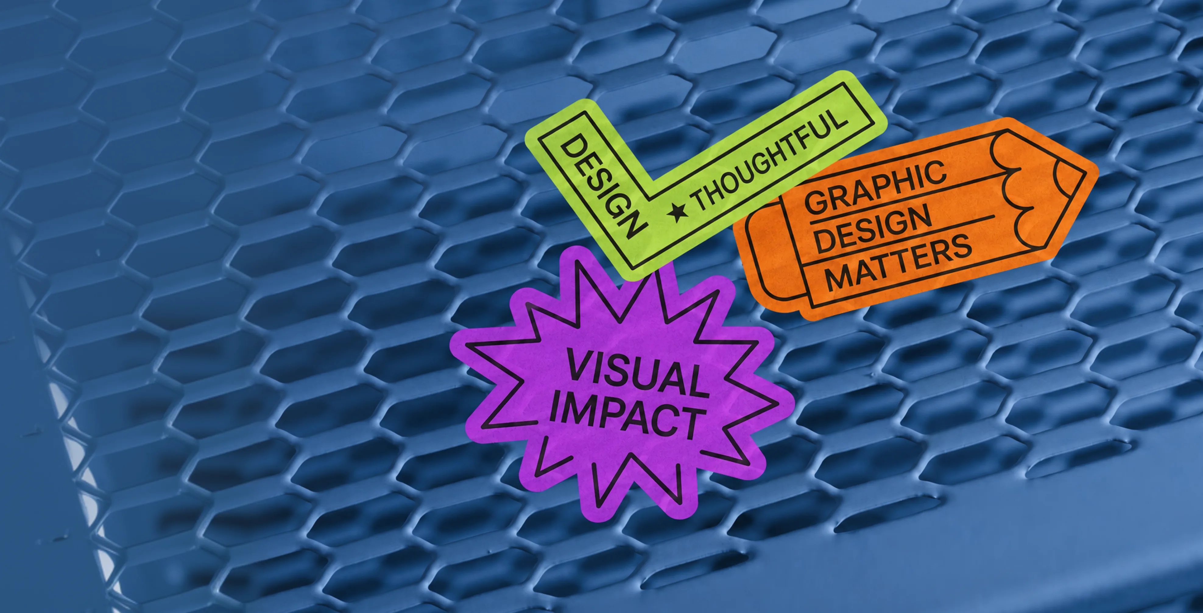
Brand Vision offers print design services for the pieces your business still hands to people. Brochures, catalogs, reports, stationery, signage, and direct mail. We design to your brand system, recommend stock and finishes, and deliver files your printer can run the same day, with correct bleeds, margins, and color profiles. Print mistakes are expensive and permanent. A graphic design agency should get the file right the first time. We do.

Brand Vision provides packaging design services from concept to press. We design the packaging, build the dielines, prepare print-ready files with correct bleeds and color specs, and check proofs before your run. The work covers boxes, labels, pouches, and multi-SKU lines that stay consistent as products grow. Shelf impact is tested in mockups before anything prints. It is the packaging work a graphic design agency should deliver, start to finish.
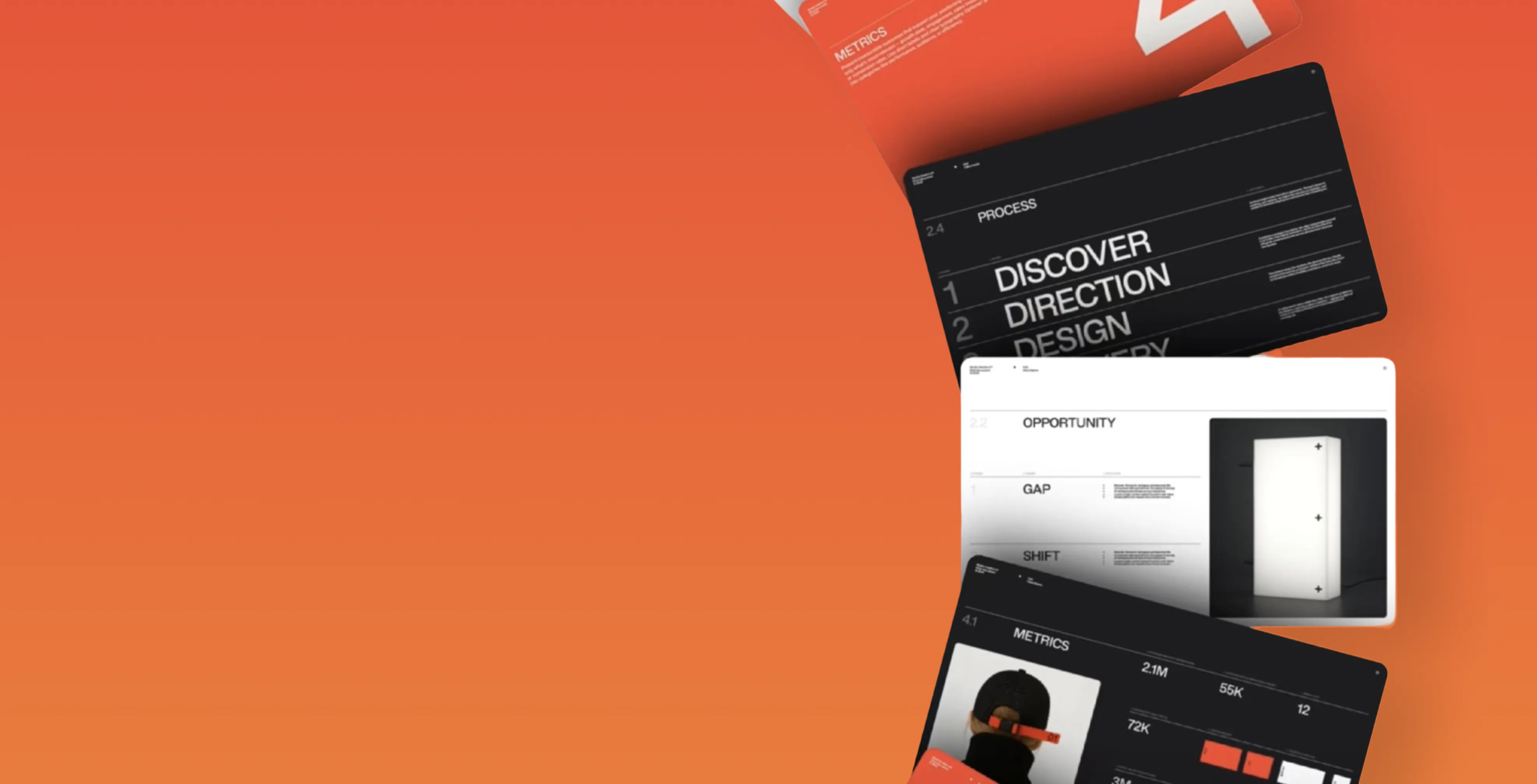
Brand Vision designs the presentations your business wins with. Pitch decks, sales decks, investor decks, and conference keynotes, built on your brand and structured so the story lands. We design charts people can read from the back row. Every deck arrives as an editable master in PowerPoint or Google Slides, so your team updates numbers without breaking the layout. It is presentation work from a graphic design agency, not a template.
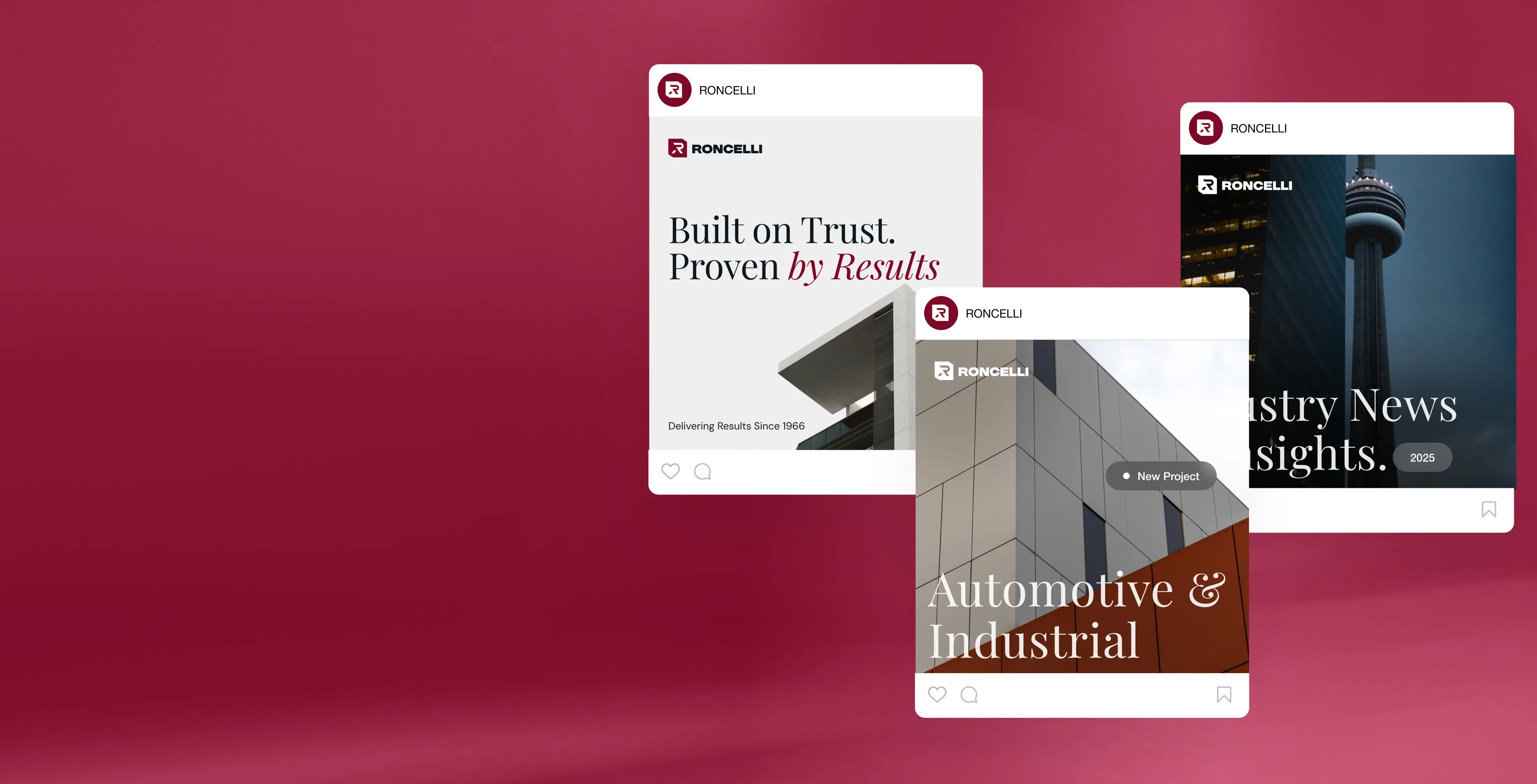
Brand Vision produces social media design services as ready-to-post sets. Feed graphics, carousels, stories, and covers, each sized for its platform and built on your brand system. We deliver one-off campaigns or a monthly production schedule, plus editable templates your team can fill between drops. Light motion graphics are available for posts that need movement. Consistency across a feed is what a graphic design agency is for.

Brand Vision creates custom illustrations your business owns outright. Spot illustrations, icon sets, infographics, characters, and editorial pieces, drawn to fit your brand rather than pulled from a stock library everyone uses. We define the style once, document it, and apply it so every future piece matches. Illustration gives a brand a look competitors cannot download, which is exactly what a graphic design agency should be building for you.
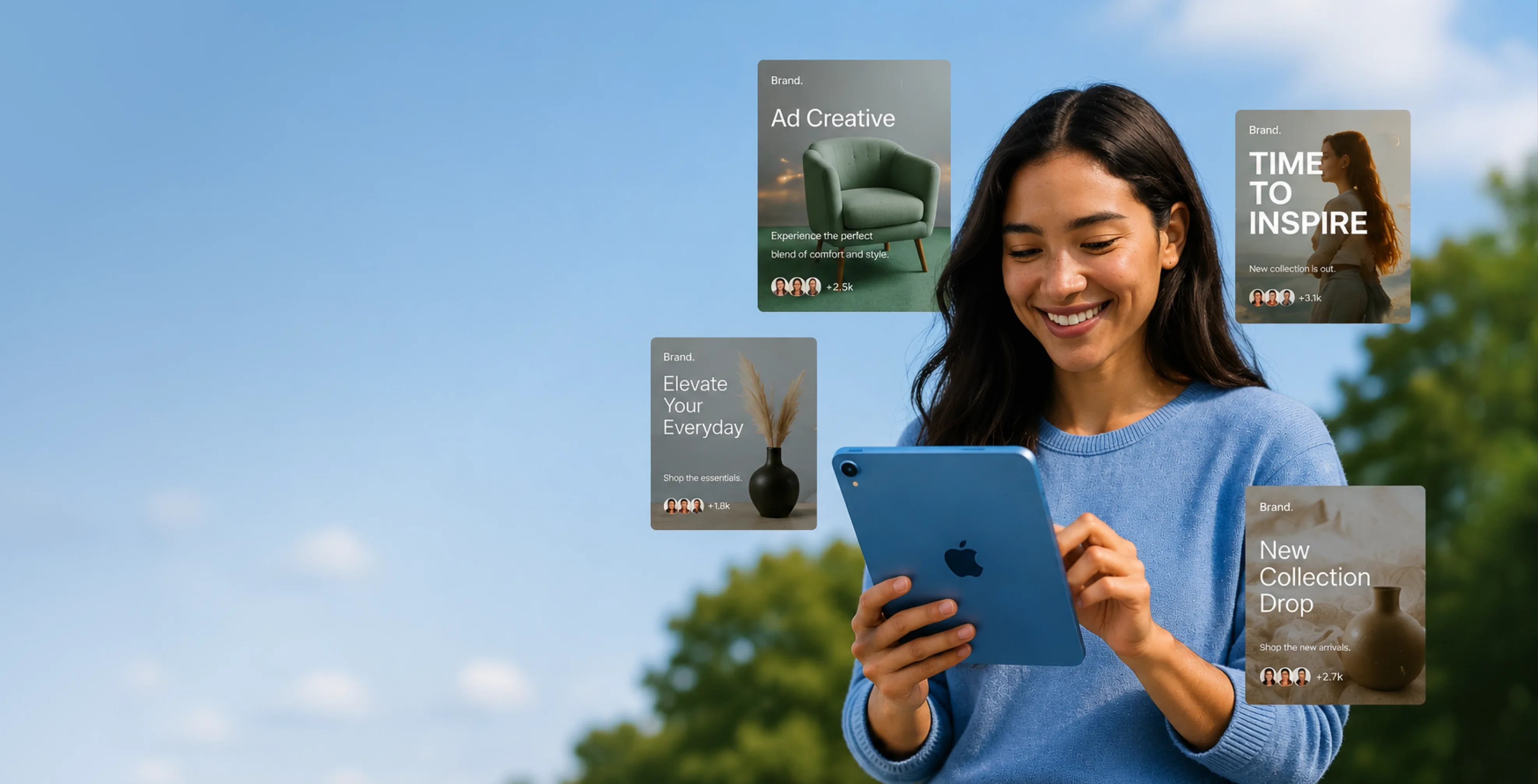
Brand Vision designs ad creative built to be tested, not admired. Static and animated sets for Meta, Google, LinkedIn, and programmatic, delivered in every size and variant your media plan calls for. We produce enough versions to test and refresh them before they fatigue. Files meet each platform's specs the first time. When the ads and the landing page come from one graphic design agency, the message holds from click to conversion.
Research first, on your system, production-correct, checked before it ships.
We learn your market, audience, and brand system before a single layout begins.
We design each piece custom to your system, tasteful and built for the job in front of it.
We revise against your feedback and test shelf and screen impact in mockups before production.
We hand off production-correct files, right bleeds, profiles, and dielines, ready to run.
Graphic design services shown at full size, from the shelf to the show floor.
Design rules change by industry. A food label carries mandatory panels. A financial deck carries disclaimers. A clinic brochure carries claims that must be worded exactly. Brand Vision designs inside those rules across every sector we serve, so the work clears review the first time.
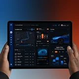










Product depth shouldn’t slow the story down. We partner with SaaS, platform, and enterprise software teams to translate technical capability into focused narratives. Clear paths to demo, trial, or contact serve both buyers and technical evaluators. Systems are built for product-led growth with composable components, editor guardrails, and instrumented analytics that tie directly to pipeline.
Complex services sell on clarity, not volume. We help consulting, financial, and advisory firms structure their digital presence around buyer tasks: understanding capabilities, comparing options, and starting a brief. Every touchpoint earns trust through specificity and proof. Content is organized by audience need, so the people making the hiring decision find answers quickly and move to contact without friction.
Patients and practitioners make high-stakes decisions under pressure. We design trust-first experiences for healthcare and wellness brands, keeping clinical accuracy intact while making it simple for people to find the right provider, service, or next step. Accessibility, privacy-compliant forms, and plain-language content are standard. Local visibility for practices and clinics is built into the foundation, not bolted on later.
Prospective clients searching for legal help are often under pressure and comparing firms quickly. We help law firms present practice areas with credibility, surface the right contact paths, and build a digital presence that earns trust before the first conversation. Clear structure, plain language, attorney profiles, and consultation flows make it easy for people to take the next step with confidence. Ethical advertising compliance is built in from the start.
Buyers, investors, and project owners move on trust and timing. We work with brokerages, developers, general contractors, and property management firms to present listings, projects, and capabilities with clarity. Content is organized around what prospects actually need: proof of work, service scope, location context, and a direct path to inquire. Pre-construction launches and trade portfolios get the same strategic rigor as resale platforms.
Conversion lives in the details. We work with consumer and ecommerce brands to build fast, clear shopping experiences where product pages explain value quickly, checkout flows reduce friction, and the entire system scales with the catalog. Promotional templates, collection architecture, and performance monitoring keep the storefront sharp as demand and inventory shift with seasons. The result is a store your team can run day to day without developer dependency.
Early-stage companies need focus over flash. We help startups define positioning, build a credible identity, and launch a conversion-ready presence that clearly communicates what the product does, who it’s for, and how to get started. Everything is built to scale: component systems, content structures, and analytics foundations grow with the roadmap instead of needing a rebuild at Series A. The pitch and the website tell the same story.
Students, parents, and administrators all need different answers from the same site. We help schools, universities, and training organizations structure digital experiences by task: apply, visit, inquire, enroll. Accessible design and plain-language content serve diverse audiences without alienating any of them. A manageable CMS means internal teams keep program pages, event listings, and admissions information current without outside help or bottlenecks.
Nonprofits compete for attention, funding, and volunteers simultaneously. We build accessible digital experiences that make programs clear, donation paths intuitive, and calls to action specific enough to drive real participation and support. Content governance is designed for lean teams, so pages, campaigns, and impact reports stay current without bottlenecks. The organizations doing the most important work deserve a digital presence that matches their mission.
From restaurants to packaged goods, this industry sells on quality and convenience. We help food and beverage brands connect story with logistics: clear menus, product lines, ordering options, and wholesale paths that make it obvious how to buy and reorder. Identity and digital experience work in tandem so visitors see quality and know exactly what to do next, whether they’re a consumer walking in or a distributor placing a first order.
Audiences decide in seconds. We work with labels, venues, talent agencies, and event companies to build media-rich, performance-optimized experiences where the work is front and center. Booking, inquiry, and ticket paths stay visible and fast across devices. Campaign templates and component systems let teams launch content for new shows, releases, and events without starting from scratch each time. The creative comes first; the infrastructure stays invisible.
Guests research and book across multiple touchpoints. We help hotels, resorts, tourism brands, and event venues present their experience with clarity, connecting visual storytelling with practical booking flows, local discovery, and seasonal content that stays current. The systems we build make it straightforward for teams to update rates, packages, and promotions without depending on a developer for every change. The experience starts online, and it should feel as considered as the stay itself.













Original research and expert perspective on design, branding, and the strategy behind both.
Still have questions? Contact us to discuss.
A graphic design agency makes the material a business puts in front of people, and it makes that material inside rules set somewhere else. Decks, proposals, reports, packaging artwork, signage, campaign formats, and the templates your own team works from every week. Graphic design services get judged on whether a piece is correct, on time, and consistent with everything shipped before it, which is a harder standard than it sounds.
What the work involves day to day. Reading a brief that is usually incomplete, deciding what the piece has to do for the person receiving it, laying it out inside an existing system, preparing the file for whatever process will reproduce it, and checking it against the material it will sit beside. Most of the difficulty lives in the last two steps, and a client never sees either of them.
Three things separate a design partner from a supplier taking orders.
Why clients pick us for it. Brand Vision has delivered more than 500 projects since 2018 across roughly 150 brands, so most formats we get asked for are ones we have shipped before. The designers hold RGD and CGD certification, which is a professional standard rather than a project award. And more than 250 verified five-star reviews sit behind the working relationship, which matters most on volume work where you are sending us three things a week and cannot afford to chase any of them.
You can look at recent projects and the designers themselves before any of this becomes a commitment. Where the rules themselves do not exist yet, the identity system is the first purchase and this is the second.
Nine graphic design services, and a typical engagement draws on three or four. Which ones you need depends less on your industry than on how much material your team puts out and how much of it ends up somewhere physical.
Presentation and pitch deck design. Sales decks, investor decks, conference talks, and internal templates, built on master slides so the next twenty slides do not get drawn by hand.
Sales and marketing collateral. One-pagers, capability statements, proposals, case studies, brochures, and leave-behinds, built as adaptable parts because the situation changes with every prospect.
Report and document design. Annual reports, whitepapers, research summaries, and technical documentation, meaning the long-form material that carries the most detail and gets the least attention.
Packaging and label artwork. Dielines, print-ready artwork, and variant management across sizes and formats, with mandatory content planned into the layout from the first concept.
Signage and environmental graphics. Storefront and building identification, interior and wayfinding, vehicle graphics, trade show and booth, window and wall.
Print production and prepress. Preparing files for the process that will actually reproduce them, specifying stock and finish, briefing the printer, and reading a proof before a run commits.
Social and campaign creative. One idea worked across every format a campaign needs, including the paid campaigns it has to perform inside, instead of one asset exported nine ways.
Editable templates for your team. The same material handed back as files your people can open and change, in the software they already have.
Ongoing design support. A monthly arrangement for teams producing enough volume that quoting each piece costs both of us more in administration than it does in design.
Where a piece has to work on screen as well as in hand, the website design team sits alongside, so a landing page and the campaign feeding it get made together instead of in sequence. And where the material exists to serve a channel plan, channel planning decides what gets made before anybody designs it, which is the correct order and not the usual one.
What we will not do is take on volume production against an identity nobody has resolved. Forty pieces made from an unfinished system is forty pieces to redo, and we would rather lose the production work than sell it twice.
The identity sets the rules and graphic design is the work made under them. One is a set of decisions written down once. The other is production that continues for as long as the business exists.
Here is the split in practice. A visual identity project decides the palette, the typefaces, the hierarchy, the spacing logic, the imagery direction, and how all of it combines. It produces a system and its documentation. Nobody outside your company ever sees that system. What they see is a deck, a pack, a sign, or a post, and every one of those is graphic design.
The confusion is fair, because both come out of the same studio and often the same month. The difference is what happens when each one finishes. An identity is finished. Production is never finished, because the business keeps needing things.
Why the order matters commercially. Material made without a system costs more every time, since each piece reopens decisions that should have been settled once. Material made against a system is quick and cheap, because the argument about how big a heading is has already happened. Companies that buy production without the system underneath accumulate work that is individually fine and collectively unrecognizable.
The reverse mistake is more expensive and much less obvious. A system bought with no production against it gets approved on clean example layouts, and clean example layouts hide everything. Real work arrives with too much copy, a partner logo you are contractually obliged to include, a photograph cropped wrong by somebody else, a legal line at six point, and a chart with eleven categories in it. A system that has never met any of that has not been tested. That is why a handful of genuine pieces get built during an identity engagement instead of after it.
So the honest sequence is positioning, then the mark, then the system, then production, and you can see how logo design sits inside that stack. If you are past the first three, this is what comes next and it should cost a fraction of what came before. If you are not past them, buying production first means paying for the same decisions twice, and the wider brand work is where that gets sorted.
A single piece typically runs one to three weeks, a full collateral set three to six, and a packaging or signage program six to twelve because a supplier sits in the middle of it. Work is quoted per project or as a monthly arrangement, and the four stages run the same way either way.
What moves the number. The format count, which is the largest variable and the one most often understated at brief stage. Whether the copy is written and final, since designing around copy that changes twice is two projects billed as one. Whether the identity is documented, because an undocumented system means we are making decisions that should already exist. How many languages, since French copy generally runs longer than the English beside it and the layout has to absorb that from the first sketch. Whether anything gets printed, fabricated, or regulated. And how many people approve, which sets the schedule more reliably than the work does.
Where the honest answer is that a scoped consultation would tell you what to make before you commission any of it, that is what gets proposed. Send over what you have and the estimate comes back with the format count itemized, so you can argue with it before agreeing to it.
Guidelines describe a system and they cannot operate it, which is why companies with the best documentation still drift. A guideline says the heading is that size at that weight. It says nothing about what to do with fourteen bullet points, a client logo you have to include, a photograph that arrived in the wrong aspect ratio, and a legal disclaimer that has to appear somewhere.
Where documentation runs out, and it runs out weekly.
The uncomfortable version is that guidelines get blamed for a problem they were never capable of solving. A team producing inconsistent work usually has adequate documentation and no capacity, no owner, and no quick route for asking a question. Adding pages to the document changes none of those three.
What we do about it is narrower than the word retainer suggests. We take the recurring pieces off the team, extend the system when a new situation appears instead of leaving somebody to improvise, and answer small questions fast, since most drift begins with somebody guessing instead of asking. Where the documentation is genuinely thin, that is a full brand engagement and we will say so instead of billing production hours against the gap.
Two places this bites hardest. Sales teams in B2B and industrial businesses, where the material changes for every prospect. And hiring, where a careers page and everything supporting it gets produced by whoever had capacity that week.
A pitch deck is the most produced and least designed thing most companies own, which is why somebody rebuilds one from scratch nearly every week. Long documents have the same problem for the opposite reason, since no team produces them often enough to build a habit around.
On presentations. The work starts before the layout. A deck is an argument in sequence, so the first pass is structure, meaning what each slide has to establish and in what order, and that comes out of the positioning instead of out of a theme. The design work that follows is built on master slides, so a layout gets chosen and never redrawn, with a small set of slide types covering what actually recurs, meaning a statement, a comparison, a process, a chart, a quote, a team page, and a numbers page. Charts get styled deliberately with your real data in them, since charts are where most decks visibly come apart. And type sizes get a floor, because a slide read on a laptop in a shared meeting is a different document from one shown on a screen at the front of a room.
That last distinction decides more than anything else on the page. A deck that gets emailed has to carry the words. A deck that gets presented has to stay out of the speaker's way. Companies using one file for both end up with slides too dense to present and too thin to read alone. Where both are genuinely needed, that is two versions built from one master, which costs far less than making the second one later.
On reports and long documents. These are typographic problems before they are visual ones. Paragraph and character styles so a two-hundred-page document behaves consistently. A hierarchy that survives four levels of heading. Tables and figures with one treatment instead of six. Running heads and pagination somebody can navigate. Callouts placed where the reading gets heavy. Then the accessibility layer, meaning a tagged structure and a genuine reading order so the file works with a screen reader, which is increasingly a procurement requirement in the public and regulated sectors.
This is where technology and software companies and founders raising money spend the most and get the least, because the deck goes out constantly and nobody owns it.
Only if they are built in the software your people already have open, which is a decision made by looking at their machines instead of asking what they would prefer. A template nobody can open is a file, and a file is not a capability.
The practical version of that is unglamorous. Presentations get built where your team presents from, which for most companies means a mainstream office tool and not a designer's application. Documents go where your team writes. Social and campaign formats frequently belong in a browser-based editor with a shared library, because the person posting at seven in the morning will not open anything heavier. So we confirm which licences the company actually holds before scoping, and where the answer names a tool designers dislike, the templates get built there anyway.
What separates a template that survives from one abandoned inside a month.
The test we hold to is whether somebody outside the project can produce something acceptable on a first attempt. Where they cannot, the template is at fault and it gets rebuilt at our cost. This is also what makes a monthly arrangement shrink over time, since the marketing program should be spending on ideas and media instead of on assembly. You can see how that lands across selected work.
Your team should produce anything that repeats a solved problem, and anything unsolved should come to us. That line is more useful than a list of file types and it holds up across most businesses.
What your team should own. Filling a template with new copy and approved imagery. Resizing inside a format that already exists, where the layout was built to flex. Assembling a proposal or a deck from approved sections. Routine social posts drawn from a defined kit. Internal documents, which nobody outside ever sees and which quietly absorb an enormous share of agency budget for no external return. And anything urgent, because a passable version inside a template at two hours beats an excellent one on Thursday.
What should come to us. Anything new, meaning a format or layout with no precedent in your library. Anything going to a printer, a fabricator, or a packaging converter, since an error there is a reprint and not a revision. Anything regulated, where the layout has to hold mandatory content. Anything a customer looks at for more than a few seconds, meaning the pack, the pitch deck, the sign, the annual report. And campaign creative, which is the work most often attempted in-house and the work that suffers most for it.
On campaigns specifically. A campaign is one idea expressed differently in every place it appears, which is a different job from one asset exported at nine sizes. A vertical video, a static feed post, a display banner, a page header, and an email header have different amounts of room, different reading conditions, and different roles in the sequence. The idea has to survive all of them while each execution gets designed for its own constraints. Sound is off, the first frame carries the message, and the type has to be legible on a phone at arm's length. That is why creative gets built alongside paid social and search instead of handed over to it afterward.
The honest read on capacity. A company with one in-house designer should send us the physical work, the regulated work, and the campaigns, and keep the daily volume. A company with no designer should keep only what a template already covers. And where the real answer is a hire instead of an agency, we will say that, including when the person you actually need is a product designer and the work belongs with interface design.
Because a screen makes colour with light and a press makes it with ink, and each can reach places the other cannot. Almost everything that goes wrong in print is a version of that, found late, when the remedy is a reprint.
On colour. Screens work in RGB and presses work in CMYK, meaning four process inks laid down as dots. Saturated blues, bright oranges, and anything fluorescent sit comfortably on a screen and have no faithful process equivalent. That gets established while the palette is being set, and where a brand colour is genuinely unreachable in process ink, the answer is usually a spot colour, meaning a premixed ink matched to a published reference. Spot inks are consistent and they cost more, though on a long run using only two colours they frequently cost less than process. Worth knowing too that the same ink prints differently on coated and uncoated paper, which is why one colour carries two reference values.
On bleed and trim. Anything meant to reach the edge has to extend past it, usually by a few millimetres, because a guillotine cutting a stack of paper moves. Then a safety margin keeps text away from the trim so nothing important sits where the cut varies. Files supplied without bleed get scaled up by somebody at the printer, and their version of your layout is always worse than yours.
On stock and finish. Weight, coating, and texture change colour, sharpness, and how a piece feels in the hand, which is a real part of what a printed thing communicates. Uncoated stock absorbs ink and reads softer. Matte lamination lowers contrast and gloss raises it. Foil, emboss, and spot varnish each need their own artwork layer prepared as a separate plate.
On the proof. A hard copy proof exists so the argument happens before the run instead of after it. Anybody approving colour from a laptop is approving their own monitor. On critical work, and particularly on rebranding rollouts where everything reprints at once, standing beside the press for the first sheets is worth the afternoon.
All of it depends on the artwork being built properly in the first place, including a version of the mark in a single colour for the jobs that only get one.
Backwards from the mandatory content and the dieline, which is the opposite of how most packaging projects start. A pack has a legal payload and a fixed shape, both knowable before anybody draws anything, so both belong in the first layout instead of arriving as a crisis in week five.
How the artwork actually gets made.
On scope, we build artwork to the stated requirements, and the judgment on whether a particular claim or panel is lawful belongs with your regulatory advisor or counsel. Clearing product names before artwork is finalized matters for the same reason, since a conflict found after plates are made is a very costly week.
This is routine for food and beverage brands, and the bilingual layer applies to anything sold across Canada whatever the category.
Signage is a different discipline from print, because the viewer is moving, the distance varies, and somebody else has to fabricate the result. A layout that works on a page fails on a building, and none of the reasons are about taste.
What changes.
Then the part that catches people. Permission usually sits with somebody else. Landlords, condominium boards, heritage and landmark designations, and municipal by-laws all constrain size, illumination, projection, and placement, and Quebec adds French-language proportion requirements on exterior signage that shape the lockup itself. We establish what is installable before designing it, because a fabricated sign is not a file you can revise.
Which is why it comes up early with real estate and development clients, why Montreal projects raise the language question at concept stage, and why we flag it in Chicago before a downtown storefront goes to fabrication.
Working files sorted by the job they do, and an honest decision about whether you need us monthly or not at all. The second half of that is a real question, and we would rather you answer it accurately than sign an arrangement you do not use.
On handover. Files arrive grouped by where they are going instead of by the software that made them, because somebody hunting for an asset on a deadline knows the destination and not the format. Five groups cover almost everything.
Ownership transfers when the invoice is settled, and the agreement names its two exceptions where you can find them. Concepts you did not pick remain ours. Fonts and stock photography carry third-party licences that stay with whoever issued them, listed line by line so what you own outright and what you are paying to use never get confused.
On ongoing support. A monthly arrangement suits a team producing steadily and wastes money for a team producing occasionally. The right size comes from the volume you genuinely ship in a normal month, counted honestly and not estimated, and never from a package. What it covers is a defined amount of production, a fast route for small questions, extensions to the system as new situations appear, and a named designer who already knows your material.
What we ask before recommending it. Count what your team produced across the last ninety days and what each piece took. If the honest answer is four things, buy them as projects. If it is forty, monthly is cheaper and much faster, because the ramp-up on every brief disappears. Ongoing programs carry a minimum term of six months, since anything shorter is mostly onboarding.
Where design volume is driven by a publishing plan, it belongs beside the content programs it serves, and where it is driven by site changes, development support runs in the same arrangement. Start a conversation and we will tell you which of the three fits, including when the answer is none of them yet.

Our goal is to nurture your vision and provide innovative, custom solutions for all your marketing needs.


%2520(1).png)
.png)
