


.webp)

.webp)
Branding
B2B Branding Strategy: Positioning, Proof and Buying-Committee Trust
Sep 6, 2026
/ By Hamoun Ani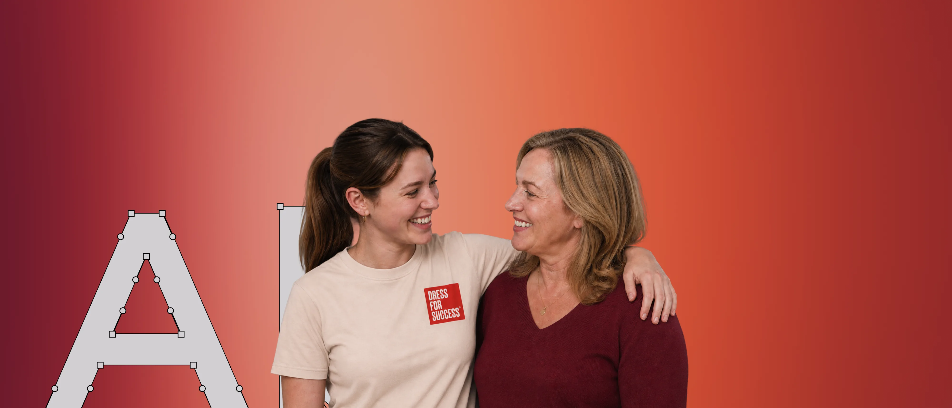
Brand Vision helps nonprofits make their mission easier to understand, trust, and support.
Nonprofits speak to many audiences. Donors need confidence. Volunteers need a clear way to help. Partners and boards need evidence. People seeking services may need answers immediately. Brand Vision creates one clear system across the brand and digital experience. As a nonprofit marketing agency, we help every audience understand the mission and find the right next step.

Building real partnerships with top global brands. Delivering results that last well beyond the launch.






Digital services that help people understand the organization and find the right way to participate.
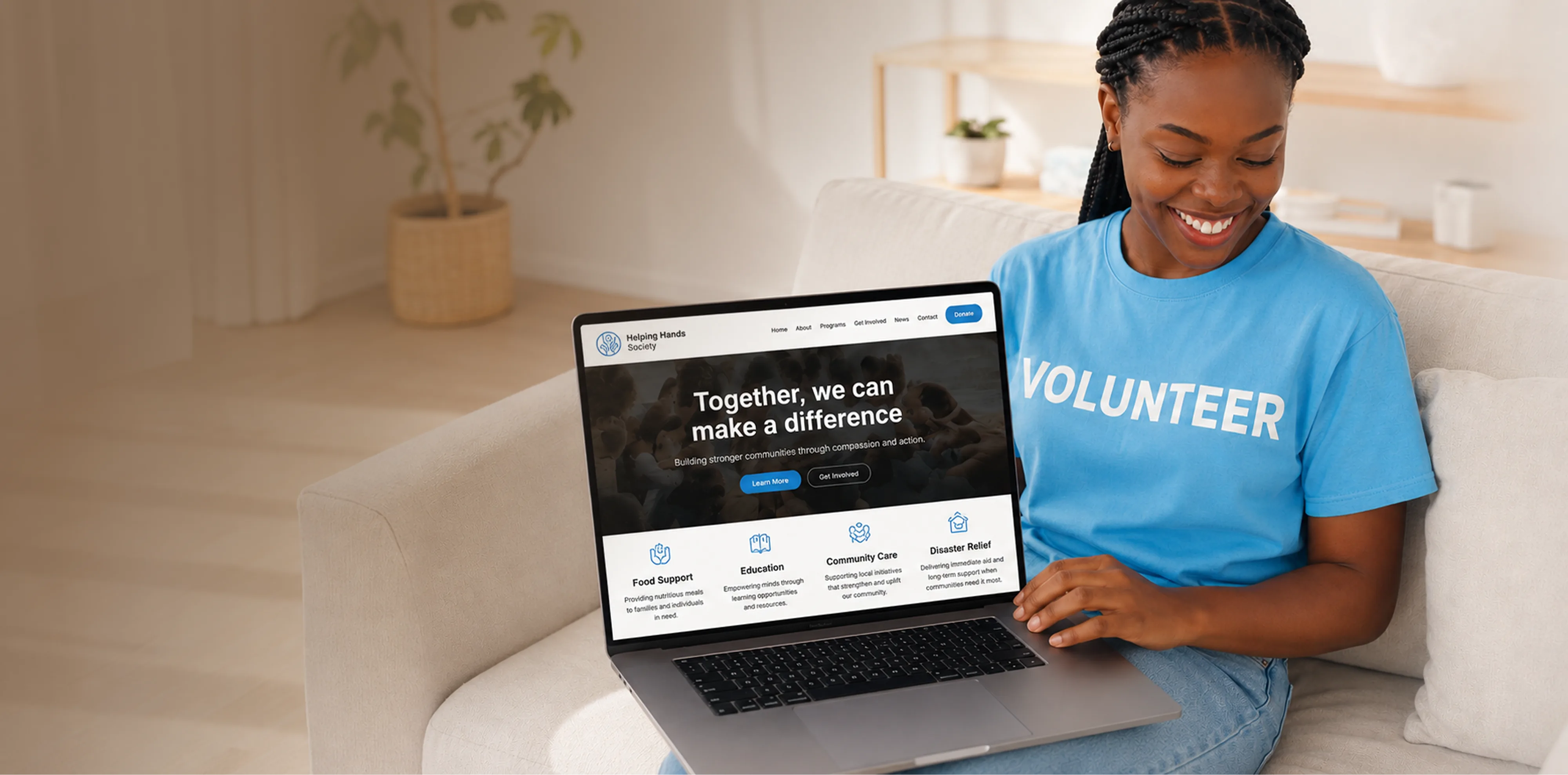
Nonprofit
Web Design
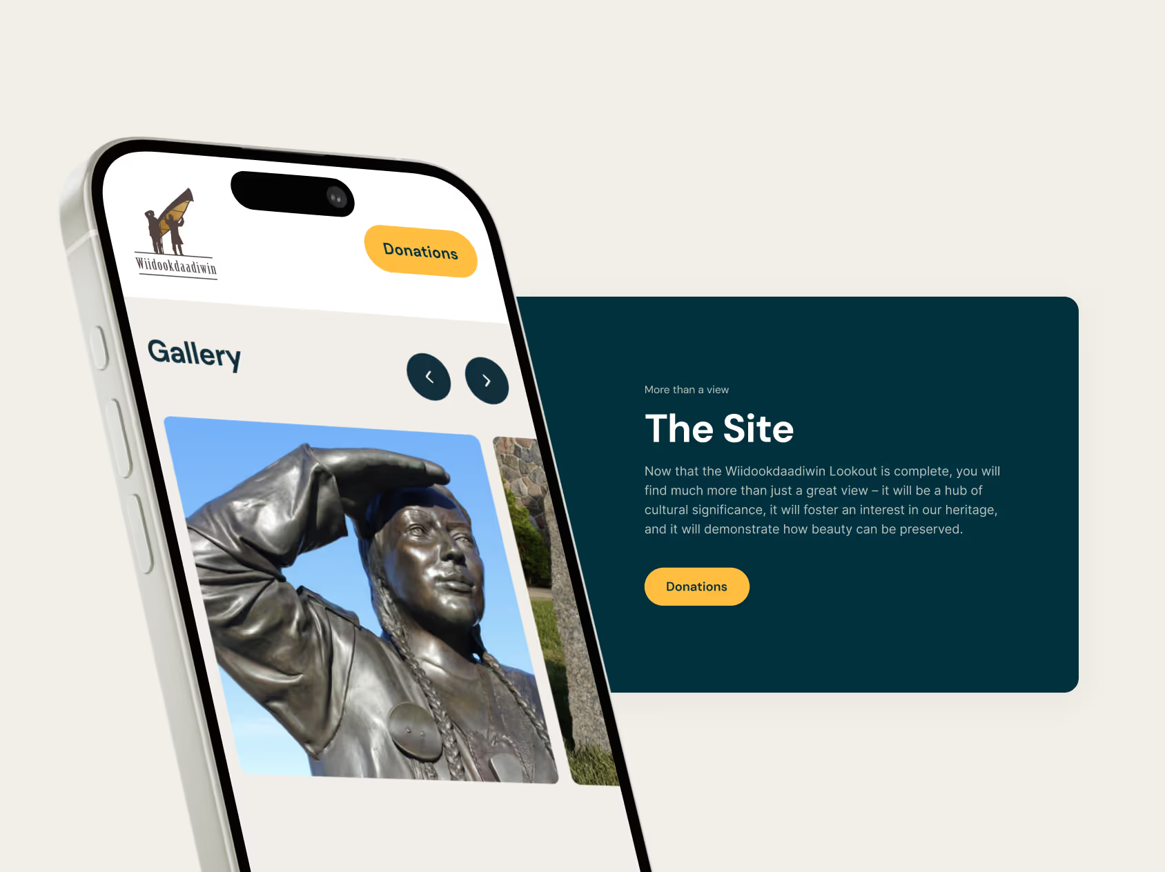
A nonprofit website is rarely only a fundraising site. It often works as a program directory, an impact and reporting archive, an event hub, and a volunteer portal all at once. Brand Vision separates those needs instead of forcing donors, volunteers, and service users down one crowded path. Our nonprofit web design builds an accessible route for each audience, a clear donation flow for supporters, and a content system small teams can keep current without a developer. The result serves the mission every day, not only during a campaign.
Nonprofit
Branding
Nonprofit branding has to create urgency without turning the people or communities it serves into a problem to be solved. Brand Vision develops the language, identity, and story that show why the work matters while protecting the dignity of those represented. Our nonprofit branding gives fundraising appeals, grant applications, and public campaigns greater emotional force without leaning on exaggeration or oversimplification, and it holds together whether it appears on a donation page, an annual report, or a community flyer.
Nonprofit
SEO
Nonprofits compete for attention with news publishers, government resources, larger charities, and established directories. Brand Vision finds the searches where that coverage is thin and the organization can genuinely help, whether someone is looking for a service, a way to donate, or trustworthy information on the cause. Our SEO and GEO strategy is built around those real-intent searches, and works to have the organization surface in the AI answers people increasingly rely on, so the mission reaches donors, volunteers, and service users the moment they are searching.

Nonprofit
UI/UX Design
Nonprofit websites often carry internal language, program names and department labels, that make sense to staff but not to the public. Brand Vision tests how real visitors interpret that language, then reorganizes the experience around the task each person came to complete: giving, volunteering, registering, or finding help. Our UI/UX design means no one has to understand the organization chart, or fight a confusing donation form, before they can act, and accessibility is built in so every visitor can take part.

Nonprofit
Marketing Strategy
Nonprofit marketing often becomes reactive. A fundraising deadline appears. An event needs promotion. A new program needs participants. Brand Vision builds a wider marketing strategy so each campaign supports more than the immediate need. Content builds trust before an appeal, email deepens the donor relationship afterward, and social media and partnerships extend the message without forcing every goal into paid advertising, which matters when every dollar is accountable to a mission.

Maintenance
& Support
Nonprofit teams are often small, and the website still has to stay current through campaigns, giving seasons, events, and program changes. Brand Vision provides ongoing website management, design support, and marketing consultation through one familiar team. Updates stay on brand, urgent changes get handled quickly, and staff are never left maintaining a system they did not build.

A genuine partner to
the nonprofit sector.
Brand Vision has long worked alongside mission-driven organizations, and we back that work with more than services. From national charities to community programs, we treat the cause with the same rigor and care as any brand we build.
Proud partners of the Huntington Society of Canada.
We stand with the Huntington Society of Canada as a recognized partner, credited on their own site. It's a lasting relationship built on a shared commitment to the cause, not a single project.
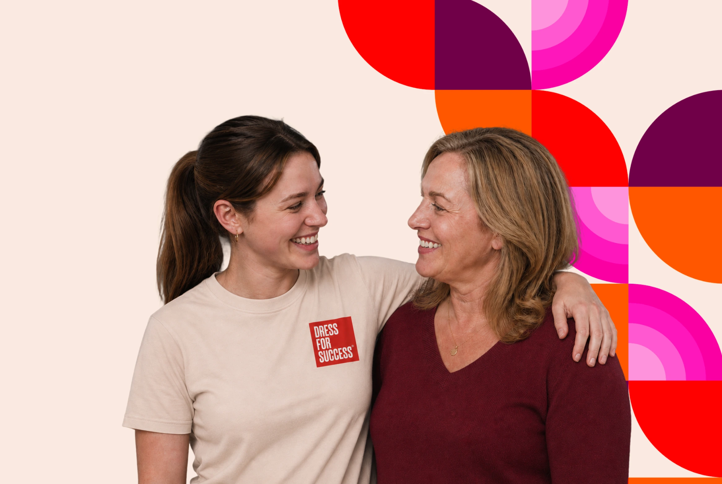
Proud partners of Dress for Success.
We're a featured partner of Dress for Success, listed on their partners page, putting our design and digital work behind a mission that helps people move their lives forward.
A standing 10% nonprofit discount.
Every registered nonprofit receives 10% off our work, because a tighter budget should never mean a weaker brand.
Latest Work
in the Nonprofit Sector
Selected brand, website, and campaign projects for charities, community organizations, and mission-driven groups.











Still have questions? Contact us to discuss.
A not for profit marketing agency designs for four audiences who want completely different things from the same website, and it does it under a budget that answers to a mission. A commercial site usually has one buyer and one path. A charity has donors who need confidence, volunteers who need a clear way in, funders and boards who need evidence, and sometimes people who need help today.
Four things change because of that.
No single path can serve everybody. A donation-first homepage buries the program someone urgently needs. A program-first homepage loses the donor who arrived ready to give. The structure has to hold both without asking anyone to guess.
Trust is the whole proposition. Nobody receives a product in exchange for a gift. What they receive is confidence that the money will do what you said, which makes clarity, evidence, and consistency commercial concerns and not soft ones.
The story has real ethical limits. Urgency sells and dignity matters, and the sector has spent decades learning what happens when the second gets sacrificed to the first.
Every dollar is accountable. Spend that a company would treat as routine gets questioned here, which means the work has to justify itself in outcomes and not activity.
So Brand Vision's nonprofit marketing services cover nonprofit branding and the language around the mission, a site that separates the audiences properly, search visibility for people looking for help as well as people looking to give, and campaigns timed to how giving actually behaves across a year. Brand Vision runs those together instead of as separate purchases.
On whether we actually know this sector, the honest evidence is the length of the relationships. We are a credited partner of the Huntington Society of Canada and a featured partner of Dress for Success, both listed on their own sites, and both relationships have outlasted any single project. More than 30 nonprofit partnerships over a decade is the number, and the useful part is how few of them were one-off engagements.
By designing a separate route for each audience from the first screen, and by naming those routes in the words visitors use instead of the words the organization uses internally. Almost every nonprofit site we inherit is organized around the org chart, and almost nobody outside the building understands it.
The specific failure is worth describing, because it is so consistent. Navigation reads "Programs and Services," "Our Impact," "Get Involved," and "Resources." A person who needs housing support does not know whether they are a program, a service, or a resource. A donor does not know whether the annual report lives under Impact or Resources. Both start clicking, and clicking is where people leave.
What we do instead.
Route by task, not by department. Give, volunteer, find help, partner with us, read the evidence. Five intentions, five obvious doors, each labelled with the verb the person would actually use.
Test the language instead of assuming it. Research with real visitors, including card sorting and short task walkthroughs, shows where internal vocabulary breaks. Program names that took a committee six months to agree usually need a plain-language subtitle, and that is not a criticism of the name.
Build a genuine program directory. Filterable by need, eligibility, location, and language, with each program as its own findable page. This is the part most charity websites treat as a PDF and it is frequently the highest-value content the organization owns.
Give the donor path its own logic. Ways to give, monthly options, where the money goes, and financial accountability in one place, so a considering donor never has to hunt for the number that convinces them.
Make the evidence section work for funders. Annual reports, financials, impact reporting, and governance in an obvious location. Grant officers and board candidates look for these first, and a hard-to-find annual report reads as an answer in itself.
That separation is the core of good nonprofit web design, and it is mostly an information architecture decision and not a visual one. The interface work then makes each route feel short.
By making the people you serve the agents in the story instead of the evidence for it. Urgency comes from the situation and the stakes, and it does not require anyone's worst moment as a fundraising asset.
The distinction we work to is between deficit framing and asset framing. Deficit framing describes a person by what they lack and positions the organization as the rescuer. It raises money in the short term, it damages the dignity of the people represented, and it quietly teaches donors that the community is helpless instead of under-resourced. Asset framing states the person's aspiration and the barrier in front of it. The urgency stays and the person stays whole.
What that means in practice.
Consent that is genuinely informed. People need to know where an image or a story will appear, for how long, that they can decline without losing service, and that they can withdraw later. This should be a written policy, not a case-by-case conversation, and we help write it.
Imagery that shows people doing something. Not looking into a lens in a moment of difficulty. The test is whether the person photographed would be comfortable with their neighbour seeing it.
First-person voice wherever possible. A quote in someone's own words carries more weight than a description of them, and it moves the authorship back to where it belongs.
Specificity instead of amplification. One accurate story is more persuasive than a general claim made larger. Exaggeration is the thing that eventually costs an organization its credibility, and credibility is the only currency here.
Language checked with the community, and not with the communications team alone. Terms move quickly and being current matters.
Out of that comes a brand strategy with a messaging framework, a written editorial policy on stories and imagery, and a visual system that holds together across a donation page, an annual report, a grant application, and a community flyer. Those four contexts have very different tones and they need to be recognizably one organization, which is where most charity branding quietly falls apart.
The form itself, before anything upstream of it, because most nonprofit donation flows lose more people at the form than the campaign ever lost at the ad. The good news is that this is the cheapest fix in the sector.
Roughly in the order we find them.
We work with whatever processor and CRM you already have, since a charity's donation stack is rarely something to rip out. The fastest way to know where your money is going is a UX audit on the giving path, which usually takes two weeks and pays for itself, and then the fixes land in the site and the form together.
Most organizations either are not using it or are running it one policy check away from suspension, and it is worth ten thousand US dollars a month in search advertising. No other lever available to a charity marketing agency comes close for the money, and it is the most under-used asset in the sector.
What it is and is not. The grant provides in-kind Google Search advertising each month for eligible registered charities. It is Search only, so it does not cover Display, YouTube, or Performance Max, and unspent budget does not roll over. It sits alongside a paid account instead of replacing one, and grant ads generally rank below paid ads in the same auction, which matters for competitive terms.
Where accounts get into trouble, and this is the part nobody warns people about.
The click-through rate requirement. Accounts are expected to maintain a click-through rate above five percent, and falling below it repeatedly leads to suspension. Broad keywords with weak ad copy are the usual cause.
Conversion tracking that must exist and must be meaningful. Valid tracking of at least one significant action is a condition of participation, and "significant" does not mean a pageview.
Keyword rules. Single-word keywords and overly generic terms are not permitted, and a quality score floor applies. Accounts built by importing a list of broad terms tend to breach several rules at once.
Account structure and activity requirements, including geo-targeting, active campaigns, and regular management. A dormant grant account is a suspended grant account eventually.
Landing pages that have to be on your own domain and cannot be commercially oriented in the ways a business page might be.
So the honest answer about help is yes, we manage grant accounts, and the more useful answer is what it is good for. It performs best on high-intent searches where somebody is looking for your service, your cause, or a way to donate. It performs poorly as a general awareness tool. Where demand exceeds what the grant can capture, a small paid budget alongside it covers the competitive terms the grant cannot win, and the organic side is usually the better long-term investment anyway. Google adjusts these policies from time to time, so anything specific gets verified against the current program rules before we build to it, and a conversation will tell you quickly whether your account is at risk.
By going after the searches where the big players are generic and you are specific, which for a charity usually means local, program-level, and cause-specific queries. You will not outrank a government health portal for a condition name and you do not need to.
Where the opportunity actually sits.
Service and eligibility searches. Somebody looking for support in a named city, for a named situation, in a named language. Government pages describe policy and large charities describe programs nationally. Neither can say what happens in your neighbourhood on a Tuesday, whether there is a waitlist, or what to bring. That specificity is genuine local search territory and it converts to real contact.
Cause information written by people who do the work. Not a restatement of a medical or policy page. What families actually ask, what the first month looks like, what nobody tells you. This is where lived expertise beats institutional authority, and it earns the links and citations that lift the rest of the site.
Ways-to-give and legacy searches. How to donate, monthly giving, gifts in a will, in-memory giving, workplace and matched giving. Low volume, extremely high value, and almost always neglected because they feel unglamorous.
Volunteer and career searches. People search for volunteer opportunities by city and by type. A single page listing opportunities with real detail outperforms a form behind a Get Involved tab.
Event and campaign pages that persist. Annual events lose their equity every year when the page is deleted and rebuilt. One permanent URL per event, updated annually, compounds instead of restarting.
Underneath it, the technical basics have to be right, meaning a crawlable program directory, clean indexation, and pages that load on a slow connection because many service users are on older phones and limited data. That work belongs in technical SEO. The content side is where the sector has the biggest untapped advantage, because charities hold knowledge nobody else can write, and they publish almost none of it. The wider approach is in our search practice.
More than you would expect, and it matters most for the audience you are least likely to be thinking about, which is somebody asking where to get help. A person typing a difficult question into an AI tool at eleven at night is having a private conversation they might not be ready to have with a human, and the answer they get either includes you or does not.
What determines whether it does.
Structured, factual answers to real questions. Who is eligible, where the service is, what it costs, what languages are available, how to make contact, what happens next. Stated plainly in text, on a page, so a system can extract them without inference.
Entity clarity. The organization, its registered name, the programs it runs, and the geography it covers, described consistently everywhere it appears. Charities often operate under a working name, a legal name, and several program names, which is exactly the ambiguity that gets an organization left out of an answer.
Third-party corroboration. Directories, community resource lists, news coverage, and partner sites. These systems weigh what independent sources say, which makes earned coverage and authority a service-delivery input as much as a fundraising one.
Pages written to be lifted. A clear question as a heading with the answer directly underneath it. A page that opens with three paragraphs about the organization's founding before saying who qualifies will lose to one that answers first.
One technical detail quietly disqualifies a lot of charity sites. Several of the major AI crawlers will fetch a JavaScript file and never run it, which means anything assembled by script after a page loads does not exist as far as they are concerned. Program directories loaded from a database at runtime, accordion eligibility sections, and tabbed service listings are the common casualties, which means the most important content on a nonprofit site is often the least visible to these systems. Checking that is early work in any AI search engagement.
There is a dignity argument here too. If the AI answer about your cause is assembled from sources that describe your community badly, the correction is publishing better material yourself, not hoping the model improves.
Assume the visitor is frightened, in a hurry, possibly on a borrowed phone, and possibly not alone. Every design decision on those pages gets made against that assumption, and it is a very different brief from a donor journey.
What changes.
The next step has to be visible without scrolling. A phone number that dials on tap, a text line, a live chat, or the address and hours. Not a contact form at the bottom of a page about the organization's history.
Plain language, tested. Short sentences, everyday words, and an aim of around a grade six to eight reading level on service pages. This is not condescension. Stress reduces reading comprehension in everybody, and a person in crisis is not reading carefully.
A quick exit where safety requires it. For organizations working with family violence, stalking, or trafficking, that means a clearly visible way to leave the page immediately, guidance on browsing history, and a design that does not autoplay anything audible. It also means being careful about what appears in a browser tab title.
Eligibility and cost answered upfront. The two questions everybody has are whether this is for me and whether I can afford it. Both belong above the fold, and "free" or "no cost" should be stated in exactly those words.
Language access that is real. Translated service pages instead of a machine-translation widget, for the languages your community actually uses, with the language switcher findable without English.
Works on old hardware and weak connections. Light pages, no dependency on a modern browser, and content that is present in the served HTML instead of assembled by script. The people most in need of these pages have the worst devices.
Nothing that feels like surveillance. Careful use of tracking on sensitive pages, no third-party pixels where a visit could imply something about a person's situation, and a privacy note written for a worried reader instead of a lawyer.
This is nonprofit UI/UX design doing its most consequential work, and the interface discipline behind it matters more here than anywhere else we work, and for organizations in health, mental health, or community care it overlaps closely with how we approach health and wellness more broadly. It is also the part of a project we will push hardest on, because it is where a website stops being marketing.
Some of it is a legal obligation depending on where you operate and how many staff you have, and all of it is a mission argument that is hard to defend ignoring. Charities get asked this a lot and rarely get a straight answer.
On the legal side in Ontario, accessibility regulations require public-facing websites to meet WCAG 2.0 Level AA for organizations above a staff threshold, with a small number of exceptions such as live captioning and pre-recorded audio description. Many mid-sized and larger charities sit inside that scope and do not realize it. Smaller organizations frequently sit outside the specific web requirement while remaining subject to the broader duty not to discriminate. Elsewhere in Canada and in the United States the framing differs, and the practical standard being assessed is consistently WCAG. Where you sit exactly is a question for your counsel, and we are not lawyers.
On the mission side the argument is shorter. A meaningful share of the population lives with a disability, and for many charities that share is higher among the people they serve than in the general population. An inaccessible service page excludes exactly the person the organization exists for, which is a harder thing to explain to a board than a remediation invoice.
What it involves in practice. Keyboard access and visible focus states through every interactive element including the donation form. Real text contrast, which is where imagery overlays usually fail. Alt text that describes purpose instead of appearance. Correct heading structure and semantic markup, which also helps search. Forms with proper labels and error messages that say what to do. Captions on video. And an accessibility statement with a way to report a problem, which costs nothing and signals a great deal.
There is a funding angle worth knowing. Accessibility remediation is often eligible under capacity-building or infrastructure grants where general marketing spend is not, which makes it one of the easier things to get funded.
Standards are treated as requirements from the first day in everything we build, not as an enhancement traded away when a launch date tightens. For an existing site, an audit against WCAG will tell you where you stand and what the remediation actually costs, which is usually less alarming than expected.
You do, for the everyday things, because the site gets built so that a non-technical person can run it confidently. And we do for everything else. A charity website that needs a developer for a program change will be out of date within a year, and that is a design failure and not a staffing one.
What we build for a small team.
A content system with guardrails. Program pages, news, events, staff, and appeal content editable in plain fields, with a structure that cannot be broken by accident. Not a blank canvas that produces a different-looking page every time.
Templates for the things you will do repeatedly. New program, new event, new campaign landing page, annual report. Assembled from defined blocks in under an hour.
Written documentation and a recorded walkthrough, so the knowledge survives the person who received the training leaving. Sector turnover makes this more valuable here than almost anywhere.
A clear line about what needs us. Layout changes, new page types, integrations, and anything touching the donation flow. Those come to us so nobody is nervously experimenting on a live giving page in November.
Training that includes the volunteer or student who will inherit it, because in a two-person shop the person maintaining the site in eighteen months has not been hired yet.
Then ongoing support sits behind that. Website management, design support for campaigns and appeals, urgent changes handled quickly during a giving season, and marketing consultation when a decision needs a second opinion. All through the same team that built it, so nobody is left maintaining a system they did not design and cannot get help with.
If your current site is already at the point where nothing can be changed without a developer, that is usually a rebuild conversation, and we will tell you honestly whether it can be salvaged. Sometimes the right answer is a smaller, simpler site your team can actually run, and that is a legitimate recommendation and not a downgrade.
A nonprofit marketing strategy gets planned backwards from the giving calendar, because in most organizations a disproportionate share of annual revenue arrives in the last six weeks of the year and the work that determines it happens months earlier. A December appeal built in November is competing with organizations that started in August.
How the year gets planned.
On reporting, the numbers we lead with.
Where the wider strategy needs paid support during a peak, that gets scoped as a defined push instead of an always-on spend, which is the right shape when every dollar is accountable to the mission.
Every registered nonprofit gets ten percent off our work, applied as standard rather than negotiated, and beyond that the more useful lever is scope. A tighter budget should change what gets built first, not how well it gets built.
The discount is simple. If you are a registered charity or nonprofit, ten percent comes off, on the whole engagement and not on selected line items. No campaign qualification and no annual cap.
What actually moves the number.
How we make the money go further, and this is the part worth asking about. Phasing, so the highest-value part ships first and the rest follows when funding allows, rather than a smaller version of everything at once. Scoping to what a grant will actually cover, since capacity-building and infrastructure funding frequently covers website and accessibility work that general operating funds will not. Building for your team to run, so you are not paying an agency for edits forever. And saying plainly when the honest recommendation is a fraction of what you asked for, which happens often and is usually a consultation rather than a build.
On whether Brand Vision takes the sector seriously, the partnerships answer that better than we can. The Huntington Society of Canada and Dress for Success both list us on their own sites, and those relationships have continued well past the original engagements. You can see the work in selected projects, and tell us what you are working with to get a scoped read, including what the discount brings it down to.
Original research and expert perspective on design, branding, and the strategy behind both.

Our goal is to nurture your vision and provide innovative, custom solutions for all your marketing needs.