












Branding
B2B Branding Strategy: Positioning, Proof and Buying-Committee Trust
Sep 6, 2026
/ By Hamoun Ani
Visual identity design that makes a brand recognizable everywhere it appears, from a social post to a storefront.
The strongest brands are recognized with the logo covered. A palette at a distance, a typeface on a page, the way a layout breathes, each one identifying the company before the name is read. Brand Vision builds visual identity design for that level of recognition, developing the palette, typography, and system that make a brand known by everything it touches.

Building real partnerships with top global brands. Delivering results that last well beyond the launch.







Visual identity design across the complete system, built around a new logo or the one you already have.
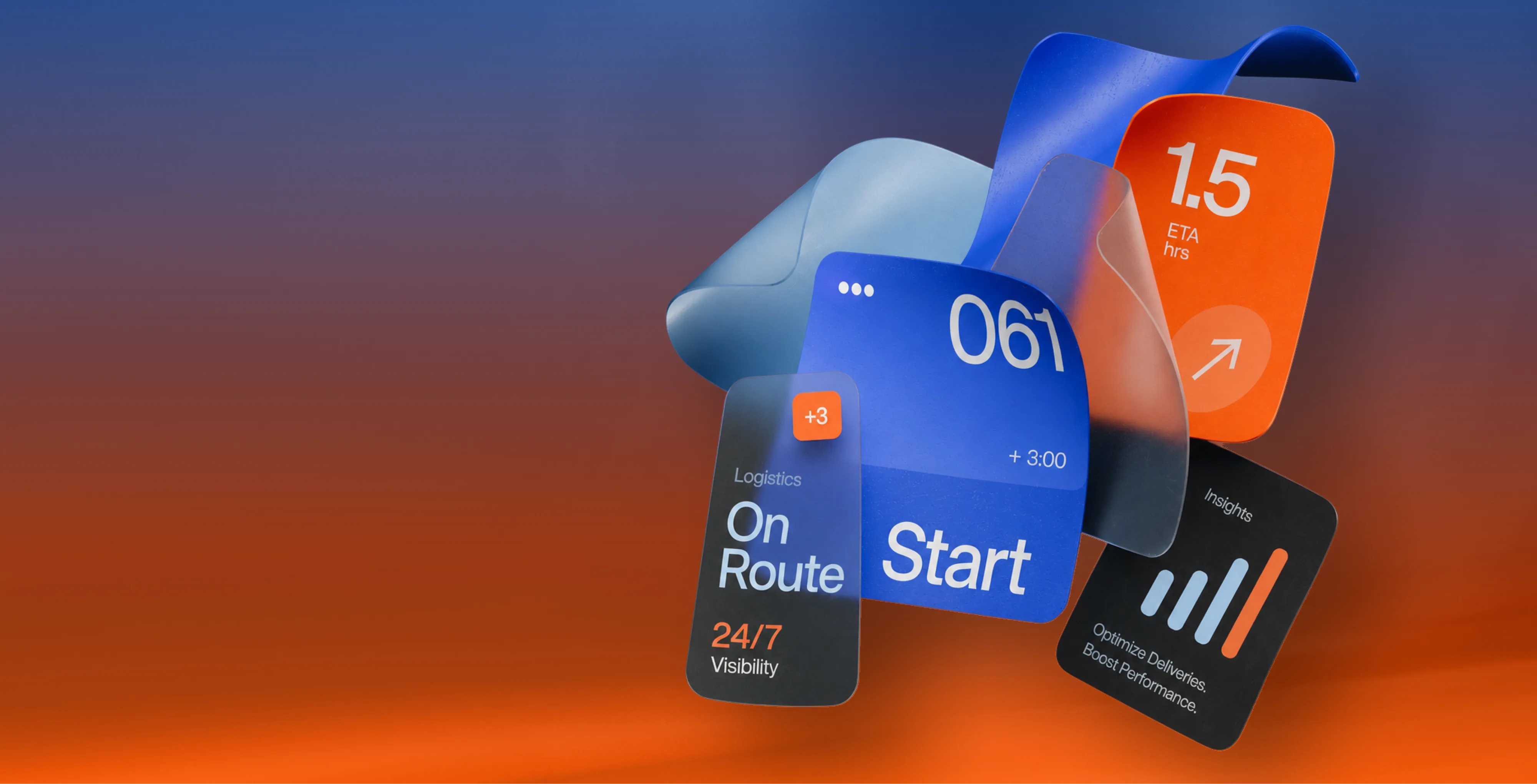
A brand identity system is every visual decision resolved and written down, palette, typography, iconography, spacing, imagery, and the rules for combining them. Brand Vision builds the system as one piece rather than a folder of parts, so anything produced from it looks related to everything else. It works around an existing logo as readily as a new one. Delivered as working files and clear documentation, it is the difference between owning assets and owning an identity.

Everything else in a visual system is built to agree with the logo, which is why we treat it as its own discipline rather than one deliverable among eight. Brand Vision designs original logos, redesigns existing ones, and builds the guidelines that keep them consistent, work that runs alongside identity projects or stands entirely on its own. There is considerably more to it than a single panel can hold.

The colour palette is recognized before anything else on the page, at a distance, in a feed, at the edge of attention. Brand Vision develops each brand palette as a working system rather than a set of swatches, a lead tone chosen to stand apart in the category, supporting tones with defined roles, and functional tones for interfaces. Every value is specified for print and screen, with contrast checked for accessibility, so the palette performs everywhere it is used.

Most of what a brand produces is words, which makes typography the most used part of any identity. Brand Vision selects and pairs typefaces for character and for work, confirming the weights, languages, and licensing a business actually needs before anything is locked. Hierarchy is set so documents structure themselves, and screen performance is tested where most reading now happens. Brand typography, chosen once and properly, removes a thousand small decisions from everyone who writes anything afterward.

Icons multiply faster than any other brand asset, across interfaces, presentations, packaging, and signage, and most companies end up with a mixture pulled from different libraries. Brand Vision designs iconography as a single family, one geometry, one stroke, one level of detail, drawn to match the logo's character and to remain legible at interface sizes. The set is built to be extended, so the fiftieth icon, made next year, still looks like the first ten.

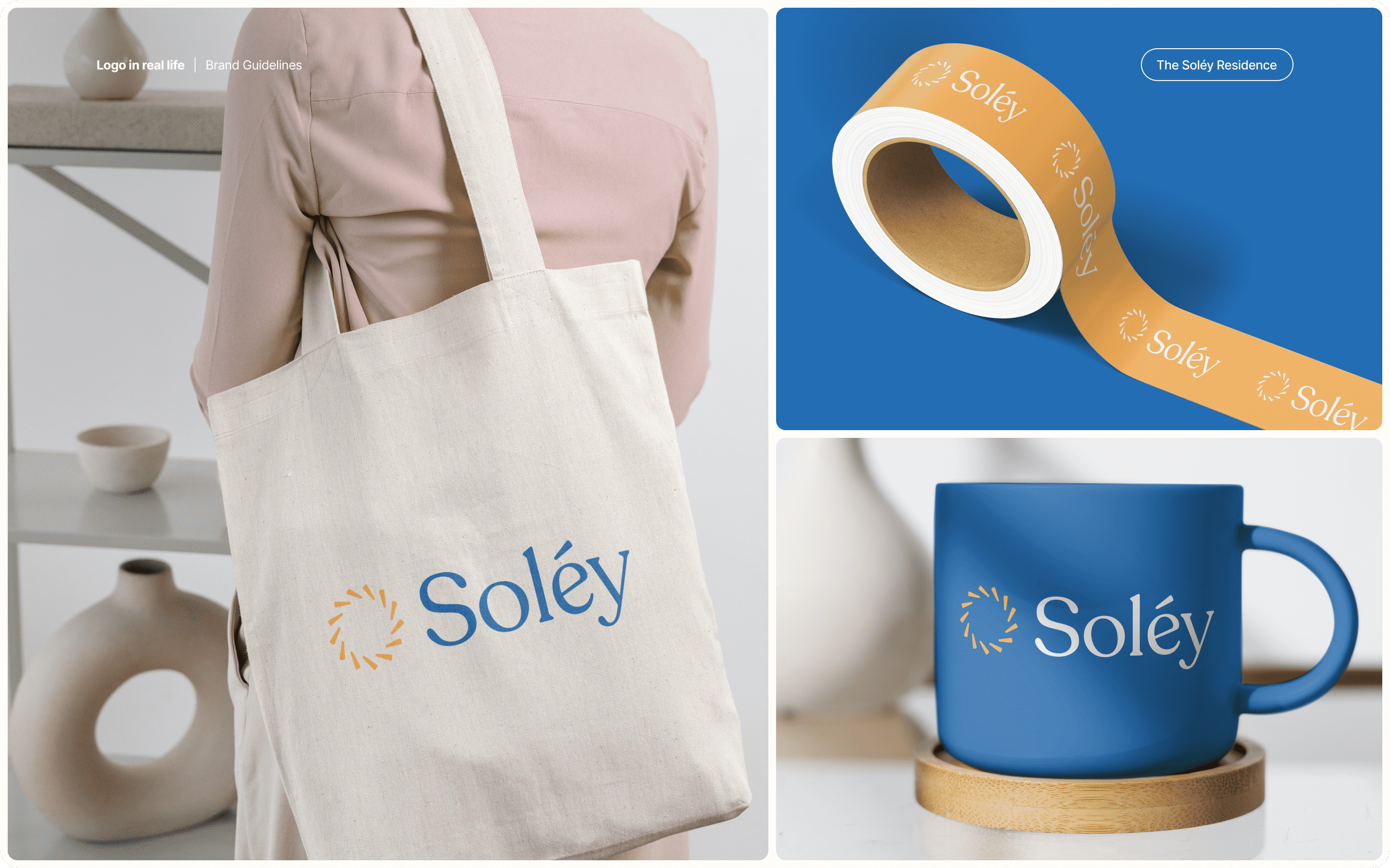
Brand collateral design covers everything a business hands to someone, presentations, proposals, stationery, social formats, and the documents a team sends daily. Brand Vision builds each piece from the brand identity design rather than alongside it, then delivers working brand templates in the tools a team already uses, so producing something on-brand takes less effort than producing something off it. The measure is simple, work made months later, by someone we never met, still looking like the brand.
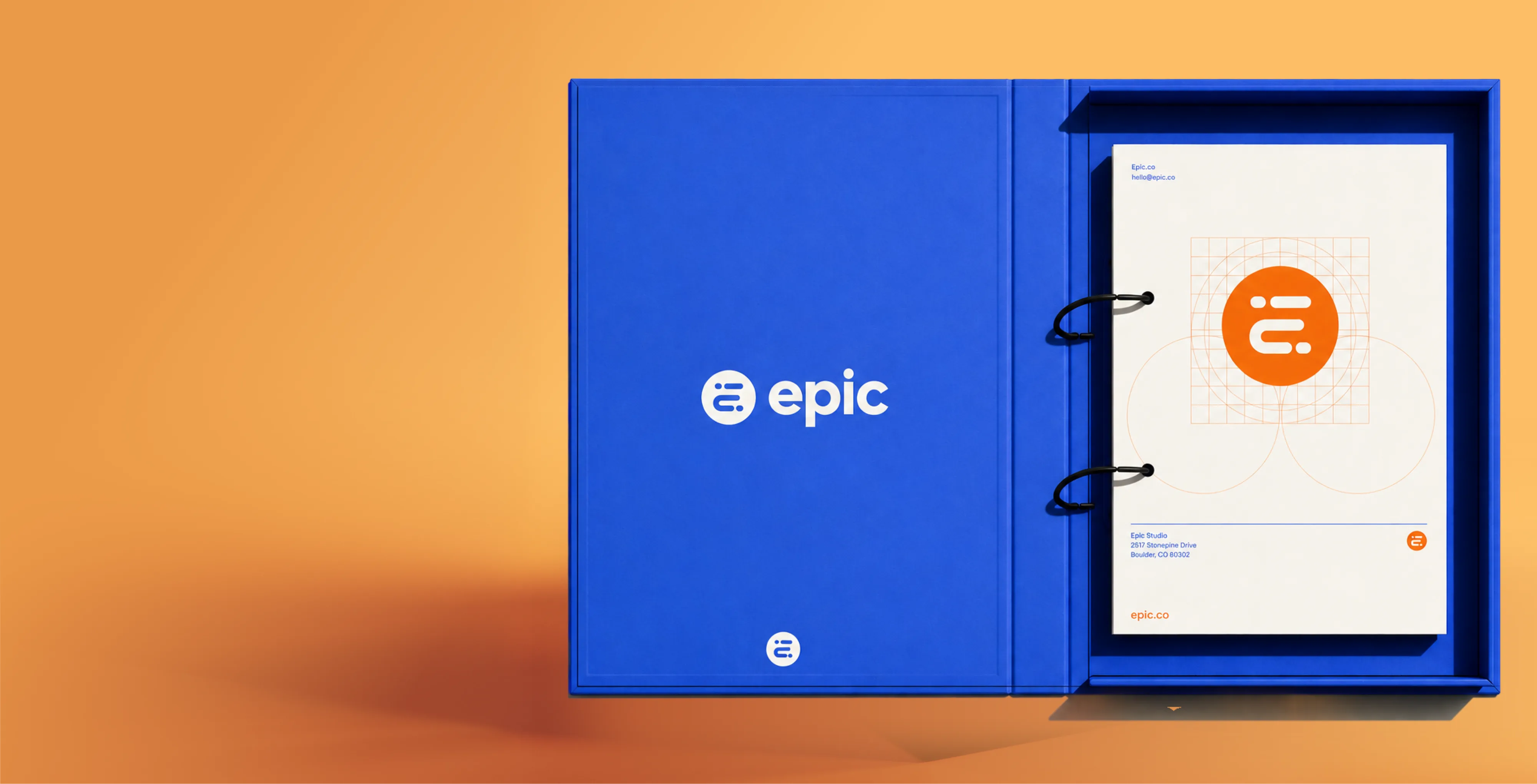
A brand book is what allows a brand identity design to survive contact with everyone who will use it. Brand Vision documents every decision in the system, the logo and its lockups, palette values for print and screen, typography and hierarchy, iconography, imagery direction, and the rules for combining them. Written for the people who will actually open it, printers, partners, agencies, and whoever builds the next presentation, with examples of correct and incorrect use because those settle arguments faster than rules do.
From the core decisions to a system anyone can use.
We study the brand, its category, and where it shows up, so the system is built for the places it actually appears.
The palette, typography, and core visual language are set and pressure-tested against the brand's real touchpoints.
Every element is resolved into one connected system, so anything made from it looks related to everything else.
You receive working files and a brand book clear enough for anyone to keep the identity consistent.
Identities shown across the touchpoints where consistency is actually tested.
Every industry lives in different touchpoints. A restaurant's identity works hardest on menus and signage, a software company's inside interfaces and presentations, a clinic's on forms. Brand Vision weights visual identity design toward the places a brand actually appears.












Product depth shouldn’t slow the story down. We partner with SaaS, platform, and enterprise software teams to translate technical capability into focused narratives. Clear paths to demo, trial, or contact serve both buyers and technical evaluators. Systems are built for product-led growth with composable components, editor guardrails, and instrumented analytics that tie directly to pipeline.
Complex services sell on clarity, not volume. We help consulting, financial, and advisory firms structure their digital presence around buyer tasks: understanding capabilities, comparing options, and starting a brief. Every touchpoint earns trust through specificity and proof. Content is organized by audience need, so the people making the hiring decision find answers quickly and move to contact without friction.
Patients and practitioners make high-stakes decisions under pressure. We design trust-first experiences for healthcare and wellness brands, keeping clinical accuracy intact while making it simple for people to find the right provider, service, or next step. Accessibility, privacy-compliant forms, and plain-language content are standard. Local visibility for practices and clinics is built into the foundation, not bolted on later.
Prospective clients searching for legal help are often under pressure and comparing firms quickly. We help law firms present practice areas with credibility, surface the right contact paths, and build a digital presence that earns trust before the first conversation. Clear structure, plain language, attorney profiles, and consultation flows make it easy for people to take the next step with confidence. Ethical advertising compliance is built in from the start.
Buyers, investors, and project owners move on trust and timing. We work with brokerages, developers, general contractors, and property management firms to present listings, projects, and capabilities with clarity. Content is organized around what prospects actually need: proof of work, service scope, location context, and a direct path to inquire. Pre-construction launches and trade portfolios get the same strategic rigor as resale platforms.
Conversion lives in the details. We work with consumer and ecommerce brands to build fast, clear shopping experiences where product pages explain value quickly, checkout flows reduce friction, and the entire system scales with the catalog. Promotional templates, collection architecture, and performance monitoring keep the storefront sharp as demand and inventory shift with seasons. The result is a store your team can run day to day without developer dependency.
Early-stage companies need focus over flash. We help startups define positioning, build a credible identity, and launch a conversion-ready presence that clearly communicates what the product does, who it’s for, and how to get started. Everything is built to scale: component systems, content structures, and analytics foundations grow with the roadmap instead of needing a rebuild at Series A. The pitch and the website tell the same story.
Students, parents, and administrators all need different answers from the same site. We help schools, universities, and training organizations structure digital experiences by task: apply, visit, inquire, enroll. Accessible design and plain-language content serve diverse audiences without alienating any of them. A manageable CMS means internal teams keep program pages, event listings, and admissions information current without outside help or bottlenecks.
Nonprofits compete for attention, funding, and volunteers simultaneously. We build accessible digital experiences that make programs clear, donation paths intuitive, and calls to action specific enough to drive real participation and support. Content governance is designed for lean teams, so pages, campaigns, and impact reports stay current without bottlenecks. The organizations doing the most important work deserve a digital presence that matches their mission.
From restaurants to packaged goods, this industry sells on quality and convenience. We help food and beverage brands connect story with logistics: clear menus, product lines, ordering options, and wholesale paths that make it obvious how to buy and reorder. Identity and digital experience work in tandem so visitors see quality and know exactly what to do next, whether they’re a consumer walking in or a distributor placing a first order.
Audiences decide in seconds. We work with labels, venues, talent agencies, and event companies to build media-rich, performance-optimized experiences where the work is front and center. Booking, inquiry, and ticket paths stay visible and fast across devices. Campaign templates and component systems let teams launch content for new shows, releases, and events without starting from scratch each time. The creative comes first; the infrastructure stays invisible.
Guests research and book across multiple touchpoints. We help hotels, resorts, tourism brands, and event venues present their experience with clarity, connecting visual storytelling with practical booking flows, local discovery, and seasonal content that stays current. The systems we build make it straightforward for teams to update rates, packages, and promotions without depending on a developer for every change. The experience starts online, and it should feel as considered as the stay itself.










Original research and expert perspective on design, branding, and the strategy behind both.
Still have questions? Contact us to discuss.
A visual identity design agency decides what a brand looks like everywhere it appears, then writes those decisions down so they hold once other people start producing work. Brand identity design is the same discipline under a different name, and the visual identity services below are how it gets delivered. The first half is design. The second half is what separates an identity from a folder of files, and it is where most projects quietly fail.
What the work covers. The palette, the typography, the iconography, the imagery direction, the spacing and layout logic, and the rules for combining them. Then the collateral a business actually hands to people, and the documentation that keeps all of it consistent in a year.
Why clients choose us for it.
Built as one system instead of a set of parts. Every element gets resolved against the others, so anything produced from the system looks related to everything else. A palette chosen without the typography in mind and an icon set drawn without the logo in mind produce assets that technically match and never look like one brand.
Tested on real touchpoints before it ships. A system that only works on the presentation slides it was designed in is not finished. We pressure-test the direction against the places your brand actually appears, which differ enormously by business.
Written for the people who will use it. Printers, partners, a new hire, whoever builds the next deck. Guidelines that only a designer can follow protect nothing.
Senior people doing the work. More than 100 visual identity systems designed across a decade, and the person setting the direction is the person presenting it. You can see the systems themselves and who built them before deciding anything.
The standard we hold this to is recognition with the logo covered. A palette at a distance, a typeface on a page, the way a layout breathes. When those identify the company before the name is read, the identity is doing its job.
Seven parts of the visual identity system, resolved together and documented as one thing. Most engagements need all of them, and a few businesses genuinely need less, which we will say.
The identity system itself. Every visual decision made and written down, meaning palette, typography, iconography, spacing, imagery, and the rules for combining them. Delivered as working files plus documentation instead of flattened exports. Spacing and layout logic are part of that scope, and they are the parts nobody asks for by name and everybody notices when they are missing.
Logo development. Everything else is built to agree with the mark, which is why it gets treated as its own discipline. Original marks, redesigns of existing ones, and the lockup system underneath. There is considerably more to it than one section can hold, so it has its own logo design page.
Colour palette. A lead tone chosen to stand apart in the category, supporting tones with defined roles, and functional tones for interfaces. Every value specified for print and screen with contrast checked.
Typography. Typefaces selected and paired for character and for work, with the weights, language coverage, and licensing confirmed before anything is locked, and a hierarchy set so documents structure themselves.
Iconography. One family with one geometry, one stroke weight, and one level of detail, drawn to match the mark and built to be extended.
Brand collateral. Presentations, proposals, stationery, social formats, and the documents a team sends daily, built from the system and delivered as working brand templates. The wider collateral and template work covers the production side of it. The list is business-specific, so a clinic needs intake forms and a software company needs a pitch deck and release notes, and we scope from what your team actually sends out.
The brand book. The document that lets all of the above survive contact with everybody who will use it.
Where a business genuinely needs less. A single location with one person producing everything can run on a mark, a palette, a type pairing, and two templates, and paying for a full icon family and a long book would be waste. The useful test is how many people will produce material without asking anybody first, since a system exists to answer questions when you are not in the room.
Where the position and messaging underneath are still unsettled, that is brand work and not identity work, and doing it in the wrong order means paying for the same decisions twice.
A logo is one asset. A visual identity is the system that makes everything else you produce look like it came from the same company. Buying the first and expecting the second is the single most common misunderstanding in branding, and it is expensive in a way that only becomes obvious about a year in.
With a logo, you can put a mark on things. With an identity, somebody who has never spoken to you can build a page, a deck, a sign, or a social post and it will look like your brand.
What a logo cannot answer, and all of it comes up within weeks of launch.
Why it matters commercially. Recognition is built by repetition, and repetition only accumulates when things look consistent. A business producing material that varies every time is paying full price for attention each time and banking none of it. Three people making three different-looking things does not read as variety, it reads as a company that has not decided who it is.
The second reason is cost. Without a system, every new piece of work restarts the argument. With one, a page or a deck takes a fraction of the time. Businesses that buy a logo and stop usually come back inside eighteen months, and the work they need then is the same work, at the same price, plus whatever was produced inconsistently in between.
So the honest sequence is positioning first, then the mark, then the system around it, and you can see how those stack across our services. If budget only stretches to part of that today, take the earlier parts and make sure nothing has to be redone later.
Most of the time we do, and it is a good deal more common than starting from nothing. A mark with recognition behind it is an asset, and replacing it because an identity project is starting is the wrong reason to replace it.
When the existing logo stays and the system gets built around it. Customers already recognize it and connect it to you, and it holds up at small sizes. And it does not actively fight the direction the brand needs to move in. In that case the palette, typography, iconography, and layout logic all get developed to agree with the mark, and the result usually feels like a significant change even though the logo is untouched, because most of what people see is everything else.
When the mark needs work first. There is more detail in it than a favicon can hold. The files are unusable or the vector has gone missing. Proportions or spacing were never properly resolved. Or it depends on effects that break in one colour and in print. Those are fixable without discarding recognition, and that sits with the logo work.
When the honest answer is that it has to go. The position has changed, the audience has changed, the name no longer fits, or the mark is genuinely limiting how the business can be understood. That is a rebrand and it should be scoped as one instead of smuggled into an identity project.
How we work it out. An audit of the mark against the places it actually has to perform, plus an honest read on how much recognition it genuinely carries. That second part matters, because familiarity inside the company is not the same as recognition in the market, and teams consistently overestimate how attached customers are to a mark they see far less often than staff do.
One practical note. Building a system around an inherited logo takes more skill than building one around a mark you drew, because you are working to a constraint somebody else set. It is also frequently the better outcome for the business, and we would rather do the harder version than sell a replacement nobody needed. Where the wider audience and category research shows the business has moved on and the mark has not, we will say that too.
A focused identity system runs six to ten weeks. An identity including a new logo and a full brand book runs three to four months. Cost scales with the number of applications and how much documentation the business needs, and the four stages are the same either way.
Research. One to two weeks. The brand, the category, and where it actually shows up, so the system gets built for the places it will be used instead of for a presentation. This is where we establish which touchpoints matter most, and the answer differs enormously by business.
Direction. Two to three weeks. Palette, typography, and the core visual language, set and pressure-tested against real touchpoints. Directions get presented in batches and discussed instead of delivered as a fixed number of options, and we keep going until it is right.
System. Two to four weeks. Every element resolved into one connected whole. Iconography, spacing logic, imagery direction, layout rules, and the combinations. The least visible stage and the one that determines whether the identity holds.
Deliver and document. One to two weeks. Working files, templates, and a brand book clear enough for somebody who was never in the room.
What moves the number. Whether a new logo is in scope. How many applications need designing, since a system plus five templates and a system plus thirty are different projects. Language requirements, particularly where bilingual or multi-script support is needed. Photography, if the imagery direction requires a shoot. How thorough the brand book has to be. And approval structure on your side, which is the largest single cause of a slipped timeline and worth being honest about at kickoff.
Where the position is unsettled, that comes first, and buying an identity against an unfinished strategy means paying for the same decisions twice. A scoped consultation is a cheaper way to find out than a design project. If you are working to a launch date, say so on the first call and you will get a straight read on whether that date and that scope can coexist.
By deciding what has to be recognizable at a distance first, then building the rest of the palette to work. Colour is the fastest-read element of any identity, which makes it the most valuable and the easiest to get wrong.
How a palette actually gets built.
The lead tone, chosen against the category. If every competitor is blue, the decision is whether to be the one that is not, or to be a blue nobody else owns. Both are valid and they are different strategies. We map the category before choosing, because a lead tone that blends in gives away the one element that works before anybody reads a word.
Supporting tones with defined roles. Not a mood board of colours somebody liked. Each one has a job, meaning where it appears, at what proportion, and what it is never used for. A palette without ratios turns into whatever the last person felt like.
Neutrals, which do most of the work. Most of what a brand produces is mostly neutral, and the greys and off-whites decide whether a brand feels warm, clinical, expensive, or cheap. They are chosen deliberately instead of defaulted into.
Functional tones for interfaces. Success, warning, error, disabled, focus, and link states. Every digital product needs these and identity projects routinely forget them, which means a developer picks them and the brand loses control of a third of the screen.
Contrast checked properly. Text needs a real contrast ratio against its background, and interface elements need one too. A lead tone that fails contrast means every button, caption, and link built on it is a compromise forever. We check this during selection instead of discovering it in the build, and it is one of the places interface work and identity work genuinely overlap.
Specified for print and screen. Values given for CMYK, RGB, HEX, and Pantone, and where a colour simply cannot be matched in process print, that gets flagged before it becomes a brand rule. Some very saturated screen colours have no honest CMYK equivalent, and finding that out at proof stage is a bad afternoon.
A dark mode variant, which is now a requirement and not an extra.
The weighting differs by category, and that is deliberate. A restaurant's palette works hardest on menus and signage, a software company's inside an interface, a clinic's on forms. We build toward where the brand actually appears in your industry.
Type carries more of an identity than anything else, because most of what a brand produces is words. And licensing is the part that catches businesses out, which is why we settle it before anything gets locked.
How the selection works.
Character and workload, weighed together. A typeface has to feel like the brand and it also has to do a job. Distinctive display faces are wonderful in headlines and exhausting in body copy. Most identities need a pairing, meaning one voice for headlines and one workhorse for everything else, and occasionally a superfamily that does both.
The weights and styles you will genuinely use. Buying a nine-weight family and using two is common. Buying two weights and needing five is worse. We confirm what the real applications need.
Language and character coverage. This matters more in Canada than most places. A typeface without properly drawn accented characters is a problem the moment anything ships in French, and it is worse when a designer improvises a diacritic. Where a business operates across Canada or in multiple scripts, coverage gets checked at selection instead of discovered later.
Screen performance, tested. How it renders at small sizes, on Windows, and at the sizes your interface actually uses. A face that is beautiful at 60 pixels and mushy at 14 is the wrong choice for a business whose customers read on phones.
Hierarchy, set once. A type scale with defined sizes, weights, and spacing for headings, body, captions, and interface text. Done properly, documents structure themselves and nobody has to decide how big a subheading is ever again.
On licensing, which is where the real risk sits. Type is licensed, not purchased, and the licences are separate by use. A desktop licence covers designers' machines. A web licence is a different purchase, frequently tiered by monthly pageviews, so a brand that grows can quietly fall out of compliance. App licences are separate again. Some foundries restrict use in a logo entirely. And embedding a font in a template or sending it to a printer has its own terms.
What we do about it. We establish which licences a business needs before selecting, price them into the recommendation instead of leaving them as a surprise, and where budget or licensing is genuinely restrictive we find a high-quality open-source option instead of pretending the problem does not exist. Self-hosting versus a hosted service is a decision with performance and privacy implications, and that gets made with development instead of assumed.
Both multiply faster than any other brand asset, which is why they need rules before they need volume. Icons and photography are where an identity most visibly falls apart, and it happens gradually enough that nobody notices until the difference is obvious.
On iconography. The failure mode is predictable. A team needs an icon, pulls one from a library, needs another next month, pulls it from a different library, and eighteen months later there are four visual languages in one deck. Different stroke weights, different corner treatments, different levels of detail, all technically fine and collectively a mess.
So we design icons as a family, which means one geometry, one stroke weight, one corner logic, one level of detail, and a drawing style that agrees with the mark. Then they get built on a consistent grid and optically aligned instead of mathematically centred, because a triangle centred mathematically looks off-centre to a human eye. And they get tested at the sizes they will actually be used, which for interfaces means small enough that a half-pixel stroke turns to mush.
The part that matters most is extensibility. The set gets documented well enough that the fiftieth icon, drawn next year by somebody else, still looks like the first ten. A closed set of thirty icons is a temporary solution, and a documented system is a permanent one, which is why it gets built alongside the rest of the brand system rather than bolted on.
On imagery. Photography direction is a set of decisions and not a set of pictures. What the subjects are, how they are lit, how much distance there is between camera and subject, what the colour treatment is, whether people are looking at the camera, and what is deliberately never shown. Written down with reference examples, that direction survives a change of photographer.
Where illustration is part of the system, the same logic applies. One approach, documented, extensible, and consistent with the icon family instead of a separate visual language sitting alongside it.
Both get delivered as working assets plus rules, and both connect directly to the material a team produces daily and to the interface where icons do their heaviest work.
A brand book is the document that lets a brand identity system survive contact with everybody who will use it, and the ones that work are short, specific, and honest about what not to do. Most brand guidelines fail for the same reason, which is that they were written to be admired instead of consulted.
What ours contain. The logo and its lockups with clear space and minimum sizes. Palette values for print and screen with the roles and ratios spelled out. Typography, hierarchy, and the type scale. Iconography and how to extend it. Imagery direction with reference examples. Spacing and layout logic. And the rules for combining all of it.
What makes the difference between a document people use and one they do not.
Written for the actual readers. A printer, a partner agency, a new hire, a sponsor, and whoever is building the next presentation at nine at night. Not for a design director. If a non-designer cannot follow it, it will be ignored and the brand will drift regardless of how thorough it is.
Wrong examples alongside right ones. This is the single most useful thing a brand book contains. Showing the stretched logo, the recoloured mark, the drop shadow somebody added, and the type set in the wrong face settles arguments faster than any rule written positively. People recognize the mistake they were about to make.
Short enough to be read. Sixty pages that get filed protect nothing. We would rather hand over fifteen that get opened.
Decisions, not descriptions. Guidelines that say what the brand aspires to feel like are inspiration. Guidelines that say the heading is this size at this weight with this much space above it are usable. The second kind is what stops drift.
Answers to the questions that actually get asked. Which logo file for a dark background, what to do when the space is smaller than the minimum, how to handle a co-branded lockup, what happens on photography. Real situations instead of ideal ones.
A living document. Version-controlled, with an owner, and updated as new applications appear. A brand book frozen at launch is out of date by the second campaign.
Where the guidelines need to carry the messaging as well as the visuals, meaning voice, tone, and what the brand would never say, that comes from the positioning work and gets documented alongside. You can see how the full picture fits together across what we offer.
You own all of it outright, and the templates are the part that determines whether any of it gets used. A system delivered as PDFs and good intentions does not survive the first busy week.
What the delivery contains.
Working source files. Editable originals for every element, not flattened exports. Without these you have pictures of an identity.
The logo in every format and variant, since everything else is built to agree with it.
Colour and type specifications as usable values, plus font files or licence documentation depending on what applies.
The icon set, delivered as scalable vectors organized sensibly, ready to drop into a site or a product.
Templates in the tools your team already uses. This is the part agencies get wrong. Beautiful templates in software nobody on your side owns get replaced within a month by something built in whatever is on the laptop. So presentations go where your team actually presents from, documents where they actually write, and social formats where they actually post. If your team works in a browser-based tool that designers look down on, that is where the templates go, because a template somebody uses beats a template somebody admires.
A short guide to which file goes where, which sounds trivial and saves a great deal of email.
On ownership. Rights transfer to you on completion, in writing, covering the identity system and the assets in it. Two exceptions apply and both are stated in the agreement where you can find them. Unselected directions remain ours, and licensed typefaces and any stock imagery carry their own terms, itemized so you know exactly what you own and what you are licensing. That distinction matters most with type, for the reasons above.
The templates and the daily production material are the bridge between an identity existing and an identity being used, which is why they are part of the collateral scope instead of an afterthought. You can see what that looks like in practice across selected work.
The identity sets the language and the digital work translates it into components, which is a real translation and not a copy. A brand designed only on static layouts meets a wall the moment it has to handle states, interaction, and things breaking.
What has to be resolved for digital specifically.
States, which static design never considers. Default, hover, focus, active, disabled, loading, error, and empty. An identity that specifies a button and stops has specified one eighth of a button. Focus states in particular get skipped and they are an accessibility requirement, not a refinement.
A spacing scale that a developer can implement. Not a feeling about generous whitespace. Defined increments that build consistent rhythm and can be turned into code.
Type that works at interface sizes, which frequently means adjusting the hierarchy from the print version instead of reusing it.
Functional colour, covered earlier, plus contrast that holds in both light and dark.
Named values shared between design and code. Colours, type sizes, spacing steps, and radii defined once and referenced everywhere, so a change made in the system reaches the product instead of being reapplied by hand in forty places. This is the difference between a brand that stays consistent as a product grows and one that diverges quietly.
Motion, where it applies. How things enter, leave, and respond. Motion is part of a modern identity and it is the element most often left undefined, which means a developer invents it.
How we run it. The identity gets built with the digital applications in mind instead of adapted afterward, then the website and any product surfaces are built from those shared values. Where the interaction detail needs its own attention, meaning states, feedback, and behaviour, that is interaction design working from the same system. And the implementation happens with the engineering side instead of being handed over as a specification and hoped for.
The test we apply is whether somebody could build a new page or a new screen next year, without asking us, and have it look like the brand. If the answer is no, the system is not finished.
Sequenced instead of announced, and then governed instead of policed. A launch is the easy part. Staying consistent in year three is what the system was built for.
On rollout. Internal first, so your own people can represent the brand correctly before anybody outside sees it. Then the highest-visibility touchpoints, meaning the website, the primary social profiles, and whatever a customer encounters most. Then the long tail on a documented schedule, which includes the things nobody lists at kickoff, such as email signatures, invoice templates, vehicle graphics, forms, and the fifty-slide deck the sales team has been editing since 2021.
Two practical notes. Running old and new material side by side for a period is normal and worth planning for instead of apologizing for. And an audit of every touchpoint before launch is the cheapest hour in the project, because the list is always longer than the estimate.
On staying consistent, which is the harder half. Consistency fails in predictable ways and each has a fix.
Nobody owns it. Somebody has to be responsible for saying yes and no. Without that, every decision goes to whoever is nearest.
People cannot find the assets. A shared location, current, organized, with the old versions removed. Half of all brand drift is somebody using a file they found in an old email.
The system does not cover a new situation. Guidelines get extended instead of ignored, which means a route for requesting a new pattern and a decision about who approves it.
Enforcement without help. Telling a team they are off-brand while giving them nothing usable produces resentment and worse work. Templates and a clear system do more than policing ever will.
Growth outpaces the documentation. New products, new markets, new sub-brands. Deciding early what is allowed to look different, and how much, is what prevents six teams becoming six brands.
Where an identity is genuinely outgrown instead of badly maintained, that is a different project and we will say so, which is a rebranding conversation instead of a governance one. And if you want a read on where your current identity is drifting before deciding anything, ask us to look.

Our goal is to nurture your vision and provide innovative, custom solutions for all your marketing needs.


%2520(1).png)
.png)