


Most Successful Modern Rebrands (2005–Present)
.webp)
Introduction
Companies often reinvent their brands to stay relevant, shed tarnished images, or enter new markets. Sometimes it’s a subtle logo tweak; other times, it’s a sweeping makeover—think bold new visuals, fresh messaging, and a change of focus. In an age when consumer perceptions shift at breakneck speed, effective modern rebrands can be transformative. Below are ten high-impact modern rebrands from 2005 to the present, spanning fashion, retail, automotive, tech, and beyond. You’ll see why they felt compelled to transform, the strategies they used, and the huge impact on public perception and business success. If you’re wondering what the most successful modern rebrands look like—or how to plan a modern rebrand strategy success of your own—these examples offer plenty of insight.
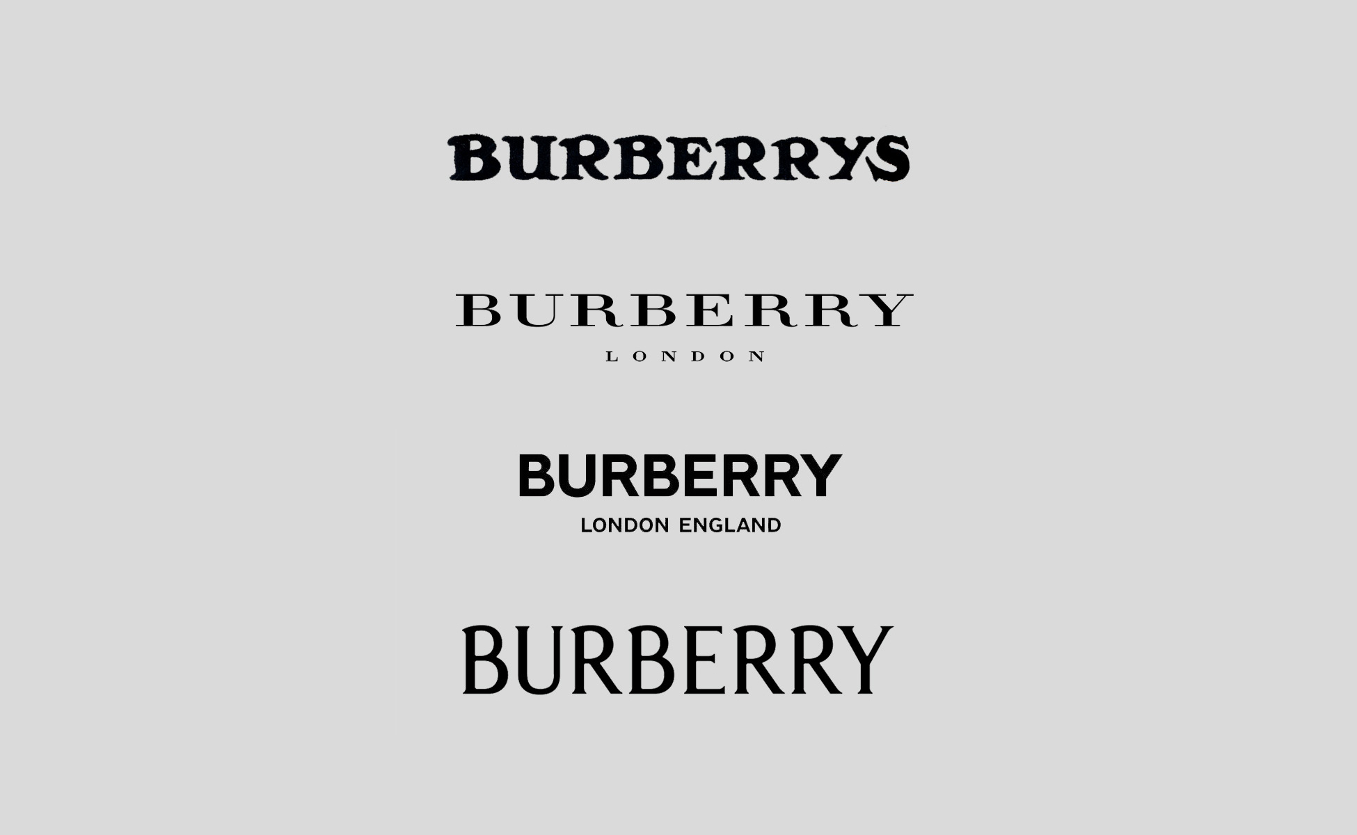
1. Burberry (Fashion)
In the early 2000s, Burberry’s signature check pattern felt overexposed and dated, and the brand suffered from a “down-market” reputation. By 2005–2010, new leadership revived Burberry as a high-end, modern luxury label. The company introduced sleek runway collections, digital marketing tactics (live-streamed shows), and updated logos—first with a minimalist approach in 2018, and more recently a blending of modern sans-serif with a revived historic equestrian knight emblem.
Burberry was facing brand dilution due to heavy licensing (knock-offs and over-licensed goods). It needed to restore its British heritage appeal and attract younger, fashion-forward audiences who had written it off. By embracing tradition while modernizing product lines, Burberry aimed to regain its place among top luxury houses.
Bringing in a new creative director, unveiling fresh design motifs, and leaning into digital engagement helped Burberry connect with emerging fashion consumers. The brand also reclaimed control over licensing to ensure exclusivity. Sales soared from roughly £225 million in 2000 to over £2 billion within a decade, and Burberry is now seen as an innovative icon mixing heritage with futuristic flair. Fashion insiders call it one of the biggest innovative branding transformations in luxury, cementing Burberry’s place among successful modern brand overhauls.

2. Old Spice (Consumer Goods)
By the late 2000s, Old Spice was basically your grandpa’s aftershave—tired and irrelevant to younger guys. Starting around 2010, a witty, ironic, and energetic approach transformed Old Spice into a top men’s grooming brand. Visually, the packaging re-embraced the nautical ship icon, but with bolder, more humorous copy and ads.
Sales were plummeting, and competitor Axe had charmed the youth demographic. Procter & Gamble needed Old Spice to stay competitive, so it opted for a comedic, playful strategy to lure millennials and even Gen Z consumers.
Wieden+Kennedy’s “The Man Your Man Could Smell Like” campaign struck gold, going viral on YouTube and Twitter. Old Spice updated its brand voice and visual style to a comedic, self-aware tone that appealed to both men and women shoppers. In just six months, sales rose 27%, sometimes hitting 107% year-over-year spikes. Old Spice’s pivot is still cited as a top modern rebranding success story that radically reshaped brand perception, making it fun, youthful, and culturally relevant.
3. Walmart (Retail)
In 2008, Walmart replaced its blocky “Wal-Mart” logo (with the star or hyphen) with a friendlier, rounded wordmark and a bright yellow “spark.” It also renovated store layouts, implemented a more inviting color scheme, and switched its motto from “Always Low Prices” to “Save Money. Live Better.”
Although Walmart was America’s biggest retailer, its reputation was taking hits—people saw it as cheap, cluttered, and unwelcoming. Walmart wanted to improve store atmosphere, address negative public perception, and compete with changing consumer expectations for a better shopping experience.
The new brand visuals and store redesigns created a softer, friendlier vibe. Customer satisfaction soared, and Walmart stayed at the top of retail despite the rise of e-commerce. By reframing its value proposition around improving customers’ lives (not just slashing prices), Walmart showed how high-impact modern rebrands can revitalize a huge company’s image—and keep its market position strong.

4. Google (Tech)
In 2015, Google swapped its classic serif logo for a sans-serif wordmark in bright but slightly softer colors. They also introduced dynamic elements like the animated
Google wasn’t just a search engine on desktops anymore—it had expanded into phones, tablets, smart TVs, voice assistants, and more. The old serif logo didn’t scale well across so many screen sizes and products. Google wanted a consistent, modern look that felt playful and user-friendly everywhere.
The new logo stuck with Google’s hallmark color sequence but simplified it. Users initially had mixed feelings, but they got used to it fast. The brand identity is now more cohesive: from the “G” icon on app icons to the swirling dots you see in Google voice searches. As Google expanded into even more realms, the 2015 rebrand helped unify its brand presence across all digital channels and keep its approachable aura.

5. Starbucks (Retail/Food)
For its 40th anniversary in 2011, Starbucks took the brand name out of the logo altogether, leaving just the green siren. The siren image was tweaked—zoomed in and simplified—while the word “Coffee” was removed, signaling Starbucks’ aim to move beyond just coffee.
Starbucks was venturing into teas, juices, and even snacks or wine in some locations. Dropping “Coffee” from the logo gave them freedom to diversify. They bet that the siren alone was recognizable enough worldwide.
Though there was initial outcry from some loyal customers, the brand’s overall acceptance proved the mermaid icon was iconic on its own. By dropping the text, Starbucks projected a future-friendly image that worked globally. The shift played a part in Starbucks’ continuing growth and brand expansion—helping them remain a top global brand in the specialty beverage space, even as they introduced more product categories.

6. Burger King (Food)
In January 2021, Burger King launched a full-scale rebrand—switching its swooshy blue logo to a nostalgic, flatter design that echoed the 1970s: “Burger King” in a chunky, playful font set between two bun shapes. The brand introduced a warm palette of red, orange, and brown, plus new packaging, uniforms, and in-store visuals.
Burger King wanted to signal a return to real, flame-grilled quality. They had lagged behind major fast-food rivals, so it was time to show freshness, authenticity, and improved menu items. This rebrand also tapped into BK’s heritage, reminding folks of simpler, “wholesome” times.
Designed by Jones Knowles Ritchie, everything from signage to the app was reworked. The retro style delivered a modern spin on BK’s heyday vibe. Consumers loved it—there was an immediate boost in brand buzz. Surveys indicated a jump in purchasing intent and big social media impressions. The new brand aesthetic and tie-in with better food quality helped BK stand out in a competitive landscape, proving successful modern brand overhauls can raise both brand love and sales numbers.
7. Airbnb (Tech/Hospitality)
In 2014, Airbnb swapped its bland wordmark for the “Bélo,” a looped symbol that merges the shape of an A, a location pin, a heart, and a person’s head. The color palette shifted to soft, friendly coral with supporting teals and purples. Meanwhile, the slogan “Belong Anywhere” underlined Airbnb’s brand story.
Airbnb was growing at breakneck speed, expanding from a room-rental site to a community-driven travel platform. Its original identity didn’t reflect that sense of “belonging.” Plus, the company wanted a universal logo that transcended language and could anchor a broader travel ecosystem.
Working with design agency DesignStudio, Airbnb rolled out the Bélo globally, encouraging users to recreate the symbol themselves. While some people mocked the shape early on, the open-minded approach to brand storytelling won out. Airbnb soared to millions of listings worldwide, with the new brand image reinforcing the idea of belonging anywhere. It’s now a prime example of contemporary rebranding success, pivoting from a practical booking site to a lifestyle phenomenon.
8. Instagram (Tech/Social Media)
In 2016, Instagram’s beloved retro camera icon disappeared, replaced by a flat, minimalist camera outline atop a pink-orange-purple gradient. The in-app interface also shifted to a stark black-and-white UI so photos popped even more.
Instagram had evolved from a small photo-filter app to a huge social platform with diverse content (videos, Stories, reels). The old icon didn’t fit a forward-looking, digital brand serving hundreds of millions of users. A simplified, colorful symbol was easier to recognize on mobile home screens and aligned with Instagram’s fun yet modern vibe.
Though initial user backlash was loud (it always is with big logo changes), acceptance came quickly. Instagram hit 1 billion users by mid-2018, and the new gradient logo became iconic. Freed from the vintage Polaroid imagery, Instagram could innovate with new features like IGTV and Reels. This shift remains a lesson in how bold changes can spark social media commotion but ultimately support a brand’s long-term growth.

9. Volkswagen (Automotive)
In 2019, VW retired its glossy, 3D emblem for a flat, minimalist black-and-white circular logo. The rebrand extended to an entire “New Volkswagen” theme, with fresh typography, color options, and a friendlier vibe in advertising and showroom experiences.
VW aimed to move past the Dieselgate scandal and reposition itself as a leader in electric mobility and sustainability. The new look symbolized honesty, modernization, and a pivot toward eco-friendly engineering—far from the old diesel image.
VW’s in-house teams simplified the circle-and-letters design for digital readiness and universal appeal. They also introduced a brand “sound logo,” new dealership signage, and branding that emphasizes real people and lifestyle benefits instead of just cars. The flat, understated emblem helped distance VW from its scandal days, and the brand is gradually rebuilding trust as it launches electric vehicles globally.

10. Uber (Tech/Transportation)
After a failed 2016 rebrand featuring an abstract “bits and atoms” pattern, Uber tried again in 2018. It went with a simple wordmark—“Uber” in a custom typeface—accompanied by a stark black-and-white color scheme. The approach was all about clarity, consistency, and trust.
Uber faced controversies over leadership scandals, poor corporate culture, and safety issues. With new CEO Dara Khosrowshahi in 2017, the company needed a fresh identity to show it was more responsible and rider-focused. Also, the old brand was confusing—different icons in different regions and no universal design.
Agency Wolff Olins collaborated with Uber’s internal team to create a straightforward brand system. The app icon simply reads “Uber,” the black-and-white palette looks professional, and the brand voice emphasizes approachability and safety. This rebrand, along with policy changes, gradually improved Uber’s tarnished reputation and set the stage for its 2019 IPO. By ditching complicated visuals and focusing on a no-nonsense identity, Uber regained user trust and signaled a stable, grown-up approach to mobility services.

Why Change?
From Burberry’s resurrection as a cutting-edge luxury house to Old Spice’s hilarious pivot that captured a new generation, these brands show why modern rebranding case studies matter so much. Each one involved far more than a logo swap: success hinged on clarifying core brand values, addressing real market challenges, and revamping visuals to match strategic goals. That’s how successful modern brand overhauls connect with consumers on an emotional level and keep a company thriving amidst industry shake-ups.
If you’re wondering why some modern rebrands outperform others, the answer lies in authenticity, consistency, and timing. Customers can tell when a brand genuinely rethinks its identity versus when it just slaps on a new logo. In these top examples—whether tech, fashion, or fast food—leaders understood they had to align all brand touchpoints with a clear new direction.
By studying these innovative branding transformations, you’ll learn how to craft a brand identity that resonates with today’s audiences. Maybe that means shedding old baggage, emphasizing new product lines, or adopting a friendlier, more inclusive feel. Each story here proves that a well-executed rebrand can shift consumer perception, drive engagement, and open up opportunities—especially in a fast-paced modern world where brand impressions are made in seconds.

Disclosure: This list is intended as an informational resource and is based on independent research and publicly available information. It does not imply that these businesses are the absolute best in their category. Learn more here.
This article may contain commission-based affiliate links. Learn more on our Privacy Policy page.


